High-Contrast Display Serif

Bread and Butter Duo + The Avenue Editorial
Pairs sculptural editorial warmth with Bread and Butter Duo's clean modern geometry.
Inspect The Avenue Editorial specimenDisclosure: MakerFileHub may earn a commission from qualifying purchases via paid links on this page. How our links work.
Rounded handwritten script paired with a narrow print in mixed case
Bread and Butter Duo pairs a rounded handwritten script with a narrow mixed-case print, so a label can carry a warm name and a quiet supporting line in the same ink without a second style.
Paid link
Get this fontProject & layout blueprintsAt-a-glance maker compatibility
Weld or Unite overlapping script joins into one continuous vector path before sending to the blade.
Visual anatomy & craft review
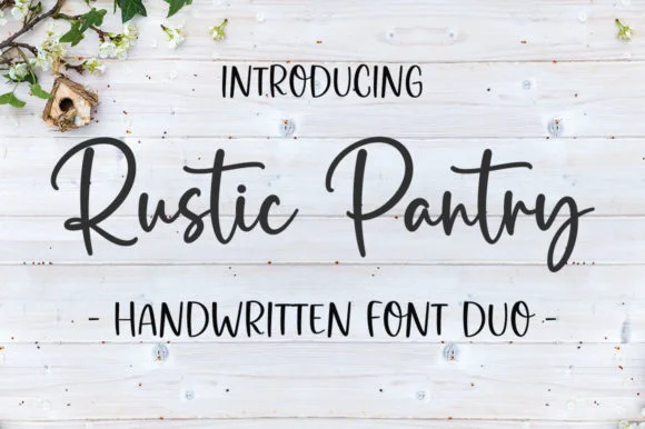
The script half is a connected hand with a swollen stroke and open loops: the capital B opens with a looped stem, the r keeps a short arm, the e closes a round bowl and the d rises into a plain stem. The print half is a narrow mixed-case face with even strokes and a plain skeleton, tracked slightly wide so it reads as a caption rather than as a second headline. That combination is what the pairing is for — the script carries the product and the print carries the information. Both halves hold at 11 pt on a jar label, and the script's round counters survive a kraft print. The marble surface, the bread photograph, the grey ink and the two caption lines are presentation; the duo is the two lines.
Rounded · Narrow · Paired
Two-font hierarchy recipes
Tested contrast partners — pairing Bread and Butter Duo with grounded secondary typography.
Bread and Butter Duo + The Avenue Editorial
Pairs sculptural editorial warmth with Bread and Butter Duo's clean modern geometry.
Inspect The Avenue Editorial specimen
Bread and Butter Duo + Abigail
Introduces organic movement on pull-quotes, signatures and gift tags.
Inspect Abigail specimenPractical applications
Concrete hierarchy, scale and production guidance tailored to Bread and Butter Duo’s stroke geometry.
The script names the product at 12 pt while the narrow print carries the ingredients line, so one small label holds both without a third face.
Hierarchy & layout recipe
Print a 50 by 70 mm label: set the product in the script at 12 pt, set the ingredients in the narrow print at 7 pt beneath, and keep 5 mm of margin so the rounded tail stays inside the die.
Pre-production check
A narrow print under 7 pt closes on kraft; check one labelled jar and raise the ingredients line rather than condensing it further.
The pair fits a small kraft tag, and the script gives a favour a warm register while the print keeps the names legible at 8 pt.
Hierarchy & layout recipe
Print a 55 by 35 mm kraft tag: set the greeting in the script at 12 pt, set the couple's names in the narrow print at 8 pt, and keep 8 mm clear at the top for the punched hole.
Pre-production check
A punched hole close to a tag edge splits it; check the punch position against the artwork and keep 5 mm of paper beyond the hole.
The script heads a daily menu while the narrow print lists the items, so a printed insert stays legible at 9 pt across a narrow column.
Hierarchy & layout recipe
Print an A6 insert: set the café name in the script at 18 pt, set the items in the narrow print at 9 pt at 13 pt leading, and hold 10 mm between the header and the first item line.
Pre-production check
A rounded script over a tight item list can crowd the column; check the insert at final size and keep the header to two words.
Technical & licence verification
Confirm included OTF/TTF/WOFF formats, full glyph tables and licence coverage on the live store page before batch production.
Closest visual alternatives
Matched across letterform anatomy, stroke behaviour and craft applications.

Casual script with a sans companion
Malley Jacklist is a duo: a heavy casual script in cream with wide loops and a light sans companion, presented as a hand-lettered pair on a deep green photograph of leaves.
Ideas for this font
Rounded uppercase paired with a connected sloping script and a sweeping R leg
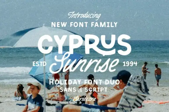
Cyprus Sunrise Duo places white rounded capitals above a flowing script word on a beach photograph, where the upper R sends a long curved leg beneath the following letters and the script S opens a large lower loop before the remaining letters connect on a rising rhythm.
Ideas for this font
Tall narrow print and fine script
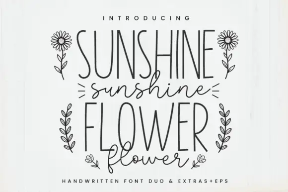
Sunshine Flower is a hand-drawn duo: a tall thin monoline capital face and a loose thin script, supplied with line-art flowers and shown in black on white.
Ideas for this font
Broad slanted script and irregular sans
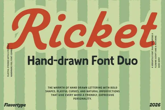
Ricket is a retro duo: a broad slanted script in brick red with bubbly bowls and a ball terminal, matched to a bold irregular sans that carries the subtitle.
Ideas for this font
Same independent foundry
Allow optional Google Analytics to measure visits and catalogue actions. Your search words and notes are not included. Privacy & storage