Modern Grotesque Body

Cryzor + Homies
Creates crisp high-hierarchy contrast beneath Cryzor headlines across menus, websites and labels.
Inspect Homies specimenDisclosure: MakerFileHub may earn a commission from qualifying purchases via paid links on this page. How our links work.
Open-inline Chicano tattoo & classical Roman serif
Cryzor is a sharp, open-inline tattoo display serif (not a script) combining flared Roman capitals with crisp twin-line interior channels.
Paid link
Get this fontProject & layout blueprintsAt-a-glance maker compatibility
Sturdy stroke walls and open counters weed cleanly on adhesive vinyl, HTV apparel film, and cut cardstock.
Visual anatomy & craft review
Cryzor is an open-inline tattoo display serif that combines flared Roman capitals with crisp twin-line interior channels, so a word reads as a chest tattoo lettered in two strokes rather than as a printed serif. The channel runs through every stem and curve, which means the face needs size to keep the two lines apart, and the flanked serifs give it a Chicano flavour. It needs roughly 34 mm for the channels to hold, and it is best in bone white on charcoal or in one dark ink on a pale ground.
Inline-tattoo · Classical-street · Sharp
Two-font hierarchy recipes
Tested contrast partners — pairing Cryzor with grounded secondary typography.
Cryzor + Homies
Creates crisp high-hierarchy contrast beneath Cryzor headlines across menus, websites and labels.
Inspect Homies specimen
Cryzor + Easy Handwriting
Adds a warm human signature touch for 1-to-3-word callouts without competing against structured serif capitals.
Inspect Easy Handwriting specimenPractical applications
Concrete hierarchy, scale and production guidance tailored to Cryzor’s stroke geometry.
Twin-channel Roman caps read as a tattoo shop's own lettering, which is what a studio paints on a window. The inline gives the mark depth in one ink, and the flared serifs hold at 60 mm on a garment.
Hierarchy & layout recipe
Sign 900 x 400 mm, word 160 mm, 60 mm margins and 25 mm frame clearance. Tee print 280 x 160 mm, word 60 mm, 40 mm margins. Card 85 x 55 mm, name 9 mm, 5 mm margins.
Pre-production check
A plastisol print at 60 mm bridges the 1.5 mm channel and the inline fills into a solid stem. Keep the channel at 2.5 mm on garment artwork, and approve a strike-off before the run.
Inline Roman caps read as an engraved award, which is what a crew thank-you wants instead of a certificate. The channel gives the name weight at 26 mm, and one ink on a dark plaque reads in low light.
Hierarchy & layout recipe
Print 210 x 297 mm, name 60 mm, message 9/13 pt, 30 mm margins. Card 148 x 105 mm, name 16 mm, message 7/10 pt, 12 mm margins. Plaque 250 x 150 mm, word 30 mm with 8 mm engraved margin.
Pre-production check
An engraved plaque cuts the 2 mm channel into two grooves that fill with swarf and the inline disappears. Engrave the solid style or widen the channel to 3 mm, and inspect one plate before the order.
Chicano inline caps read as a tattoo-culture title, which is what a niche magazine puts on a cover. The channels hold at 90 pt on coated stock, and the flared serifs give the cover its subject without a photograph.
Hierarchy & layout recipe
Cover 210 x 297 mm, title 90 pt, cover lines 9/12 pt, 18 mm margins and 10 mm trim. Opener 420 x 297 mm, headline 120 mm, body 9/13 pt. Poster A2, word 280 mm, details 22/28 pt, 30 mm margins.
Pre-production check
A 90 pt title on uncoated stock gains ink and the 1.5 mm channel closes at the curves. Print coated or keep the title at 76 pt, and check one cover proof before the run.
Technical & licence verification
Confirm included OTF/TTF/WOFF formats, full glyph tables and licence coverage on the live store page before batch production.
Closest visual alternatives
Matched across letterform anatomy, stroke behaviour and craft applications.
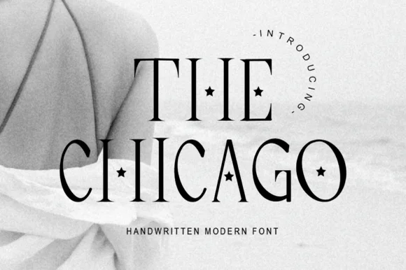
Tall thin display serif with star-cut counters
The Chicago is a tall display serif in which the stems stretch upward, the hairlines stay fine and a small star is punched into several counters, so a two-word title reads as a decorated magazine masthead.
Ideas for this font
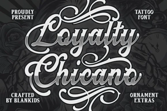
Bold beveled Chicano tattoo script with ornament extras
Loyalty Chicano is a bold, broad-nib Chicano tattoo script bundled with matching ornamental scroll extras for full chest and poster lockups.
Ideas for this font
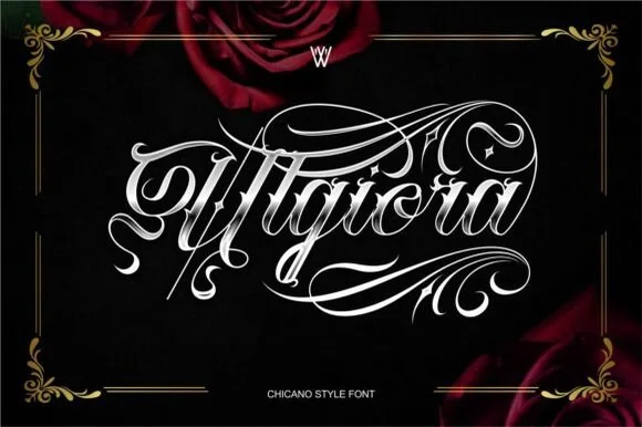
Chicano gothic-script hybrid with heavy flourishes and a shaded inner stroke
Ulgiora is a chicano-style hybrid in which a gothic skeleton is drawn as a connected script, with heavy flourishes that leave the word at both ends and a fine shaded line inside the thick strokes.
Ideas for this font
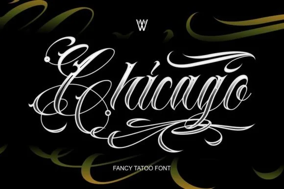
Ornate tattoo script with hatched shading and long capital flourishes
Chicago is an ornate tattoo script in which the capitals throw long flourishes, the stems carry drawn-in shading strokes and the tails curl into hooks, so a single word reads as a piece of lettering rather than as text.
Ideas for this font
Same independent foundry
Allow optional Google Analytics to measure visits and catalogue actions. Your search words and notes are not included. Privacy & storage