Editorial Serif Anchor

Criden + The Lumina Awesome
Anchors Criden's fluid strokes with crisp Roman proportions on wedding suites, headers and packaging.
Inspect The Lumina Awesome specimenDisclosure: MakerFileHub may earn a commission from qualifying purchases via paid links on this page. How our links work.
Cream retro lettering with broad flowing curves and a soft heavy stroke
Criden is retro lettering drawn with broad flowing curves, a soft heavy stroke and rounded terminals, so a short word reads as a hand-painted sign from the seventies rather than a formal script.
Paid link
Get this fontProject & layout blueprintsAt-a-glance maker compatibility
Weld or Unite overlapping script joins into one continuous vector path before sending to the blade.
Visual anatomy & craft review
The capital C opens as a wide crescent that begins above the x-height and closes low, and the letters after it keep that flow: the r and the i stay small and round, the d closes a soft bowl, the e lifts into a curl and the n holds a wide shoulder that runs straight into the next letter. Weight is heavy and even, the joins carry the same thickness as the stems and the ends are fully rounded, which is what gives the word its painted, slightly inflated quality. The fit is loose enough that the letters do not touch except at the joins, and the baseline drifts a little to keep the sign-painted feel. The orange ground, the cream ink, the drawn flowers and mushrooms and the small italic line beneath are presentation; the lettering is the word.
Retro · Flowing · Heavy
Two-font hierarchy recipes
Tested contrast partners — pairing Criden with grounded secondary typography.
Criden + The Lumina Awesome
Anchors Criden's fluid strokes with crisp Roman proportions on wedding suites, headers and packaging.
Inspect The Lumina Awesome specimen
Criden + One More
Keeps small-scale dates, URLs, nutrition facts and care instructions crisp and legible below script titles.
Inspect One More specimenPractical applications
Concrete hierarchy, scale and production guidance tailored to Criden’s stroke geometry.
The flowing retro weight reads down a street and looks painted on site, which is the register a seasonal stall wants for a fascia or a board.
Hierarchy & layout recipe
Set the stall name at 20 cm on a 1.6 m board, set the produce line in a plain sans at 6 cm, and hold 15 cm of margin so the soft terminals stay on the board.
Pre-production check
Painted broad curves pool at the turns; check the first letter and pull the brush faster through the curve rather than thinning the paint.
The retro flow suits a warm-weather celebration, and the heavy round stroke reads in daylight at 12 cm across a lawn without extra decoration.
Hierarchy & layout recipe
Set the greeting at 12 cm on a 700 by 500 mm board, set both names at 7 cm beneath it, and leave 12 cm of margin so the widest curve stays inside the frame.
Pre-production check
Boards in strong sun wash out a warm ink; check the sign in place and use a darker ground rather than thickening the lettering.
The painted weight holds on a curved bottle label where a fine script would vanish, and the round terminals keep the name friendly at 14 pt.
Hierarchy & layout recipe
Set the brand at 14 pt on a 60 by 90 mm bottle label, keep the flavour in a 6 pt sans, and leave 7 mm at the sides so the curves are not squeezed by the label edges.
Pre-production check
A curved label pinches the outer curves of a heavy script; check a printed label on the actual bottle and widen the side margins first.
Technical & licence verification
Confirm included OTF/TTF/WOFF formats, full glyph tables and licence coverage on the live store page before batch production.
Closest visual alternatives
Matched across letterform anatomy, stroke behaviour and craft applications.
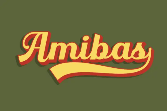
Heavy retro script with a looped capital and a returning under-tail
Amibas is a heavy retro script in which the letters slant together, the capital loops back over its own stem and a long tail returns beneath the whole word, so a name reads as a seventies sports badge.
Ideas for this font
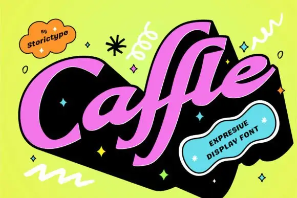
Heavy slanted retro script with flat-cut terminals
Caffle sets a heavy slanted script in solid pink on a black slab, with a wide capital leaning across the word and lowercase letters packed so tight they nearly touch, so the line reads as one painted shape instead of a string of joined letters.
Ideas for this font

Weighty vintage script set in two compact stacked lines
Coastal Honey is a weighty vintage script drawn to stack two words tightly, with heavy even strokes, curled terminals and a compact silhouette that reads like a printed sign.
Ideas for this font
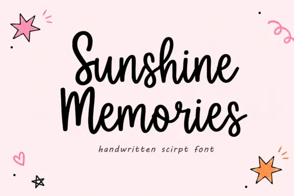
Rounded connected handwritten script
Sunshine Memories is a rounded connected script in black on pale pink: fat even strokes, a moderate bounce and small drawn hearts, dots and stars scattered around the two words.
Same independent foundry
Allow optional Google Analytics to measure visits and catalogue actions. Your search words and notes are not included. Privacy & storage