Neutral Sans Workhorse

Charming Chunky + Helina
Lets Charming Chunky own the focal silhouette while handling secondary copy, sizing and subheads cleanly.
Inspect Helina specimenDisclosure: MakerFileHub may earn a commission from qualifying purchases via paid links on this page. How our links work.
Playful upright forms with uneven mixed-case proportions and a stitched outline
Charming Chunky is a playful display face in which the letters mix capital and lowercase proportions, the heights shift and a stitched outline runs around the whole lockup, so a word reads as a cut felt shape.
Paid link
Get this fontProject & layout blueprintsAt-a-glance maker compatibility
Sturdy stroke walls and open counters weed cleanly on adhesive vinyl, HTV apparel film, and cut cardstock.
Visual anatomy & craft review
The C opens a wide crescent, the h keeps a fat stem and a rounded shoulder, the A carries a low bar, the r holds a short arm and the y drops a curled tail, all at a heavy even weight with fully rounded ends. The mixing is the character: some letters are set tall like capitals and others sit small like lowercase, which is what gives the face its cut-out rhythm at 40 pt. The stitched outline surrounds the whole word rather than each letter, so the lockup reads as one sewn shape and can be die-cut in felt or card. Counters close below 20 pt, so the face wants display sizes. The pale ground, the pastel fills, the small sparkles and the two caption lines are presentation; the display face is the two words.
Playful · Uneven · Outlined
Two-font hierarchy recipes
Tested contrast partners — pairing Charming Chunky with grounded secondary typography.
Charming Chunky + Helina
Lets Charming Chunky own the focal silhouette while handling secondary copy, sizing and subheads cleanly.
Inspect Helina specimen
Charming Chunky + Medvilea Editorial
Grounds bold display lettering with classic typographic authority on posters, badges and apparel.
Inspect Medvilea Editorial specimenPractical applications
Concrete hierarchy, scale and production guidance tailored to Charming Chunky’s stroke geometry.
The stitched outline can be cut as one shape per word, and the mixed heights give a garland a hand-made rhythm at 40 mm.
Hierarchy & layout recipe
Cut a garland panel: set the word at 40 mm with the stitch inset 3 mm inside the cut line, keep 6 mm of material beyond the outline, and leave 15 mm between panels so the string does not pass through a letter.
Pre-production check
A stitch inset under 2 mm tears when the felt is cut; check one panel and widen the inset rather than the letters.
The uneven proportions read at 45 mm against frosting, and the single outline gives the topper a finished edge without a second colour.
Hierarchy & layout recipe
Cut a 130 mm wide topper: set the word at 45 mm tall, keep 6 mm of material around the stitched outline, and leave a 20 mm stem at the centre so the topper stands without a support behind it.
Pre-production check
A thin stem under 15 mm bends under the weight of the card; check the topper in the cake and widen the stem rather than shrinking the word.
The playful mixing reads at 50 mm from a child's eye level, and the stitched edge gives a printed wall piece the look of a fabric cut-out.
Hierarchy & layout recipe
Print a 600 by 300 mm panel: set the greeting at 50 mm, keep the stitch line 4 mm inside the printed edge, and leave 5 cm of border so nothing is cropped by the frame or the fixings.
Pre-production check
A stitched outline printed at 50 mm on a light wall looks faint; check the proof and keep the stitch colour darker than the fill.
Technical & licence verification
Confirm included OTF/TTF/WOFF formats, full glyph tables and licence coverage on the live store page before batch production.
Closest visual alternatives
Matched across letterform anatomy, stroke behaviour and craft applications.
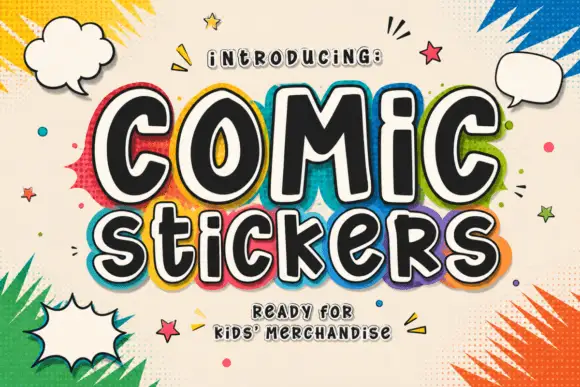
Soft irregular mixed-case lettering with thick faces and layered sticker-like edging
Comic Stickers combines tall COMiC forms with a lower mixed-case Stickers line, where rounded black faces with uneven widths and softly bent terminals are separated from bright offset borders by pale edging.
Ideas for this font
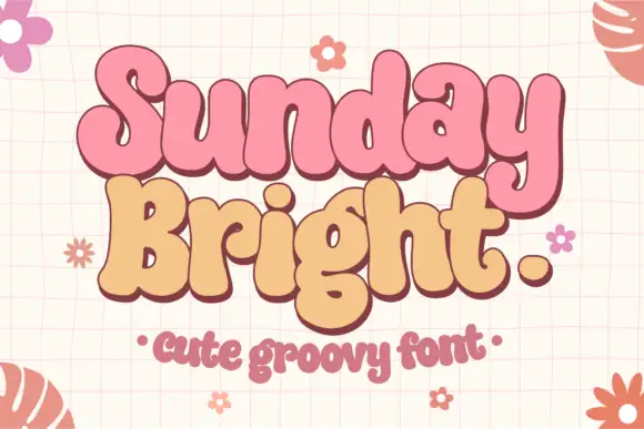
Soft joined-looking groovy forms
Sunday Bright is a soft groovy display in pink and cream on a pale grid: fat rounded letters that appear joined, a low waist, tall loops and a full stop drawn as a circle, presented as a pair of stacked words in two colours.
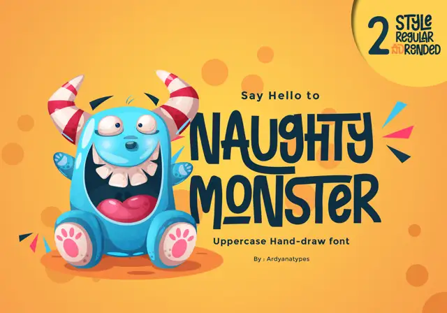
Tall eccentric cartoon capitals
Naughty Monster stretches cartoon letterforms into tall narrow capitals whose cross-strokes run out past their neighbouring letters and whose tops refuse to line up.
Ideas for this font
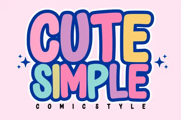
Tall rounded comic blocks with bubble outlines and per-letter colour
Cute Simple is a tall rounded comic alphabet in which the blocks stack tightly, the outlines bubble outward and each letter can take its own colour without breaking the composition.
Ideas for this font
Same independent foundry
Allow optional Google Analytics to measure visits and catalogue actions. Your search words and notes are not included. Privacy & storage



