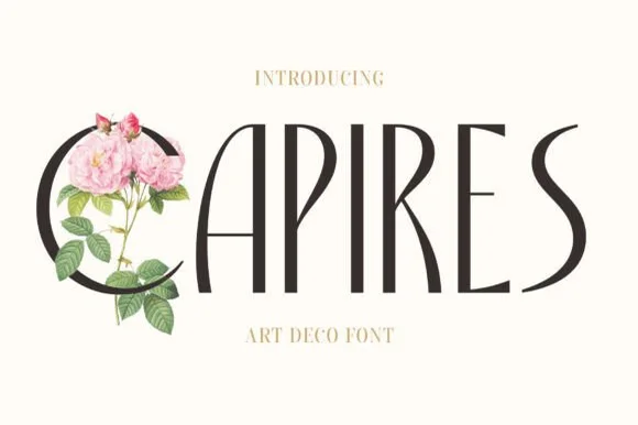
Modern Grotesque Body

Tigreal Family + Modern Heritage
Creates crisp high-hierarchy contrast beneath Tigreal Family headlines across menus, websites and labels.
Inspect Modern Heritage specimenDisclosure: MakerFileHub may earn a commission from qualifying purchases via paid links on this page. How our links work.
Worn letterpress slab family
Tigreal Family is a letterpress slab in cream on a dark ground: wide rounded slabs with a dotted worn fill and open bowls, shown as one word with an engraved lion above, two badge seals at the sides and a line beneath listing the four cuts.
Paid link
Get this fontProject & layout blueprintsAt-a-glance maker compatibility
Fine grain and micro-texture excel in 300 DPI print, sublimation, and screen print rather than small vinyl weeding.
Visual anatomy & craft review
The plate presents a family rather than a single cut, and the line beneath names them — regular, outline, rough and stamp — which is what a buyer of a letterpress style needs to know before choosing. The drawing is a wide rounded slab with open bowls, and the worn fill is made of small dots rather than a random texture, so the same wear reproduces at any size. The engraved lion and the two seals are period furniture that set the craft context, and the small caps lines around the word describe the making. Because the slabs are wide, the face needs generous spacing, and the specimen sets one word that fills the width. The palette is cream on a dark brown, which is a fair test for a face used on a stamp or a kraft label.
Slab, letterpress, worn, vintage
Two-font hierarchy recipes
Tested contrast partners — pairing Tigreal Family with grounded secondary typography.
Tigreal Family + Modern Heritage
Creates crisp high-hierarchy contrast beneath Tigreal Family headlines across menus, websites and labels.
Inspect Modern Heritage specimen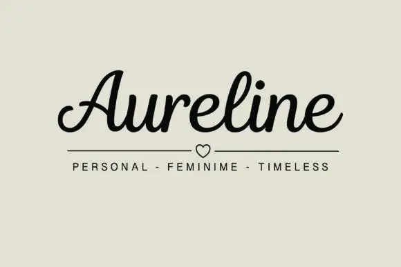
Tigreal Family + Aureline
Adds a warm human signature touch for 1-to-3-word callouts without competing against structured serif capitals.
Inspect Aureline specimenPractical applications
Concrete hierarchy, scale and production guidance tailored to Tigreal Family’s stroke geometry.
A worn slab reads as a stamped paper label, and the dotted fill hides the fibre variation that an uncoated stock would show anyway.
Hierarchy & layout recipe
Print a 65 by 85 mm label: the roastery at 15 pt, the origin at 8 pt, and the weight at 6 pt. Keep 4 mm inside the die, print one ink on kraft, and use the stamp cut for the name.
Pre-production check
Check the 15 pt name on kraft, where the dots can fill the counter; keep the size above 12 pt. Confirm the 6 pt weight reads at arm's length and that the label peels cleanly.
A letterpress slab gives a craft book the look of a printed cover, and the outline and rough cuts let one family carry a title and a caption.
Hierarchy & layout recipe
Set the title at 80 mm cap height in the regular cut, the subtitle in the outline cut at 12 pt, and the author at 9 pt. Print two colours on a textured stock and keep the title in the upper half.
Pre-production check
Check the subtitle at 12 pt in the outline cut, where thin contours can break; use the regular cut below 14 pt. Confirm the 9 pt author survives lamination and that the title clears the trim.
A worn slab reads as a rubber stamp, which is exactly what a handmade parcel needs, and the rough cut adds the texture without a second tool.
Hierarchy & layout recipe
Print a 40 mm stamp: the name at 9 pt, a 2 mm border, and one ink on a kraft sticker. Keep 5 mm inside the die and keep the dots above 0.3 mm at that size.
Pre-production check
Check the 9 pt stamp at 40 mm, where the dotted fill can close; use the regular cut. Confirm the name reads at arm's length and that the stamp sits flat on a curved parcel.
Technical & licence verification
Confirm included OTF/TTF/WOFF formats, full glyph tables and licence coverage on the live store page before batch production.
Closest visual alternatives
Matched across letterform anatomy, stroke behaviour and craft applications.
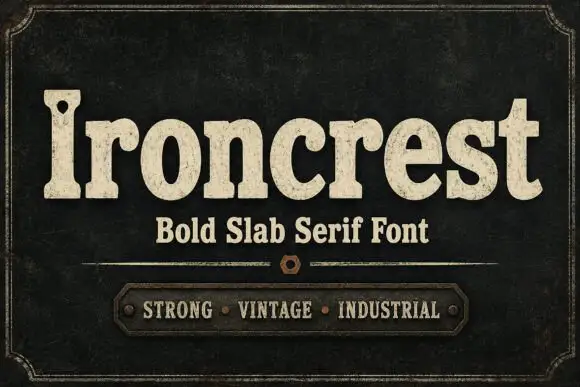
Heavy rounded mixed-case slabs with coarse worn fill and a pierced capital
Ironcrest shows cream mixed-case lettering against dark green-black, where the lowercase bowls stay thick and rounded, the r carries a curled shoulder, the t rises into a blunt wide crossbar and the capital I holds a small dark hole near its upper section while fine mottling roughens the fill.
Ideas for this font
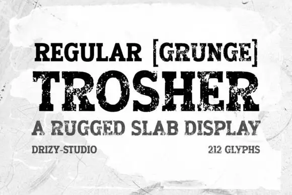
Rugged eroded slab display
Trosher is a rugged slab display in black on a mottled white ground: broad bracketed slabs with clean and heavily eroded fills, mixed case with tall ascenders and a full-width setting, with a bracketed note above, a plain line beneath and two small notes at the foot.
Ideas for this font
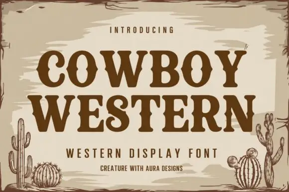
Western slab display with spurred serifs and an inline shade
Cowboy Western is a western slab display in which the serifs grow spurs, the stems stay heavy and an inline shade runs through each letter, so a name reads as a brand burnt into a barn board.
Ideas for this font
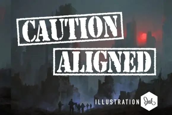
Distressed stencil capitals enclosed in rough rectangular rules
Caution Aligned shows white heavy capitals in two separately framed rows, where narrow gaps interrupt several bowls and stems and ragged edges with coarse rectangular outlines create a stamped-looking silhouette.
Same independent foundry
Allow optional Google Analytics to measure visits and catalogue actions. Your search words and notes are not included. Privacy & storage