Modern Grotesque Body

Broken Grunge + Godthem
Creates crisp high-hierarchy contrast beneath Broken Grunge headlines across menus, websites and labels.
Inspect Godthem specimenDisclosure: MakerFileHub may earn a commission from qualifying purchases via paid links on this page. How our links work.
Chipped-edge condensed woodblock slab serif
Broken Grunge is a tall, condensed mixed-case slab serif chewed along every edge with rough concrete-and-woodcut chips.
Paid link
Get this fontProject & layout blueprintsAt-a-glance maker compatibility
Fine grain and micro-texture excel in 300 DPI print, sublimation, and screen print rather than small vinyl weeding.
Visual anatomy & craft review
Broken Grunge is a tall condensed slab with mixed case, chewed edges and a rough concrete texture that sits on the outline rather than the fill, so the letters keep a solid silhouette while the perimeter looks broken. The slabs are heavy and the compression is strong, which fits a long word into a narrow panel, and the chips are coarse enough to survive a small print. It needs roughly 20 mm for the chips to read as wear, and it is a poster, label and apparel face.
Chipped · Condensed · Rock-poster
Two-font hierarchy recipes
Tested contrast partners — pairing Broken Grunge with grounded secondary typography.
Broken Grunge + Godthem
Creates crisp high-hierarchy contrast beneath Broken Grunge headlines across menus, websites and labels.
Inspect Godthem specimen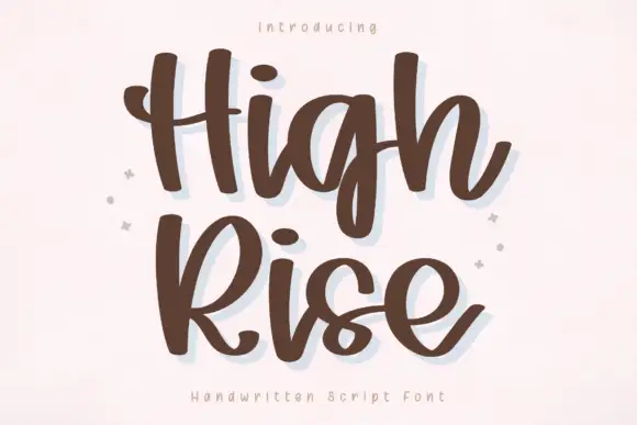
Broken Grunge + High Rise
Adds a warm human signature touch for 1-to-3-word callouts without competing against structured serif capitals.
Inspect High Rise specimenPractical applications
Concrete hierarchy, scale and production guidance tailored to Broken Grunge’s stroke geometry.
Chewed edges read as a printed poster that has been on a wall, which suits an industrial or punk subject. Condensed width fits a long title in a narrow column.
Hierarchy & layout recipe
Poster A2, word 280 mm, details 22/28 pt, 30 mm margins and 20 mm clear of the frame. Masthead 180 x 40 mm, 44 pt across the head trim. Flyer A5, word 120 mm, lineup 10/13 pt, 12 mm margins.
Pre-production check
Photocopied flyers on recycled stock fill the chips and the word looks smudged. Print one test copy on the actual machine, and reduce the chip density rather than the size.
A chewed slab reads as a mark printed on a rough surface, which is what a workshop or small producer wants. Heavy slabs stay legible on a bottle at 14 mm.
Hierarchy & layout recipe
Label 90 x 110 mm, word 16 mm, abv 4.5 pt, 5 mm top arc. Sign 1200 x 400 mm, word 220 mm, 80 mm margins. Crate 400 x 200 mm, word 80 mm, 25 mm margins.
Pre-production check
Bottle labels pass through a cooler and chewed edges plus condensation read as damage. Use a matt synthetic label, and check one chilled bottle before the batch.
Rough slab lettering reads as a facility marking that has been there for years, which suits an industrial haunt. Compression keeps a long attraction name inside one board.
Hierarchy & layout recipe
Sign 1200 x 400 mm, word 220 mm, 80 mm margins. Crate 400 x 200 mm, word 80 mm, 25 mm margins. Ticket 210 x 75 mm, word 24 mm, stub 40 mm and 15 mm clear of the perforation.
Pre-production check
Tickets are torn at a perforation and a word crossing it is destroyed. Keep the artwork 15 mm clear, and check one torn ticket before the print run.
Technical & licence verification
Confirm included OTF/TTF/WOFF formats, full glyph tables and licence coverage on the live store page before batch production.
Closest visual alternatives
Matched across letterform anatomy, stroke behaviour and craft applications.
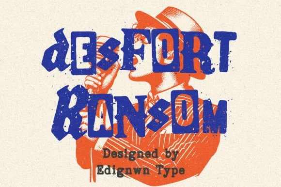
Gritty stamp-distressed mixed-typeface ransom-note font
Desfort Ransom is a rugged, ink-stamped ransom-note typeface mixing serif, sans, and reverse-tile characters with weathered woodblock grit!
Ideas for this font
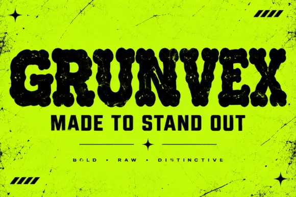
Rounded puffy street-grunge block display (OTF)
Grunvex is an ultra-heavy, puffy street-block display font combining rounded graffiti-slab silhouettes with subtle worn-ink texture.
Ideas for this font
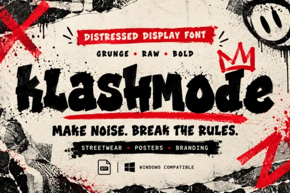
Chaotic punk-street & ransom-tilted grunge display (OTF)
Klashmode is a raw, rebellious street-grunge display font mixing chunky tilted uppercase and lowercase blocks with rough ink-stamp edges.
Ideas for this font
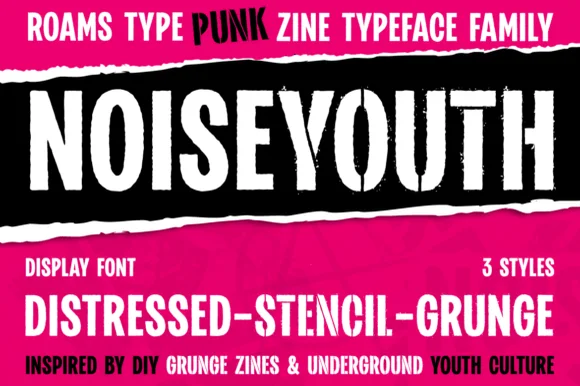
Punk zine display in three distressed styles
Noise Youth is a punk zine typeface family in white and black on magenta: tall condensed capitals shown in distressed, stencil and grunge styles, with ink bands and a caption line about DIY zines.
Ideas for this font
Same independent foundry
Allow optional Google Analytics to measure visits and catalogue actions. Your search words and notes are not included. Privacy & storage