Modern Grotesque Body

Golden Antique + Hermano
Creates crisp high-hierarchy contrast beneath Golden Antique headlines across menus, websites and labels.
Inspect Hermano specimenDisclosure: MakerFileHub may earn a commission from qualifying purchases via paid links on this page. How our links work.
Retro serif with bulbous ball terminals and a swash tail
Golden Antique is a retro serif in which the stems swell, the terminals turn into balls and the final letter drops a swash, so a two-word title reads as a 1970s record sleeve rather than as a classical serif.
Paid link
Get this fontProject & layout blueprintsAt-a-glance maker compatibility
Weld or Unite overlapping script joins into one continuous vector path before sending to the blade.
Visual anatomy & craft review
The G curls a heavy spur, the o stays a wide bowl, the l rises on a fat stem, the d closes a broad bowl, the e turns a heavy eye and the final e finishes a swash tail, all at a retro weight with bulbous ball terminals and a soft, slightly irregular edge. The balls are the character: they replace plain serifs, which is why the sample sets two stacked words in cream over a photographed interior. Because the shapes are solid, the face holds from 26 pt and prints in one flat colour, and the ball terminals need a little tracking to stay separate. The interior photograph, the small arched lettering above and the caption beneath are presentation; the cream display words are the face.
Retro · Ball terminals · Swash
Two-font hierarchy recipes
Tested contrast partners — pairing Golden Antique with grounded secondary typography.
Golden Antique + Hermano
Creates crisp high-hierarchy contrast beneath Golden Antique headlines across menus, websites and labels.
Inspect Hermano specimen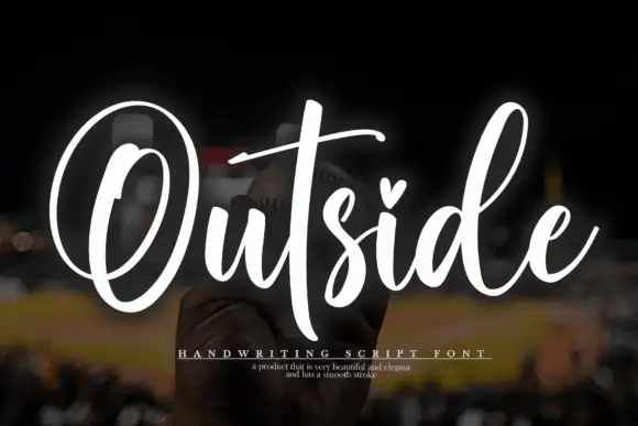
Golden Antique + Outside
Adds a warm human signature touch for 1-to-3-word callouts without competing against structured serif capitals.
Inspect Outside specimenPractical applications
Concrete hierarchy, scale and production guidance tailored to Golden Antique’s stroke geometry.
The ball terminals give a roaster a period mark, and the heavy weight holds a brand name at 22 pt on a kraft label in one ink.
Hierarchy & layout recipe
Print a 70 by 45 mm label: set the brand name at 22 pt, set the roast level in a 7 pt sans beneath, and keep 5 mm from the die so the ball terminals stay whole.
Pre-production check
Ball terminals cut by a small die flatten on one side; check the imposed label and keep 4 mm of clear ground.
The retro weight gives a food feature warmth, and the swash tail fills the end of a column head at 60 pt on a printed page.
Hierarchy & layout recipe
Print an A4 spread: set the header at 60 pt across the top, set the standfirst in a 10 pt sans beneath, and keep 18 mm of clearance so the swash does not touch the copy.
Pre-production check
A swash printed into a column rule reads as a fault; check the proof and keep 12 mm of clear space below the tail.
The bulbous serifs suit a period invitation, and the swash keeps a short name lively at 32 pt on a matte card in one ink.
Hierarchy & layout recipe
Print an A6 card: set the name at 32 pt, set the date in a 10 pt rounded sans beneath, and keep 12 mm of margin so the swash tail sits inside the trim.
Pre-production check
A swash tail printed on the trim line looks cut; check the card and raise the whole word by 4 mm.
Technical & licence verification
Confirm included OTF/TTF/WOFF formats, full glyph tables and licence coverage on the live store page before batch production.
Closest visual alternatives
Matched across letterform anatomy, stroke behaviour and craft applications.

Tall light capitals with long overlapping crossbars
Beach Dates is a tall light capital face in which the C and D open broad curves, the serifs taper finely and the H crossbar reaches left into the C while the T bar stretches across the row below, so two stacked words lock into one form.
Ideas for this font
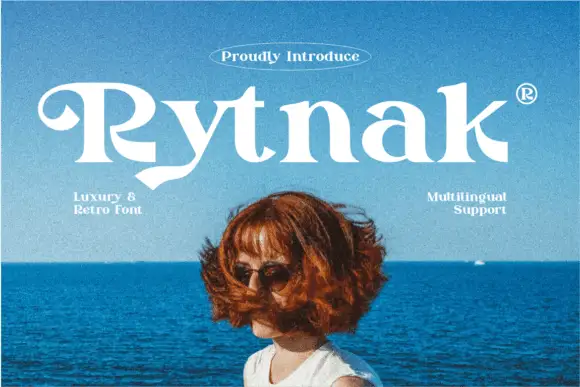
Heavy retro serif
Rytnak is a heavy retro serif in white over a photograph of a figure against a blue sea: fat stems, a hooked R, a pointed y tail and wide bowls, set as one word with a tracked line above in an oval rule and two small notes at the sides.
Ideas for this font

Tall ornamental serif with inward curls and heavy vertical stress
Billvane is a tall ornamental serif in which the stems carry heavy vertical stress, the terminals curl inward and the bowls close on small counters, so a single word reads as a Victorian playbill.
Ideas for this font

Fine narrow elegant serif
Wolles Elegant Modern Serif is a fine narrow serif in cream over a warm blurred interior: tall caps with hairline stems, a raised curve on the W and a low tail on the L, long flat serifs and wide spacing, with small tracked notes in the upper corners and a line beneath.
Same independent foundry
Allow optional Google Analytics to measure visits and catalogue actions. Your search words and notes are not included. Privacy & storage