Editorial Serif Anchor

Better + Bulgary
Anchors Better's fluid strokes with crisp Roman proportions on wedding suites, headers and packaging.
Inspect Bulgary specimenDisclosure: MakerFileHub may earn a commission from qualifying purchases via paid links on this page. How our links work.
Textured dry-brush & street-calligraphy bold script
Better (by OliviaFontCo) is an energetic, heavy dry-brush script featuring raw bristle streaks along stroke tips and dramatic crossbars.
Paid link
Get this fontProject & layout blueprintsAt-a-glance maker compatibility
Weld or Unite overlapping script joins into one continuous vector path before sending to the blade.
Visual anatomy & craft review
A textured dry-brush street script set in stark white over dark emerald and gold foliage: a bold B, a sweeping double crossbar on the tt and brisk bristle-feathered lowercase, so the words read as something painted on a wall rather than as a digital script with a grain filter. The feathered edges and the varying stroke weight are the product, and the dry breaks sit at the ends of strokes where a brush actually runs out. Because the weight is bold, the face holds at poster and apparel sizes but clogs when small. The foliage behind is staging. Uses are apparel, coffee packaging, podcast art and quote prints.
Dry-brush · Expressive · Textured
Two-font hierarchy recipes
Tested contrast partners — pairing Better with grounded secondary typography.
Better + Bulgary
Anchors Better's fluid strokes with crisp Roman proportions on wedding suites, headers and packaging.
Inspect Bulgary specimen
Better + Bielchon
Keeps small-scale dates, URLs, nutrition facts and care instructions crisp and legible below script titles.
Inspect Bielchon specimenPractical applications
Concrete hierarchy, scale and production guidance tailored to Better’s stroke geometry.
A dry-brush script gives an apparel chest graphic the look of a wall-painted mark, and the bold weighted strokes survive a screen print where a fine script would break up, which is the practical test for merchandise.
Hierarchy & layout recipe
Print a 250 mm chest graphic: the word at 60 mm x-height, the tagline in a 14 mm sans, and one ink on a dark shirt. Keep the smallest dry break at 4 mm and place the graphic 80 mm below the collar.
Pre-production check
Check the screen at actual mesh, where a dry break can fill; simplify rather than shrink. Wash-test one shirt and confirm the feathered edges stay ragged after five cycles instead of blurring.
A bold brush script scales up to a wall without losing its character, so a motivational mural reads as painted rather than printed, and the heavyweight strokes survive being viewed from across a room where a thin script would vanish.
Hierarchy & layout recipe
Paint a 2400 by 1200 mm wall: the phrase at 400 mm x-height on one line, a 120 mm credit beneath, and two colours on a primed wall. Keep 200 mm margins and keep the dry breaks above 20 mm.
Pre-production check
Check the wall from ten metres, where a dry break can read as damage; keep it above 20 mm. Confirm the phrase fits the measure without hyphenation and that the credit sits inside the masked area.
A brush script on a coffee bag reads as a roaster with a hand rather than a white-label brand, and the bold weight holds on a kraft bag where a delicate script would disappear into the paper texture.
Hierarchy & layout recipe
Print a 90 by 200 mm bag panel: the brand at 24 pt, the origin at 9 pt, and the roast at 7 pt. Keep 6 mm inside the panel, keep the brush above 0.5 mm, and leave 20 mm at the foot for the valve.
Pre-production check
Check the 24 pt brand on kraft, where a dry break can fill; keep it above 0.5 mm. Confirm the 7 pt roast reads in the hand and that the print clears the degassing valve.
Technical & licence verification
Confirm included OTF/TTF/WOFF formats, full glyph tables and licence coverage on the live store page before batch production.
Closest visual alternatives
Matched across letterform anatomy, stroke behaviour and craft applications.

Bold retro-romance brush script with curled swashes
Vintage Melinda is a creamy, thick-stroke retro brush script with dramatic curled swash capitals and sweeping baseline loops.
Ideas for this font
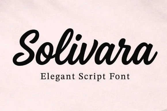
Bold upright thick-and-thin script
Solivara is an elegant bold script in black on a warm off-white ground: upright letters with pronounced thick-and-thin contrast, rounded terminals that curl back into the stroke, and tight joins, so the word reads as a confident retro script rather than a formal calligraphy.
Ideas for this font
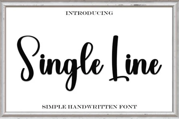
Monoline signature script
Single Line is a monoline signature script in heavy black on cream: a thick even stroke, tall open loops, blunt entry and exit points, a slight forward slant and a bounce across the two words, with a tracked caption beneath in a small roman.
Ideas for this font
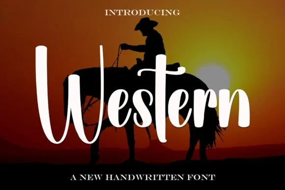
Tall brush script with long ascenders
Western is a tall brush script in white over a sunset silhouette: very long ascenders, thick swelled downstrokes, thin joins and a descender that swings below the word, set as one line with small capital lines above and below.
Ideas for this font
Same independent foundry
Allow optional Google Analytics to measure visits and catalogue actions. Your search words and notes are not included. Privacy & storage