Editorial Serif Anchor

Direkt Stencil + Auretha
Anchors Direkt Stencil's fluid strokes with crisp Roman proportions on wedding suites, headers and packaging.
Inspect Auretha specimenDisclosure: MakerFileHub may earn a commission from qualifying purchases via paid links on this page. How our links work.
Hand-crafted stencil script with broken joins
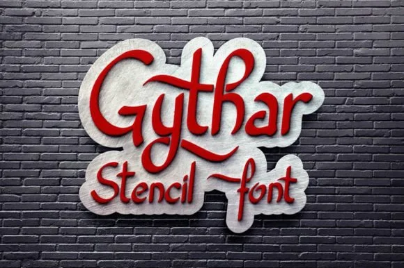
Direkt Stencil is a hand-crafted script in which the strokes stay brushy, the joins are cut away and the letters lean, so a two-word title reads as a stencilled sign rather than as handwriting.
Paid link
Get this fontProject & layout blueprintsAt-a-glance maker compatibility
Open counter bridges hold interior islands intact on laser-cut wood, acrylic, and mylar stencils.
Visual anatomy & craft review
The D opens a broad capital, the i carries a light dash, the r finishes a short arm, the e turns a round eye, the k splays two strokes and the t crosses a high bar, all at a brush weight with stencil bridges cut through the joins and a quick forward lean. The bridges are the character: they break the connections a script would normally close, which is why the sample sets two stacked words as a stencilled sign. Because the strokes are broad, the face holds from 28 pt and cuts cleanly in card or vinyl. The tiled wall, the black letters, the small script caption and the soft shadow are presentation; the dark stencil script words are the face.
Stencil · Script · Casual
Two-font hierarchy recipes
Tested contrast partners — pairing Direkt Stencil with grounded secondary typography.
Direkt Stencil + Auretha
Anchors Direkt Stencil's fluid strokes with crisp Roman proportions on wedding suites, headers and packaging.
Inspect Auretha specimen
Direkt Stencil + Montreal
Keeps small-scale dates, URLs, nutrition facts and care instructions crisp and legible below script titles.
Inspect Montreal specimenPractical applications
Concrete hierarchy, scale and production guidance tailored to Direkt Stencil’s stroke geometry.
The stencil bridges let a sign be painted through a mask, and the broad strokes read at 60 mm on a studio wall in one colour.
Hierarchy & layout recipe
Cut a 700 by 250 mm mask: set the name at 60 mm, keep every bridge at 5 mm, and leave 25 mm of border so the mask holds its shape while it is taped up.
Pre-production check
A bridge under 4 mm collapses in a paper mask; check the mask and widen the bridge rather than the letters.
The stencil bridge cuts give a cutting file its open shapes, and the broad strokes stay rigid at 45 mm in card on a cake.
Hierarchy & layout recipe
Cut a 170 mm topper: set the word at 45 mm, keep the bridges at 4 mm of material, and add a 20 mm stem behind a solid letter so the support stays out of sight.
Pre-production check
A stencil bridge that is too narrow snaps when the card is handled; check the cut file and widen every bridge to 4 mm.
The stencilled look suits a maker's booth, and the broad strokes hold a two-word sign at 70 mm on a board in one colour.
Hierarchy & layout recipe
Print a 600 by 300 mm board: set the words at 70 mm, keep 30 mm of border, and keep every bridge open so the stencil reads as painted rather than as broken.
Pre-production check
A bridge that closes looks like a printing fault; check the board and open each gap before the second coat.
Technical & licence verification
Confirm included OTF/TTF/WOFF formats, full glyph tables and licence coverage on the live store page before batch production.
Closest visual alternatives
Matched across letterform anatomy, stroke behaviour and craft applications.
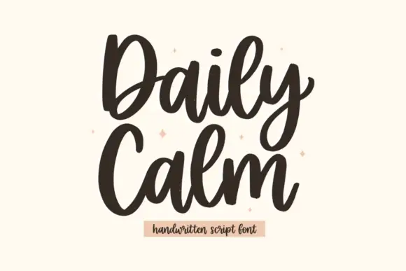
Tall rounded script with heavy entries and a stacked two-line rhythm
Daily Calm is a tall rounded script with heavy entries and light exits, drawn so two stacked words share the same width and read as a single column of movement.
Ideas for this font
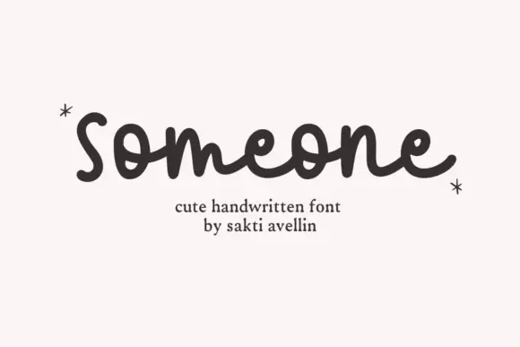
Rounded monoline-style script
Someone is a rounded monoline script in dark brown on white: fat even strokes, round bowls, a lowercase s that opens with a curl and a final e whose exit loops back over the word.

Tall connected script with a long y descender and open round bowls
Hello Honey is a tall connected script in which the ascenders rise high, the bowls stay round and the y drops a descender that runs far below the line before curling away.
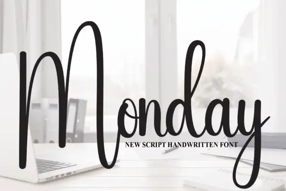
Tall script with an oversized narrow M
Monday is a tall script in black over a photograph of a desk: a very tall narrow capital M drawn as two long strokes with a shallow valley between, a compact connected body and a y whose descender curls below the word.
Ideas for this font
Same independent foundry
Allow optional Google Analytics to measure visits and catalogue actions. Your search words and notes are not included. Privacy & storage