Editorial Serif Anchor

Beauty Story + Augler
Anchors Beauty Story's fluid strokes with crisp Roman proportions on wedding suites, headers and packaging.
Inspect Augler specimenDisclosure: MakerFileHub may earn a commission from qualifying purchases via paid links on this page. How our links work.
Thin contrast script on a dark ground
Beauty Story is a light script whose two words sit on one line with a clear thick-thin contrast, drawn thin enough that on the charcoal sample the lettering reads as white thread.
Paid link
Get this fontProject & layout blueprintsAt-a-glance maker compatibility
Weld or Unite overlapping script joins into one continuous vector path before sending to the blade.
Visual anatomy & craft review
The capital B opens with a large round bowl and a swash that lifts away from it, and the S of the second word turns with a wide curve that carries the eye into the rest of the word. Downstrokes are noticeably heavier than the joins, and the joins themselves are short, so the two words stay separate rather than running together as one signature. Ascenders in the t and y reach well above the x-height and the descender of the y finishes in a thin point, which is the detail the dark ground flatters: the thin parts are what the contrast shows. The small paragraph of body copy under the script, the tracked line above and the studio credit at the foot are all part of the cover, and the paragraph is listing text rather than part of the typeface.
Romantic · Light · Contrasted
Two-font hierarchy recipes
Tested contrast partners — pairing Beauty Story with grounded secondary typography.
Beauty Story + Augler
Anchors Beauty Story's fluid strokes with crisp Roman proportions on wedding suites, headers and packaging.
Inspect Augler specimen
Beauty Story + Bielchon
Keeps small-scale dates, URLs, nutrition facts and care instructions crisp and legible below script titles.
Inspect Bielchon specimenPractical applications
Concrete hierarchy, scale and production guidance tailored to Beauty Story’s stroke geometry.
A contrasted script reads as premium at small sizes because the eye registers the heavy downstrokes first, which is what a narrow cosmetic label needs where there is no room for a second graphic.
Hierarchy & layout recipe
Keep the name at 12 pt on a 50 mm label, set the variant in a tracked sans at 6 pt beneath, and leave 5 mm at the right so the closing swash of the second word is not cut by the die.
Pre-production check
On a matte label stock the hairlines can fill; ask for the proof on the finished material, since a flat laser print will flatter a contrast that the press may lose.
A thin contrasted script on a dark cover reads formally from a distance and stays legible in the low light of a ceremony, which a pale, low-contrast script would not.
Hierarchy & layout recipe
Set the names at 26 pt in white on a charcoal programme, keep the order of service inside in a light serif at 9 pt, and hold 15 mm between the lowest descender and the first printed line beneath.
Pre-production check
Reverse-out hairlines can fill with ink on uncoated paper; proof the cover once on the actual stock and widen the joins if they close up.
A contrasted script picks up the white of a reversed headline and gives a dark opener a second voice that is decorative without being loud, which is hard to achieve with a second sans.
Hierarchy & layout recipe
Run the title at 48 pt in white on the reversed page, set the standfirst at 10 pt in a light serif two lines below, and keep the thin joins from sitting over any photographic detail in the background.
Pre-production check
Thin white strokes over a busy photograph vanish at the crossing points; test the opener with the final image rather than on a flat black proof.
Technical & licence verification
Confirm included OTF/TTF/WOFF formats, full glyph tables and licence coverage on the live store page before batch production.
Closest visual alternatives
Matched across letterform anatomy, stroke behaviour and craft applications.

Bouncing tail script with long entry and exit swashes
Farmhouse is a bouncing tail script in which the letters sit at different heights, the strokes swell on the downstroke and long swashes enter and leave the word, so a name reads as hand lettering on a painted board.
Ideas for this font
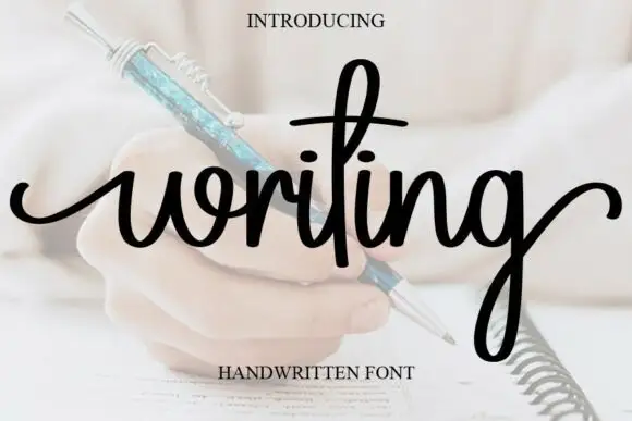
Looped handwriting with a tall ascender
Writing is a looped handwriting in black over a pale photograph of a hand with a pen: tall loops on the ascenders, small open bowls and a light even stroke, with a deep descender on the g.
Ideas for this font
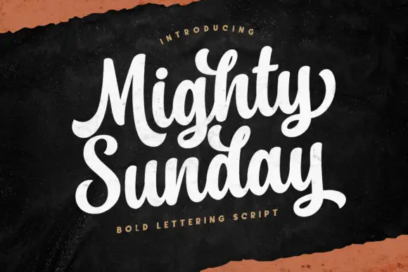
Bold lettering script with heavy looping capitals and a tight stacked fit
Mighty Sunday is a bold lettering script in which the capitals loop heavily, the strokes stay fat through the joins and two stacked words lock together into a single block.
Ideas for this font
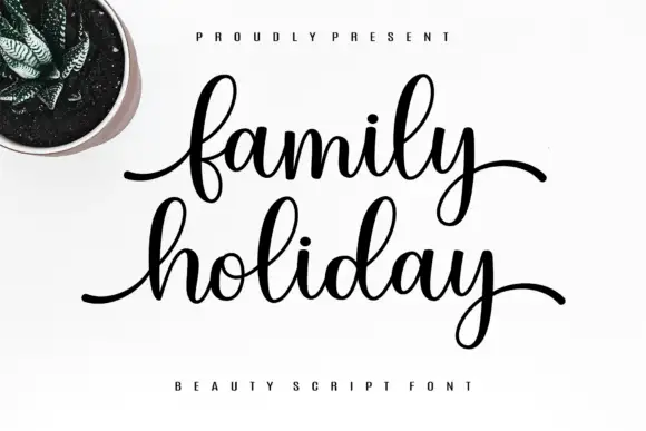
Fine script with long horizontal entry and exit strokes on a level baseline
Family Holiday is a fine script whose words begin and end with long horizontal strokes, so two stacked lines read as a pair of calm, level bars rather than a sloped signature.
Ideas for this font
Same independent foundry
Allow optional Google Analytics to measure visits and catalogue actions. Your search words and notes are not included. Privacy & storage