Editorial Serif Anchor

Writing + Grandeur – Elegant Classic Serif
Anchors Writing's fluid strokes with crisp Roman proportions on wedding suites, headers and packaging.
Inspect Grandeur – Elegant Classic Serif specimenDisclosure: MakerFileHub may earn a commission from qualifying purchases via paid links on this page. How our links work.
Looped handwriting with a tall ascender
Writing is a looped handwriting in black over a pale photograph of a hand with a pen: tall loops on the ascenders, small open bowls and a light even stroke, with a deep descender on the g.
Paid link
Get this fontProject & layout blueprintsAt-a-glance maker compatibility
Weld or Unite overlapping script joins into one continuous vector path before sending to the blade.
Visual anatomy & craft review
writing is set lowercase across the card, and the lettering is a looped handwriting rather than a calligraphy: the w is four even strokes, the r is reduced to a stem with a short shoulder, the i is dotted, the t lifts into a tall loop with a high crossbar and the g drops into a deep loop that swings back. The strokes are light and even, the joins between letters lift off the baseline, and the whole word reads as written quickly with a fine pen. The ground is a pale photograph of a hand writing in a notebook, so the lettering sits over the act it describes, and one caption at the top and one at the foot frame it. The face is a handwriting for stationery, letterheads and journal covers: it needs a generous size for the fine loops, it prints best in one dark ink, and it wants a wide measure because the word is long.
A looped handwriting over a notebook
Two-font hierarchy recipes
Tested contrast partners — pairing Writing with grounded secondary typography.
Writing + Grandeur – Elegant Classic Serif
Anchors Writing's fluid strokes with crisp Roman proportions on wedding suites, headers and packaging.
Inspect Grandeur – Elegant Classic Serif specimen
Writing + Cultivo
Keeps small-scale dates, URLs, nutrition facts and care instructions crisp and legible below script titles.
Inspect Cultivo specimenPractical applications
Concrete hierarchy, scale and production guidance tailored to Writing’s stroke geometry.
A looped hand signals a feature about writing before the title is read, and the fine stroke lets a photograph remain visible behind it.
Hierarchy & layout recipe
Print a 230 by 300 mm opener: set the title at 80 pt on one row, keep 26 mm of clear ground beneath before the standfirst at 11 pt, and hold 22 mm of margin at both sides.
Pre-production check
Fine loops over a photograph can disappear; print one opener and check every stroke against the image before the issue.
A handwriting reads as a personal note rather than an invitation, which suits a small ceremony built around a written message.
Hierarchy & layout recipe
Print a 130 by 180 mm card: set the greeting at 26 pt on one row, keep 18 mm of clear ground beneath before the details at 9 pt, and hold 15 mm of margin on all sides.
Pre-production check
The deep descender on the g needs room above the detail line; print one card at the finished size and check the clearance before the set.
A handwriting cover turns a plain notebook into an object, and one ink on a kraft board is a realistic print for a small run.
Hierarchy & layout recipe
Print a 148 by 210 mm cover: set the word at 60 pt on one row, keep 20 mm of clear ground beneath before the brand line at 10 pt, and hold 16 mm of margin on all sides.
Pre-production check
Fine strokes on a textured board can break; print one cover on the actual stock and check the loops before the run.
Technical & licence verification
Confirm included OTF/TTF/WOFF formats, full glyph tables and licence coverage on the live store page before batch production.
Closest visual alternatives
Matched across letterform anatomy, stroke behaviour and craft applications.
Display
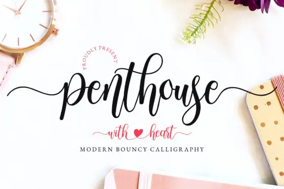
Penthouse is a modern bouncy calligraphy script: tall loops, thick downstrokes and a baseline that rises and falls, with a swash tail and a heart drawn between the words.
Ideas for this font
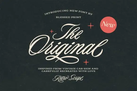
Slanted retro car-sign script
The Original Script is a slanted retro script in cream on near-black: fat even strokes, a strong forward lean, wide open loops on the O and the g, and a long thin underline that runs beneath the whole word.
Ideas for this font
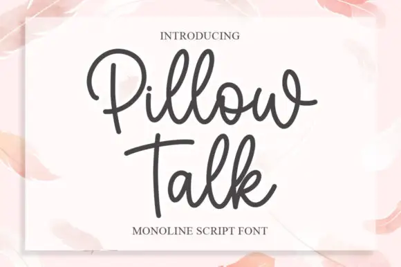
Monoline script with plump rounded bowls
Pillow Talk is a monoline script in charcoal on a soft pink page: plump rounded bowls, a single even stroke, looped ascenders and a tight fit, printed on a white card that sits on a watercolour ground.
Ideas for this font

Bouncing tail script with long entry and exit swashes
Farmhouse is a bouncing tail script in which the letters sit at different heights, the strokes swell on the downstroke and long swashes enter and leave the word, so a name reads as hand lettering on a painted board.
Ideas for this font
Same independent foundry
Allow optional Google Analytics to measure visits and catalogue actions. Your search words and notes are not included. Privacy & storage