Editorial Serif Anchor

Chunky Retro + Medvilea Editorial
Anchors Chunky Retro's fluid strokes with crisp Roman proportions on wedding suites, headers and packaging.
Inspect Medvilea Editorial specimenDisclosure: MakerFileHub may earn a commission from qualifying purchases via paid links on this page. How our links work.
Heavy retro script with fat curled terminals and tight connected loops
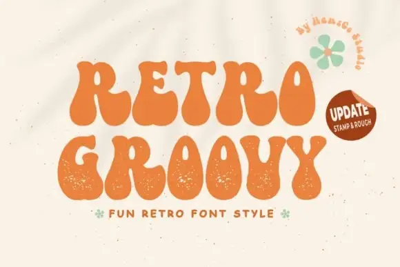
Chunky Retro is a heavy script in which the strokes stay thick through every join, the loops close tight and the terminals curl into fat hooks that read as seventies packaging.
Paid link
Get this fontProject & layout blueprintsAt-a-glance maker compatibility
Weld or Unite overlapping script joins into one continuous vector path before sending to the blade.
Visual anatomy & craft review
The capital C opens as a broad curled bowl and the rest of the word keeps the same load: the h rises into a fat loop, the u holds two swollen stems, the n keeps a round shoulder and the k splays with a curled arm. Weight never thins at the joins, which is what makes the word read as one continuous painted ribbon, and the tight loops give the face its period look. The terminals are the signature: the first and last letters finish in heavy hooks that curl back toward the word, so a short phrase holds a wide format on its own. Counters close up below 24 pt, so the face wants display sizes on print and 40 mm minimum on a garment. The mustard ground, the concentric rings, the cream and yellow inks, the sparkles and the small credit are presentation; the script is the two words.
Heavy · Curled · Retro
Two-font hierarchy recipes
Tested contrast partners — pairing Chunky Retro with grounded secondary typography.
Chunky Retro + Medvilea Editorial
Anchors Chunky Retro's fluid strokes with crisp Roman proportions on wedding suites, headers and packaging.
Inspect Medvilea Editorial specimen
Chunky Retro + One More
Keeps small-scale dates, URLs, nutrition facts and care instructions crisp and legible below script titles.
Inspect One More specimenPractical applications
Concrete hierarchy, scale and production guidance tailored to Chunky Retro’s stroke geometry.
The thick ribbon of connected letters carries a cover at 80 pt, and the curled terminals give the title a period voice without extra artwork.
Hierarchy & layout recipe
Print an A4 cover: set the title at 80 pt across the middle, set the standfirst in a 12 pt sans beneath, and keep 18 mm of margin so the heavy hooks stay inside the trim.
Pre-production check
A heavy script at 80 pt can close its loops on a matte stock; check the proof and open the tightest join rather than reducing the weight.
The curled terminals fill a wide sign at 10 cm and read across a room, which is what a themed celebration needs from its entrance.
Hierarchy & layout recipe
Print a 900 by 600 mm board: set the greeting at 10 cm across the upper half, set the date in a 3.5 cm caps sans beneath, and leave 10 cm of border so the hooks are not cropped by the frame.
Pre-production check
A heavy script printed on a glossy board catches light and loses the join detail; check the board under the room lighting and choose a matte finish.
The retro weight gives a bottle label a period character, and the thick strokes stay visible at 13 pt on a curved surface where a thin script would vanish.
Hierarchy & layout recipe
Print a 60 by 90 mm label: set the drink name at 13 pt, set the volume in a 5 pt caps sans at the foot, and keep 7 mm of margin so the curled terminal is not wrapped around the bottle curve.
Pre-production check
A curved label compresses the outer letters of a heavy script; check a labelled bottle and keep the word short enough to sit on the flat of the label.
Technical & licence verification
Confirm included OTF/TTF/WOFF formats, full glyph tables and licence coverage on the live store page before batch production.
Closest visual alternatives
Matched across letterform anatomy, stroke behaviour and craft applications.
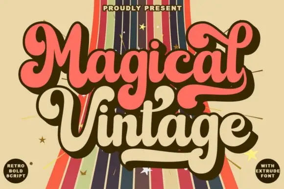
Fat retro script with extrusion
Magical Vintage is a fat retro script in salmon and cream on a striped ground: heavy connected strokes, large loops, an inline highlight and a hard extrusion behind each letter, with two round badges at the corners, so the pair reads as a seventies poster title.
Ideas for this font
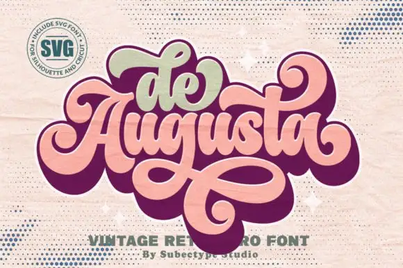
Ornate retro script with heavy joins and broad returning loops
De Augusta is an ornate retro script in which the letters stay heavy and connected, the entry strokes curl wide and a long loop leaves the word, passes beneath it and returns across, so a short name reads as a seventies badge.
Ideas for this font

Bouncing tail script with long entry and exit swashes
Farmhouse is a bouncing tail script in which the letters sit at different heights, the strokes swell on the downstroke and long swashes enter and leave the word, so a name reads as hand lettering on a painted board.
Ideas for this font
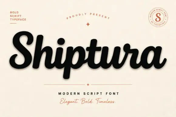
Bold connected script with a slight slant
Shiptura is a bold modern script in black with a soft shadow on cream: thick connected letters with rounded bowls, a slight rightward slant, blunt entry strokes and a small tail on the final letter, presented between two tracked capital lines and a round badge.
Ideas for this font
Same independent foundry
Allow optional Google Analytics to measure visits and catalogue actions. Your search words and notes are not included. Privacy & storage