Neutral Sans Workhorse

Autism + Memoir Slang
Lets Autism own the focal silhouette while handling secondary copy, sizing and subheads cleanly.
Inspect Memoir Slang specimenDisclosure: MakerFileHub may earn a commission from qualifying purchases via paid links on this page. How our links work.
Heavy capitals filled with a fine jigsaw pattern in alternating bright colours
Autism places large block capitals inside a white panel over pale puzzle imagery, where the A and M have angular outer silhouettes while the U and S curve broadly, and thin pale interlocking jigsaw outlines run through the coloured letter bodies to break up otherwise solid forms.
Paid link
Get this fontProject & layout blueprintsAt-a-glance maker compatibility
Sturdy stroke walls and open counters weed cleanly on adhesive vinyl, HTV apparel film, and cut cardstock.
Visual anatomy & craft review
The bodies stay heavy and squared, the outer contours mix angular and curved letters and the jigsaw lines cut pale paths through the fill. That internal outline is the character: the word reads as a printed sign with a drawn pattern rather than a textured face, which is why the sample sits in a bordered panel. The listed name is not evidence of accessibility or endorsement, so keep the wording factual and the imagery in context. Keep 44 pt so the puzzle lines stay visible and check the file for the pattern layer.
Heavy capitals filled with a fine jigsaw pattern in alternating bright colours
Two-font hierarchy recipes
Tested contrast partners — pairing Autism with grounded secondary typography.
Autism + Memoir Slang
Lets Autism own the focal silhouette while handling secondary copy, sizing and subheads cleanly.
Inspect Memoir Slang specimen
Autism + Glofi
Grounds bold display lettering with classic typographic authority on posters, badges and apparel.
Inspect Glofi specimenPractical applications
Concrete hierarchy, scale and production guidance tailored to Autism’s stroke geometry.
The blocky panel works as an event sign, and the jigsaw lines give the lettering a pattern without extra artwork on the sheet.
Hierarchy & layout recipe
Print a 600 by 300 mm panel: set the heading at 56 mm on one row, keep 22 mm of clear ground beneath before the dates at 15 pt, and keep 26 mm of border so the panel stays crisp.
Pre-production check
The listed name is not an endorsement; check the wording with the group you are working with.
The block letters suit a small charity stall tag, where the jigsaw pattern still reads at 45 mm and the message stays short.
Hierarchy & layout recipe
Print a 45 by 70 mm tag: set the name at 18 pt on one row, keep 9 mm of clear ground beneath before the charity number at 6 pt, and keep 6 mm to the punch hole.
Pre-production check
The jigsaw lines close under 16 pt; check the printed tag and hold the name at 18 pt or above.
The patterned blocks set a zine cover, and the bordered panel gives a small community publication a finished, structured look.
Hierarchy & layout recipe
Print an A5 cover: set the title at 40 pt on one row, keep 18 mm of clear ground beneath before the issue line at 9 pt, and keep 16 mm of margin at each side.
Pre-production check
Accessibility claims are not supported by a typeface; check the copy rather than the cover art.
Technical & licence verification
Confirm included OTF/TTF/WOFF formats, full glyph tables and licence coverage on the live store page before batch production.
Closest visual alternatives
Matched across letterform anatomy, stroke behaviour and craft applications.
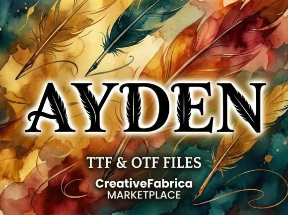
High-contrast serif capitals with thin feather-like cuts running through selected broad strokes
Ayden shows black serif capitals with pale feather-like lines inside their stems and diagonals, where a central quill-like line branches into short fine marks that appear in the broad strokes, and painted feathers, swirls and a pale glow fill the presentation around the letters.
Ideas for this font
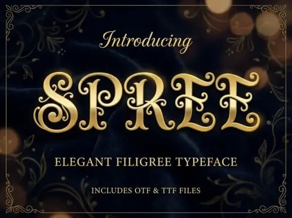
Filigree spiral display
Spree is an ornate display in gold on a dark bokeh ground: high-contrast capitals with long inward spirals, curled terminal extensions and fine filigree inside the bowls, set as one word between a script introducing line and two plain lines naming the style and the formats, all inside a fine ornamental frame.
Ideas for this font
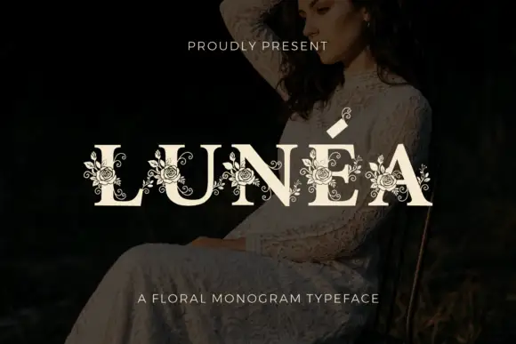
Floral monogram display
Lunéa is a floral monogram display in cream over a dark portrait: broad serif capitals with a fine accent, and fine roses, leaves and curled tendrils drawn over every letter, with a small sprig above the A and a tracked line beneath naming the style.
Ideas for this font
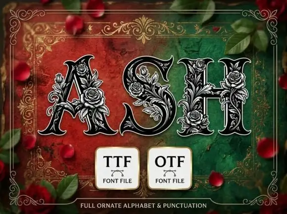
Heavy pointed serif capitals wrapped in dense fine rose and leaf outlines
Ash presents three dark capitals on a red-green field. Broad contrast strokes taper into sharp curled serifs, while pale outlined roses, leaves and tendrils climb around the A, fill parts of the S and bridge the H crossbar, with thin outer contours separating ornament from letter body.
Ideas for this font
Same independent foundry
Allow optional Google Analytics to measure visits and catalogue actions. Your search words and notes are not included. Privacy & storage