Modern Grotesque Body

Archives Classic + Cultivo
Creates crisp high-hierarchy contrast beneath Archives Classic headlines across menus, websites and labels.
Inspect Cultivo specimenDisclosure: MakerFileHub may earn a commission from qualifying purchases via paid links on this page. How our links work.
Very light condensed capitals with small feet and rounded rectangular bowls
Archives Classic sets pale cream capitals across a grey desert photograph, where long thin uprights and narrow rounded rectangular bowls make two rows airy despite the density of the letters, and small slab feet finish each stem.
Paid link
Get this fontProject & layout blueprintsAt-a-glance maker compatibility
Sturdy stroke walls and open counters weed cleanly on adhesive vinyl, HTV apparel film, and cut cardstock.
Visual anatomy & craft review
The stems stay long and thin, the bowls narrow into rounded rectangles, the feet stay small and the spacing opens. That airiness is the character: a long archive title fits a column without crowding, which is why the sample keeps two calm rows. Thin condensed type is hard to print, so keep 24 pt as the floor, print on coated stock and check the thin strokes against your own background rather than a photograph. The thin condensed stems are the first to break: they silt on uncoated stock and disappear under a heavy ink, so keep 24 pt as the floor and print on a coated sheet.
Very light condensed capitals with small feet and rounded rectangular bowls
Two-font hierarchy recipes
Tested contrast partners — pairing Archives Classic with grounded secondary typography.
Archives Classic + Cultivo
Creates crisp high-hierarchy contrast beneath Archives Classic headlines across menus, websites and labels.
Inspect Cultivo specimen
Archives Classic + Honey
Adds a warm human signature touch for 1-to-3-word callouts without competing against structured serif capitals.
Inspect Honey specimenPractical applications
Concrete hierarchy, scale and production guidance tailored to Archives Classic’s stroke geometry.
The condensed caps suit an index, and the thin uprights hold a long heading at 24 pt on a page, where the airy spacing keeps the row readable.
Hierarchy & layout recipe
Print a 210 mm page: set the heading at 24 pt on one row, keep 14 mm of clear ground beneath before the list at 9 pt, and keep the measure wide enough that the row does not stack awkwardly.
Pre-production check
Thin strokes on newsprint thicken noticeably; check the proof and choose a coated sheet before the run.
The light slabs give a studio restraint, and the narrow bowls hold a two-word name at 18 pt on a 60 by 40 mm label, where the small feet stay visible on matte paper.
Hierarchy & layout recipe
Print a 60 by 40 mm label: set the studio name at 18 pt on one row, keep 8 mm of clear ground beneath before the town at 6 pt, and keep the label pale so the thin strokes hold.
Pre-production check
Hairlines printed at 12 pt break on textured stock; check the plate proof and hold the name at 16 pt.
The airy caps suit a details card, and the narrow bowls hold a venue name at 16 pt on heavy stock, where the wide spacing keeps the card calm.
Hierarchy & layout recipe
Print a 105 by 148 mm details card: set the venue at 16 pt on one row, keep 10 mm of clear ground beneath before the address at 10 pt, and keep 16 mm of margin all round.
Pre-production check
A condensed title face is not built for dense records; check the size before setting paragraphs.
Technical & licence verification
Confirm included OTF/TTF/WOFF formats, full glyph tables and licence coverage on the live store page before batch production.
Closest visual alternatives
Matched across letterform anatomy, stroke behaviour and craft applications.
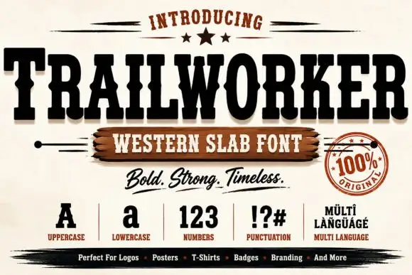
Heavy ornamental western display
Trailworker is a heavy western display in black on cream: very wide slabs with notched and inlaid strokes, spurred serifs, and a decorative centre notch on several letters, presented with a script tagline, a set of specimen glyphs and a round seal, so the sheet reads as a full western kit.
Ideas for this font
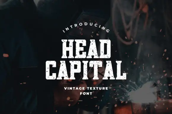
Condensed chamfered slab blocks with an irregular chipped texture
Head Capital is a condensed slab in which the blocks sit upright, the corners chamfer, the feet run broad and irregular chips erode the faces, so a short heading reads as stencilled onto workshop steel.
Ideas for this font
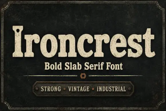
Heavy rounded mixed-case slabs with coarse worn fill and a pierced capital
Ironcrest shows cream mixed-case lettering against dark green-black, where the lowercase bowls stay thick and rounded, the r carries a curled shoulder, the t rises into a blunt wide crossbar and the capital I holds a small dark hole near its upper section while fine mottling roughens the fill.
Ideas for this font
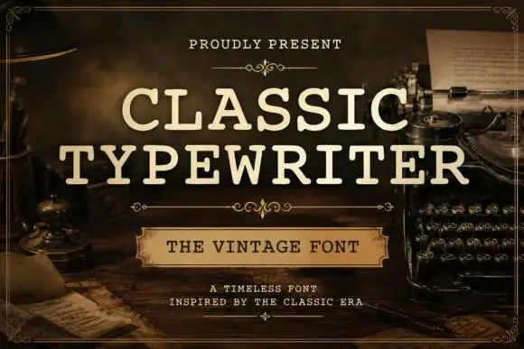
Even typed-looking capitals with rounded slab ends and open bowls
Classic Typewriter shows cream uppercase lettering in two lines over a dark writing-desk scene: the strokes stay comparatively even, the slab ends round off and the open C and P bowls leave generous white space inside the letters.
Same independent foundry
Allow optional Google Analytics to measure visits and catalogue actions. Your search words and notes are not included. Privacy & storage