Modern Grotesque Body

Aloha Chunky + Cultivo
Creates crisp high-hierarchy contrast beneath Aloha Chunky headlines across menus, websites and labels.
Inspect Cultivo specimenDisclosure: MakerFileHub may earn a commission from qualifying purchases via paid links on this page. How our links work.
Chunky rounded retro letters with intertwined low swashes
Aloha Chunky shows yellow-orange stacked lettering with brown outlines and offset dark edges, where broad rounded bodies, bulbous terminals and rolled entries make the words feel dense, the upper A keeps a triangular counter and the h and a finish in wide curls that collect beneath the lower line.
Paid link
Get this fontProject & layout blueprintsAt-a-glance maker compatibility
Sturdy stroke walls and open counters weed cleanly on adhesive vinyl, HTV apparel film, and cut cardstock.
Visual anatomy & craft review
The bodies stay broad, the terminals swell into rolls, the outlines thicken every form and one curl sweeps under the second word. That offset outline is the character: the lettering reads as a hand-painted sign with a shadow plate, which is why the flowers and rainbows stay around the block. The outline and the shadow are presentation treatments rather than proven layers. Keep 44 pt so the two contours stay separate and check your file for a separate outline style.
Chunky rounded retro letters with intertwined low swashes
Two-font hierarchy recipes
Tested contrast partners — pairing Aloha Chunky with grounded secondary typography.
Aloha Chunky + Cultivo
Creates crisp high-hierarchy contrast beneath Aloha Chunky headlines across menus, websites and labels.
Inspect Cultivo specimen
Aloha Chunky + Hello Honey
Adds a warm human signature touch for 1-to-3-word callouts without competing against structured serif capitals.
Inspect Hello Honey specimenPractical applications
Concrete hierarchy, scale and production guidance tailored to Aloha Chunky’s stroke geometry.
The chunky retro forms give a summer night a period poster look, and the two rows fill a wide format without extra artwork.
Hierarchy & layout recipe
Print an A2 poster: set the title at 92 pt across two rows with 24 mm between baselines, keep 28 mm of clear ground beneath for the lower curl, and keep 24 mm of border all round.
Pre-production check
The offset expands the block by 4 mm each side; check the artwork against the trim before printing.
The bulbous terminals give a celebration card warmth, and the stacked rows keep a short greeting inside one compact block.
Hierarchy & layout recipe
Print a 120 by 170 mm card: set the greeting at 40 pt across two rows, keep 20 mm of clear ground beneath for the curls, and keep 15 mm of margin at each side.
Pre-production check
The two contours merge under 30 pt; check the printed card and keep both rows at 34 pt or larger.
The rounded retro weight gives a cup label its period feel, and the outline keeps a short name legible on a pale ground.
Hierarchy & layout recipe
Print a 60 by 60 mm cup label: set the bar name at 22 pt on one row, keep 10 mm of clear ground beneath before the size at 6 pt, and keep 5 mm to the die edge.
Pre-production check
The flowers and stars are cover art; check the files before planning them beside the name.
Technical & licence verification
Confirm included OTF/TTF/WOFF formats, full glyph tables and licence coverage on the live store page before batch production.
Closest visual alternatives
Matched across letterform anatomy, stroke behaviour and craft applications.
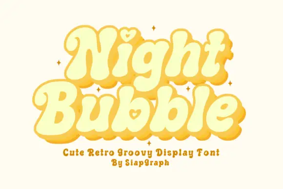
Soft retro bubble letters with hearts
Night Bubble is a soft retro display face in butter yellow: fat rounded letterforms, an offset pink shadow, and a small heart tucked into the counters of the N and the b.
Ideas for this font
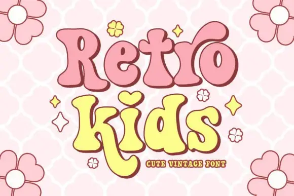
Soft retro letters with heart and long curved leg
Retro Kids uses rounded heavy serif-like forms with uneven widths, where the i takes a heart for its dot, the k drops a long curved leg under the row, the two words sit in pink and yellow with a thick outline and the cover fills the field with outlined daisies.
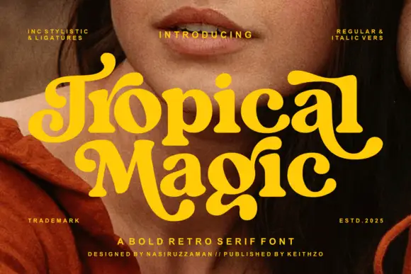
Heavy rounded retro serif
Tropical Magic is a heavy rounded retro serif in yellow over a portrait: fat stems with ball terminals, curled entries on the capitals, round bowls and a swollen waist, set on two lines with tracked notes in the corners naming the italics and the alternates, and a credit along the foot.
Ideas for this font
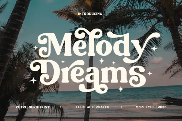
Retro serif with curled alternates
Melody Dreams is a retro serif in cream over a beach photograph: moderate contrast, rounded bracketed serifs, and heavy curls on the M and the D that turn into decorative terminals, with alternate glyphs that add stars, so the pair reads as a seventies album cover.
Ideas for this font
Same independent foundry
Allow optional Google Analytics to measure visits and catalogue actions. Your search words and notes are not included. Privacy & storage



