High-Contrast Display Serif

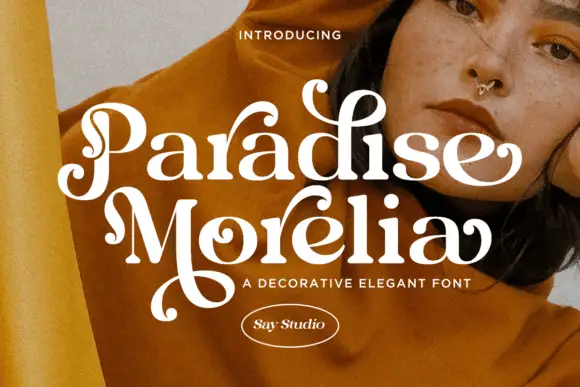
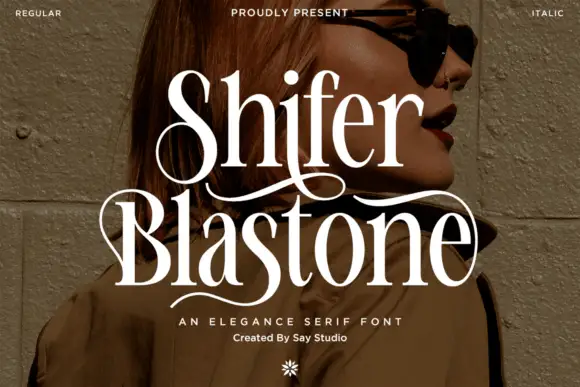
Pilova + Amor Hadena
Pairs sculptural editorial warmth with Pilova's clean modern geometry.
Inspect Amor Hadena specimenDisclosure: MakerFileHub may earn a commission from qualifying purchases via paid links on this page. How our links work.
Bold rounded geometric display
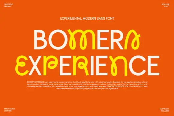
Pilova is a bold display sans in yellow on near-black: very wide rounded letters with almost circular counters, a short waist, and a dot on the i that sits clear of the stem, presented with small technical notes in the corners, so the plate reads as a contemporary display release.
Paid link
Get this fontProject & layout blueprintsAt-a-glance maker compatibility
Sturdy stroke walls and open counters weed cleanly on adhesive vinyl, HTV apparel film, and cut cardstock.
Visual anatomy & craft review
The word is set once across the plate and the drawing is a geometric sans at heavy weight: the counters are close to circles, the terminals are rounded rather than flat, and the waist on the letters is short, which gives the word its soft, bubble-like feel without becoming a novelty face. The width is generous, so the word fills the frame at a size where the geometry is visible, and the spacing is even enough that the letters read separately despite the weight. Because the strokes are heavy and the counters round, the face holds at label size as well as at poster size. The ground is a flat near-black, the word is a single yellow, and four small tracked notes in the corners document the family without adding a second voice.
Rounded, bold, geometric, friendly
Two-font hierarchy recipes
Tested contrast partners — pairing Pilova with grounded secondary typography.
Pilova + Amor Hadena
Pairs sculptural editorial warmth with Pilova's clean modern geometry.
Inspect Amor Hadena specimen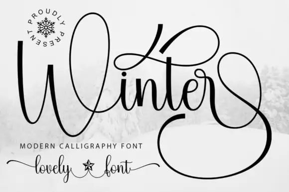
Pilova + Winter
Introduces organic movement on pull-quotes, signatures and gift tags.
Inspect Winter specimenPractical applications
Concrete hierarchy, scale and production guidance tailored to Pilova’s stroke geometry.
A rounded geometric mark reads as friendly and modern, and the heavy even strokes survive being printed small on a bottle cap or stamped on a paper cup.
Hierarchy & layout recipe
Set the mark at 26 pt on a carton, 12 pt on a cap and 8 pt on a cup, opening the tracking below 14 pt. Keep one colour and hold clear space equal to the counter of the o on every side.
Pre-production check
Check the 8 pt cup mark, where the round counters can fill on a curved surface; keep the size above 7 pt. Confirm the carton mark reads on a shelf and that the ink holds on a coated board.
A rounded display reads as celebratory rather than corporate, and the heavy strokes stay legible at banner distance where a lighter face would thin out.
Hierarchy & layout recipe
Print 800 by 400 mm: the name at 130 mm cap height, the age in a 45 mm rounded sans, and a 5 mm border. Keep 25 mm margins and print two colours on a pale ground so the rounded counters stay open.
Pre-production check
Check the banner at four metres, where the rounded terminals can blur; keep the print clean. Confirm the 45 mm age reads at three metres and that the border clears the eyelets.
A rounded geometric face reads at a bar counter and looks contemporary against timber, and the heavy strokes survive being cut in vinyl for a temporary sign.
Hierarchy & layout recipe
Cut a 900 by 300 mm panel: the bar name at 130 mm cap height, the prices in a 26 mm sans, and a 6 mm rule. Keep 30 mm margins and cut in one colour so the rounded forms stay smooth.
Pre-production check
Check the vinyl at 130 mm, where a curve under 6 mm radius lifts; simplify the tightest curves. Confirm the 26 mm prices read at four metres and that the panel sits flat on a temporary frame.
Technical & licence verification
Confirm included OTF/TTF/WOFF formats, full glyph tables and licence coverage on the live store page before batch production.
Closest visual alternatives
Matched across letterform anatomy, stroke behaviour and craft applications.
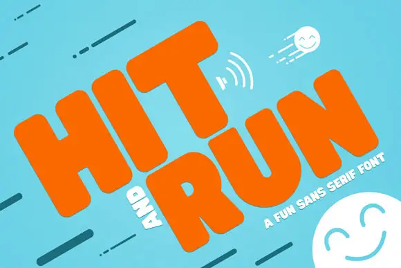
Heavy rounded capitals with soft block bodies and a tiny compact R opening
Hit and Run tilts orange uppercase words across turquoise, where thick soft-edged H and I stems sit beside a broad T crossbar and the R carries a small rounded counter with a substantial leg, while motion marks and smiling faces fill the cover around the words.
Ideas for this font

Heavy round lowercase forms with a long K leg and deep j hook
Kohilo shows pale yellow heavy lettering against vivid red, where the dotted descending letter appears in a brighter yellow, the opening K sends a broad curved leg beneath the first round bowl and the central descender turns into a deep rounded hook.
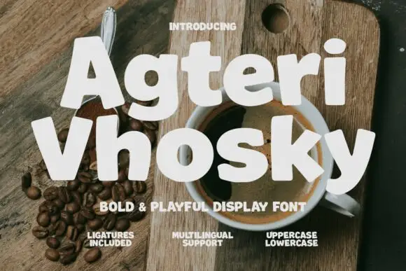
Heavy informal mixed case with tilted bodies and small round counters
Agteri Vhosky shows white mixed-case words over a coffee photograph, where heavy near-even strokes and softly irregular outlines create broad rounded bodies, a small triangular A counter and a lower y that descends into a wide curve.
Ideas for this font
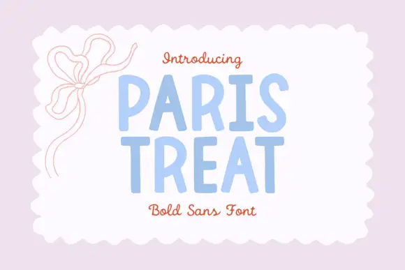
Irregular handmade capital sans
Paris Treat is a handmade capital sans in powder blue inside a scalloped white card on a pale pink ground: upright capitals with slightly irregular edges, modest variations in width and soft corners, with a drawn bow at the upper left and two lines of a serving script at the top and the foot.
Ideas for this font
Same independent foundry
Allow optional Google Analytics to measure visits and catalogue actions. Your search words and notes are not included. Privacy & storage