High-Contrast Display Serif

Designer + Alerigue
Pairs sculptural editorial warmth with Designer's clean modern geometry.
Inspect Alerigue specimenDisclosure: MakerFileHub may earn a commission from qualifying purchases via paid links on this page. How our links work.
Forward-sloping squared lowercase with broad horizontal cuts and rounded corners
Designer shows pale slanted lettering inside a thin teal frame on charcoal, where the bowls are broad and squared, the e opens along a long horizontal cut, the g drops below the baseline and a small New tab sits above the frame.
Paid link
Get this fontProject & layout blueprintsAt-a-glance maker compatibility
Sturdy stroke walls and open counters weed cleanly on adhesive vinyl, HTV apparel film, and cut cardstock.
Visual anatomy & craft review
The lowercase leans forward, the bowls square off with soft corners, the horizontals run long and the descender hangs clear. That forward lean is the character: a plain word gains motion without turning into a script, which is why the sample keeps one slanted word inside a frame. The frame and tab are composition elements, and one word proves no numerals or punctuation, so test the actual character set and keep 26 pt before the squared corners soften. The squared corners are the detail that softens: below 26 pt they round back into a plain lowercase and the lean is all that remains, so keep 26 pt and test the character set first.
Slanted · Squared bowls · Rounded corners
Two-font hierarchy recipes
Tested contrast partners — pairing Designer with grounded secondary typography.
Designer + Alerigue
Pairs sculptural editorial warmth with Designer's clean modern geometry.
Inspect Alerigue specimen
Designer + Honey and Lemon
Introduces organic movement on pull-quotes, signatures and gift tags.
Inspect Honey and Lemon specimenPractical applications
Concrete hierarchy, scale and production guidance tailored to Designer’s stroke geometry.
The slanted lowercase gives a studio momentum, and the squared bowls hold a one-word name at 26 pt on a card in one ink.
Hierarchy & layout recipe
Print an 85 by 55 mm card: set the wordmark at 26 pt on one row, keep 14 mm of clear ground at the right so the lean does not crowd the border, and set the contact line at 7 pt beneath.
Pre-production check
A forward lean set at 18 pt looks like a misregistration; check the proof and keep the wordmark at 24 pt or above.
The squared slanted letters suit a lab door, and the broad bowls hold a short sign at 44 pt on a printed sheet, where the lean still reads at corridor distance.
Hierarchy & layout recipe
Print an A4 sign: set the sign at 44 pt on one row, keep 18 mm of clear ground beneath before the room number at 13 pt, and keep 18 mm of margin so the descender is not trimmed.
Pre-production check
The descending g cut by the border reads as a fault; check the artwork and keep 8 mm of clear space below.
The slanted word sets a short standfirst, and the horizontal cuts keep a phrase readable at 30 pt across a page, where the lean gives the line motion without a second face.
Hierarchy & layout recipe
Print a 210 mm page: set the standfirst at 30 pt on one row beneath the headline, keep 14 mm of clear ground above and below, and keep the block inside the column so the lean stays parallel to the type.
Pre-production check
A slanted line beside justified body text looks accidental; check the page and keep the standfirst ranged left.
Technical & licence verification
Confirm included OTF/TTF/WOFF formats, full glyph tables and licence coverage on the live store page before batch production.
Closest visual alternatives
Matched across letterform anatomy, stroke behaviour and craft applications.

Light contrast capital sans
Mansory is a light contrast sans in black on cream, shown small against a sunlit venetian blind: wide capitals with a broad circular O, fine diagonal joins and hairline uprights, with a small serif line beneath and an italic credit under that.
Ideas for this font

Geometric cut-out display sans
Borsen sets a wide geometric wordmark in white over a dark car photograph, where the letters run broad and even, horizontal cuts open parts of the E and N while broad strokes hold the line together, and the whole name sits as one long block above a small credit line.
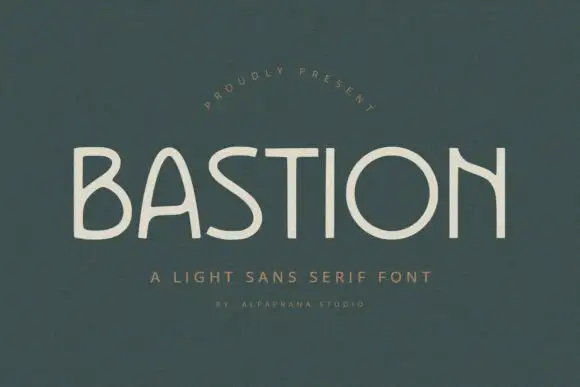
Light uneven capitals with an arched A and a curved high N diagonal
Bastion shows pale capitals on muted green, where the B carries two broad irregular bowls, the A rises into a rounded narrow arch and the O closes as a wide near-circle while the N replaces a rigid diagonal with a high bowed connector.
Ideas for this font
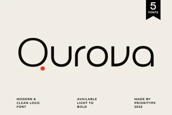
Rounded geometric logotype family
Qurova is a rounded geometric sans in near-black on cream: mixed case with a wide open Q circle, a separate red dot set below the tail, broad arches and an even stroke, with a small format note, a weight range and a credit spread along the foot.
Ideas for this font
Same independent foundry
Allow optional Google Analytics to measure visits and catalogue actions. Your search words and notes are not included. Privacy & storage