Neutral Sans Workhorse

Oldink + Modern Heritage
Lets Oldink own the focal silhouette while handling secondary copy, sizing and subheads cleanly.
Inspect Modern Heritage specimenDisclosure: MakerFileHub may earn a commission from qualifying purchases via paid links on this page. How our links work.
Heavy blackletter display
Oldink is a heavy blackletter in oxblood on aged parchment: mixed case with a divided O, uneven pointed terminals, dense stems and sharp spurs, set in two lines above and below a small serif line, all framed by drawn marginalia — a castle, comets and star charts — with a paragraph of description along the foot.
Paid link
Get this fontProject & layout blueprintsAt-a-glance maker compatibility
Fine grain and micro-texture excel in 300 DPI print, sublimation, and screen print rather than small vinyl weeding.
Visual anatomy & craft review
The plate is a manuscript rather than a specimen, and the marginalia carries as much of the impression as the letters: the castle, the comets and the star charts frame the two words so the set reads as a page from a book of hours. The drawing is a heavy blackletter with a divided O and uneven pointed terminals, which is denser and less regular than a modern gothic, and the mixed case means the face can set a phrase rather than a word. That construction sets a moderate size floor, because the fine spurs close when the letters shrink. The description along the foot is product copy that names the sources honestly. It suits a poster, a book cover and a themed bar sign.
Decorative, blackletter, medieval, heavy
Two-font hierarchy recipes
Tested contrast partners — pairing Oldink with grounded secondary typography.
Oldink + Modern Heritage
Lets Oldink own the focal silhouette while handling secondary copy, sizing and subheads cleanly.
Inspect Modern Heritage specimen
Oldink + Kernova
Grounds bold display lettering with classic typographic authority on posters, badges and apparel.
Inspect Kernova specimenPractical applications
Concrete hierarchy, scale and production guidance tailored to Oldink’s stroke geometry.
A heavy blackletter sets a period evening in two lines, and the dense stems read across a dim room where a fine gothic would vanish.
Hierarchy & layout recipe
A2 poster: the event at 95 mm cap height, the details in a 14 mm serif, and the venue at 11 mm. Keep 32 mm margins and print one colour on a dark stock with the type reversed out.
Pre-production check
Check the A2 at five metres, where a fine spur can vanish; keep it above 2 mm. Confirm the 11 mm venue reads at two metres and that the marginalia do not compete with the title.
A blackletter frames a period novel as a manuscript page, and the divided O gives the title a detail that a plain gothic cannot offer.
Hierarchy & layout recipe
Set the title at 80 mm cap height across 180 mm, the author in a 12 pt serif, and the imprint at 8 pt. Print two colours on a textured stock and keep 22 mm margins at the head.
Pre-production check
Check the title at 80 mm, where a spur can clot on a rough sheet; specify a smooth stock. Confirm the 8 pt imprint survives lamination and that the title clears the trim by 12 mm.
A blackletter mark signals a venue's character before a customer reads the sign, and the dense strokes hold on a dark window in vinyl.
Hierarchy & layout recipe
Cut 900 by 320 mm vinyl: the name at 100 mm cap height, the line in a 20 mm serif, and a 4 mm contour. Keep 25 mm margins and apply the film to a clean pane at night so bubbles show.
Pre-production check
Check the cut at 100 mm, where a 4 mm spur can tear on weeding; widen it to 6 mm. Confirm the 20 mm line reads at two metres and that the spurs clear the door frame.
Technical & licence verification
Confirm included OTF/TTF/WOFF formats, full glyph tables and licence coverage on the live store page before batch production.
Closest visual alternatives
Matched across letterform anatomy, stroke behaviour and craft applications.
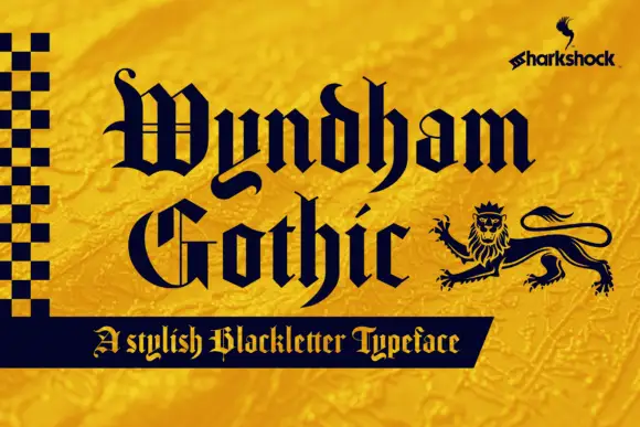
Structured blackletter with fine lines
Wyndham Gothic is a structured blackletter in navy on a gold ground: slim internal lines, long y and h tails, even shoulders and a small lion ornament at the right, set in two stacked words with a bordered strip beneath carrying a plain descriptor, and a small maker mark at the upper right.
Ideas for this font
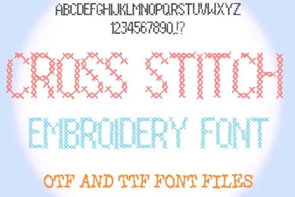
Narrow uppercase forms built from repeated small crossed-stitch-like marks
Cross Stitch Embroidery builds every letter from rows of X stitches on a regular grid, so a word looks like a finished sampler rather than a printed line of type.
Ideas for this font
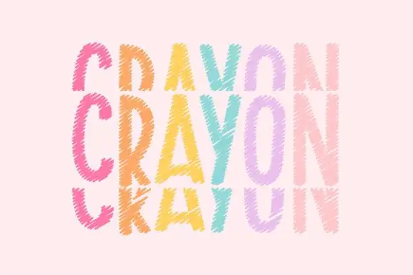
Tall crayon-textured capitals repeated in cropped upper and lower rows
Crayonfriends Stacked repeats the same tall word in three pastel rows on pale pink, where the middle row is complete while the rows above and below are cut by broad horizontal blank bands, and scratchy diagonal marks break both the coloured strokes and their edges.
Ideas for this font
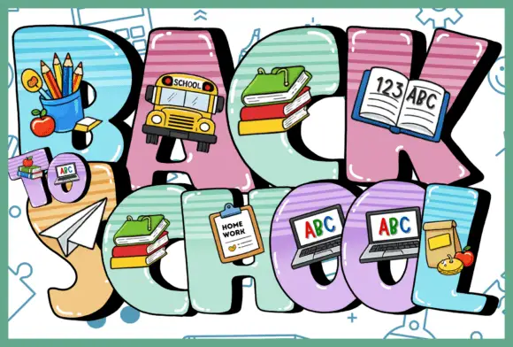
Large rounded capitals carrying school-object illustrations and striped surface panels
Back to School packs multicoloured capitals into three rows, where pencils, a school bus, stacked books, a notebook and computer screens overlap the broad letter bodies and striped panels fill parts of the strokes at varied angles.
Ideas for this font
Same independent foundry
Allow optional Google Analytics to measure visits and catalogue actions. Your search words and notes are not included. Privacy & storage