Neutral Sans Workhorse

Byrne + Modern Heritage
Lets Byrne own the focal silhouette while handling secondary copy, sizing and subheads cleanly.
Inspect Modern Heritage specimenDisclosure: MakerFileHub may earn a commission from qualifying purchases via paid links on this page. How our links work.
Jewelled serif capitals topped with ornate crown-like flourishes
Byrne builds each capital from a slab of engraved jewellery, the letter filled with filigree and cabochon colour and a small tiara rising from its top edge, so a five-letter word reads as five crowns in a row.
Paid link
Get this fontProject & layout blueprintsAt-a-glance maker compatibility
Sturdy stroke walls and open counters weed cleanly on adhesive vinyl, HTV apparel film, and cut cardstock.
Visual anatomy & craft review
The wordmark sits on purple embroidered velvet, and every letter holds a different jewel family: a blue B, a red Y, a green R, a violet N and a gold E, each outlined in gold with an arc of scrollwork above and small gems set into the shoulders. Interiors are packed with fine gold linework against a coloured field, so the letter survives as a silhouette only while the contrast holds. Captions describe an ornate tiara alphabet for luxury branding and the file list names OTF and TTF. This is cover art made of letters, and the ornament is dense enough that a long word at small size turns into a band of texture rather than a readable name.
Jewelled serif capitals topped with ornate crown-like flourishes
Two-font hierarchy recipes
Tested contrast partners — pairing Byrne with grounded secondary typography.
Byrne + Modern Heritage
Lets Byrne own the focal silhouette while handling secondary copy, sizing and subheads cleanly.
Inspect Modern Heritage specimen
Byrne + Augler
Grounds bold display lettering with classic typographic authority on posters, badges and apparel.
Inspect Augler specimenPractical applications
Concrete hierarchy, scale and production guidance tailored to Byrne’s stroke geometry.
Two jewelled initials carry the formality of a wedding suite on their own, and the tiara tops give a plain card a piece of ornament without another illustration.
Hierarchy & layout recipe
Print a 130 by 180 mm invitation: set the monogram at 54 pt on one row, keep 20 mm of clear ground beneath before the names at 14 pt, and keep 18 mm of margin from the card edge.
Pre-production check
The filigree needs foil or a coated stock; check the proof before committing a letterpress run of the suite.
A single jewelled letter reads as a luxury stamp on a small label, and the gem colours tie into the metal and stone the brand actually sells.
Hierarchy & layout recipe
Print a 50 by 90 mm hang tag: set the initial at 26 pt on one row, keep 10 mm of clear ground beneath before the product line at 6 pt, and keep 6 mm from the letter to the punch hole.
Pre-production check
Jewel colours are baked into the artwork; check the file layout before planning a one-colour letterpress tag.
The ornament is the story on a jewellery cover, and five large letters fill a masthead that a plain serif would leave thin.
Hierarchy & layout recipe
Print a 230 by 300 mm cover: set the title at 88 pt on one row, keep 24 mm of clear ground beneath before the standfirst at 12 pt, and keep 20 mm of margin so the crowns clear the trim.
Pre-production check
Fine gold linework fills in on uncoated paper; check a proof on the actual stock before the print run.
Technical & licence verification
Confirm included OTF/TTF/WOFF formats, full glyph tables and licence coverage on the live store page before batch production.
Closest visual alternatives
Matched across letterform anatomy, stroke behaviour and craft applications.
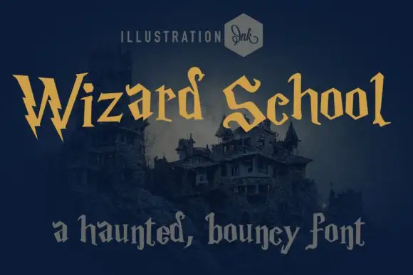
Whimsical gothic with spiky wobbly serifs
Wizard School is a whimsical gothic display in gold on a dark castle scene: letters built from wobbly stems with spiky serifs and uneven heights, with a second line set in a softer grey gothic beneath them.
Ideas for this font
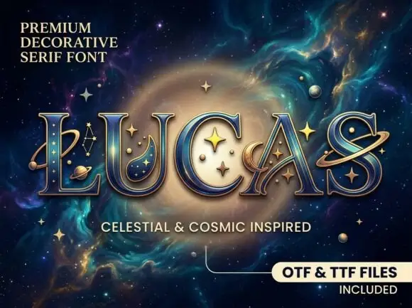
Celestial inset serif display
Lucas is a celestial display in gold and deep blue on a nebula: wide capitals with a serif structure, a fine inset contour, dimensional edging and inlaid planet and star ornaments inside the letters, with a small note at the upper left and a format note at the lower right.
Ideas for this font
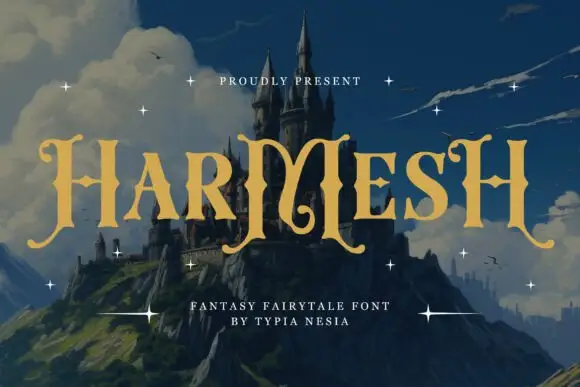
Angular fantasy capitals with hooked tops and curling feet
Harmesh shows gold-coloured capitals over a castle landscape, where tall stems end in pointed hooks and large curling feet, and the heavy H and M shapes use angular inner joins with broad triangular endings while small stars sit around the title.
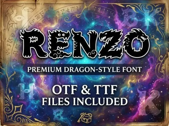
Dragon-style display
Renzo is a dragon-style display in black with a white outline on a purple nebula ground: heavy caps whose terminals and counters become dragon heads with eyes, teeth and scales, with spined edges along the strokes and pointed feet.
Ideas for this font
Same independent foundry
Allow optional Google Analytics to measure visits and catalogue actions. Your search words and notes are not included. Privacy & storage