Editorial Serif Anchor

Winter December Font + Lumera Editorial
Anchors Winter December Font's fluid strokes with crisp Roman proportions on wedding suites, headers and packaging.
Inspect Lumera Editorial specimenDisclosure: MakerFileHub may earn a commission from qualifying purchases via paid links on this page. How our links work.
Tall rounded winter lettering
Winter December is a tall rounded hand-lettering in near-black on a pale winter photograph: narrow letters, small counters and a slight warm wobble, with a letter-spaced caption in a boxed strip below.
Paid link
Get this fontProject & layout blueprintsAt-a-glance maker compatibility
Weld or Unite overlapping script joins into one continuous vector path before sending to the blade.
Visual anatomy & craft review
Winter sits above December in the same tall hand, and each letter is drawn with a rounded monoline: the W is a series of narrow Vs, the i and the n are compressed, the D of December opens into a large bowl and the b and the r are taller than the rest. The letters lean slightly and vary a little in weight, which keeps the two rows looking written rather than set, and the descender of the p drops below the line into the space above the caption. The ground is a pale photograph of snow-covered branches, and a boxed strip at the foot carries the style name in tracked capitals. The face is a seasonal hand for cards, tags and winter signage: it holds at small sizes because the strokes are even, and it works in one dark ink on a pale or a photographic ground.
A tall hand for winter signage
Two-font hierarchy recipes
Tested contrast partners — pairing Winter December Font with grounded secondary typography.
Winter December Font + Lumera Editorial
Anchors Winter December Font's fluid strokes with crisp Roman proportions on wedding suites, headers and packaging.
Inspect Lumera Editorial specimen
Winter December Font + Sailors
Keeps small-scale dates, URLs, nutrition facts and care instructions crisp and legible below script titles.
Inspect Sailors specimenPractical applications
Concrete hierarchy, scale and production guidance tailored to Winter December Font’s stroke geometry.
A tall narrow hand fits a long month on a small card, and one ink on a pale ground keeps a winter suite affordable for a date nobody plans far ahead.
Hierarchy & layout recipe
Print a 130 by 180 mm invitation: set the names at 26 pt on one row, keep 18 mm of clear ground beneath before the details at 9 pt, and hold 15 mm of margin on all sides.
Pre-production check
A pale ground and a dark hand can look grey in print; print one invitation on the intended stock and check the contrast before the suite.
The hand reads at stall distance without a second colour, and the tall proportions fit a long stall name on a narrow board.
Hierarchy & layout recipe
Print a 500 by 300 mm board: set the stall name at 80 pt across two rows, keep 22 mm of clear ground beneath before the prices at 16 pt, and hold 20 mm of border on all sides.
Pre-production check
Narrow letters at 80 pt can look squeezed; print one board at the final size and check the spacing before the set.
A tall hand fits a full name on a narrow tag, and the even weight reads at twelve points where a script would collapse into a smear.
Hierarchy & layout recipe
Print a 40 by 80 mm tag: set the greeting at 12 pt, set the name at 9 pt beneath with 5 mm of clear ground, and hold 4 mm from the lowest loop to the punch hole.
Pre-production check
A punch hole can clip a tall ascender; print one tag at the real size, punch it and check both rows before the order.
Technical & licence verification
Confirm included OTF/TTF/WOFF formats, full glyph tables and licence coverage on the live store page before batch production.
Closest visual alternatives
Matched across letterform anatomy, stroke behaviour and craft applications.
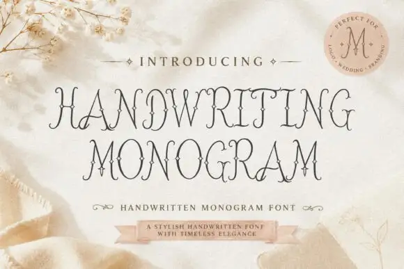
Fine ornamental monogram capitals with hairline flourishes
Handwriting Monogram is a fine ornamental alphabet in capitals only, built from hairline stems and small flourishes, with letters designed to interlock when two or three of them are set together.
Ideas for this font
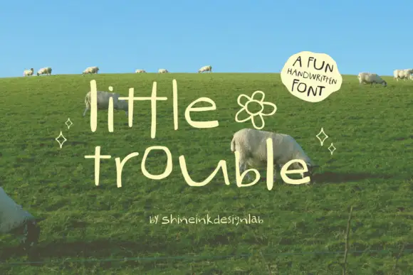
Thin quirky handwriting
Little Trouble is a thin handwritten face in cream over a green hillside: tall narrow lowercase letters with uneven heights, an open e and a hooked t, a drifting baseline, and a small drawn flower between the words, with a curved note in a soft shape at the upper right.
Ideas for this font
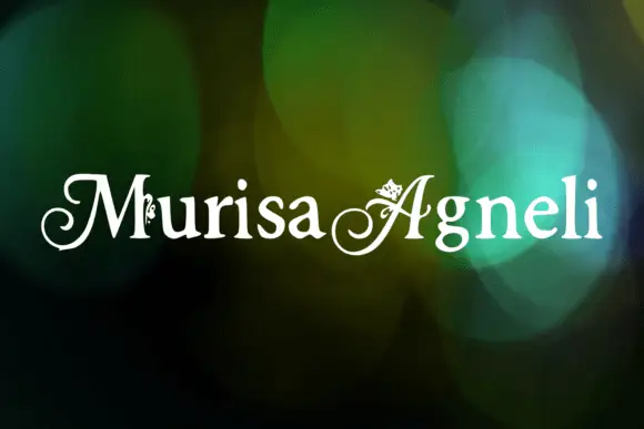
Decorative ornamented capitals
Murisa Agneli is a set of decorative serif capitals in white on a bokeh ground: high-contrast strokes, curled serifs, and small drawn ornaments set inside the counters of several letters.
Ideas for this font
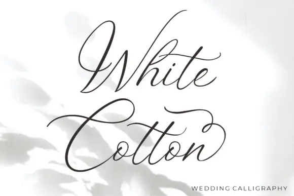
Fine sweeping wedding calligraphy
White Cotton is a fine wedding calligraphy in charcoal on white: hairline letters with heavy shades on the downstrokes, a capital W drawn as a wide sweep and a C whose crossbar runs the width of the word.
Ideas for this font
Same independent foundry
Allow optional Google Analytics to measure visits and catalogue actions. Your search words and notes are not included. Privacy & storage