Neutral Sans Workhorse

Wildrune + Corven
Lets Wildrune own the focal silhouette while handling secondary copy, sizing and subheads cleanly.
Inspect Corven specimenDisclosure: MakerFileHub may earn a commission from qualifying purchases via paid links on this page. How our links work.
Uneven chipped gothic
Wildrune is an uneven gothic in pale stone on a black cracked ground: broad curved bowls, chipped pointed terminals, varied stroke widths, set as one word between a fine fleur ornament above and a tracked descriptor beneath, with small cross ornaments at the sides.
Paid link
Get this fontProject & layout blueprintsAt-a-glance maker compatibility
Sturdy stroke walls and open counters weed cleanly on adhesive vinyl, HTV apparel film, and cut cardstock.
Visual anatomy & craft review
The plate is a dark specimen with a plain hierarchy, and the cracked ground is fine enough not to compete with the letters. The drawing is a gothic with broad curved bowls and chipped terminals, so the word reads as cut into stone rather than printed, and the uneven widths give it a hand-carved feel that a rigid gothic cannot produce. That construction sets a moderate size floor, because the chips and points close first. The fleur, the crosses and the descriptor are staging and product copy. It suits a cover, a poster and a label for a fantasy or a heritage subject, and it is one of the warmer gothic faces at a moderate size.
Decorative, gothic, chipped, rustic
Two-font hierarchy recipes
Tested contrast partners — pairing Wildrune with grounded secondary typography.
Wildrune + Corven
Lets Wildrune own the focal silhouette while handling secondary copy, sizing and subheads cleanly.
Inspect Corven specimen
Wildrune + Auretha
Grounds bold display lettering with classic typographic authority on posters, badges and apparel.
Inspect Auretha specimenPractical applications
Concrete hierarchy, scale and production guidance tailored to Wildrune’s stroke geometry.
A chipped gothic frames a fantasy cover, and the uneven widths give the title a carved quality without an illustration. It suits a fantasy series.
Hierarchy & layout recipe
Set the title at 85 mm cap height across 180 mm, the author in a 12 pt serif, and the imprint at 8 pt. Print two colours on a textured stock, keeping 20 mm margins and 0.3 mm as the finest stroke.
Pre-production check
Check the title at 85 mm, where a chip can clot; keep the counters open. Confirm the 8 pt imprint survives lamination and that the terminals clear the trim.
A chipped gothic reads as an old notice, and the pale stone colour holds on a dark poster seen from across a street. It reads as an old notice.
Hierarchy & layout recipe
A2 poster: the event at 100 mm cap height, the details in a 22 mm serif, and the venue at 11 mm. Keep 28 mm margins, print one colour on a dark stock and keep the strokes above 3 mm.
Pre-production check
Check the A2 at five metres, where a chip can vanish; keep the strokes above 3 mm. Confirm the 11 mm venue reads at two metres and that the ornaments clear the type.
A chipped label reads as a game title, and the uneven strokes hold over an illustrated box without a solid plate behind them.
Hierarchy & layout recipe
Print a 60 by 90 mm label: the title at 14 pt, the subtitle at 8 pt, and the edition at 7 pt. Keep 5 mm inside the die and keep the chips above 0.4 mm.
Pre-production check
Check the 14 pt title on the box, where a chip can fill; keep it above 0.4 mm. Confirm the 7 pt edition reads in hand and that the label clears the fold.
Technical & licence verification
Confirm included OTF/TTF/WOFF formats, full glyph tables and licence coverage on the live store page before batch production.
Closest visual alternatives
Matched across letterform anatomy, stroke behaviour and craft applications.
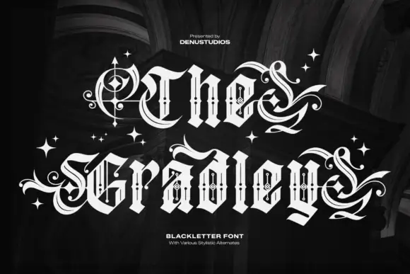
Ornate blackletter with hairline inner strokes and long curling swashes
The Gradley is an ornate blackletter display face: heavy letters with a fine inline running through the stems, long swashes on several capitals, and stars scattered between the words.
Ideas for this font
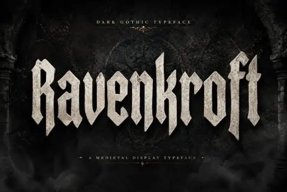
Faceted blackletter display
Ravenkroft is a faceted blackletter in bone on a dark stone ground: tall capitals with deep R and f descenders, sharp angular spurs, a stone texture on the fill and a slight forward lean, with a small line above and a plain line beneath that name the style.
Ideas for this font
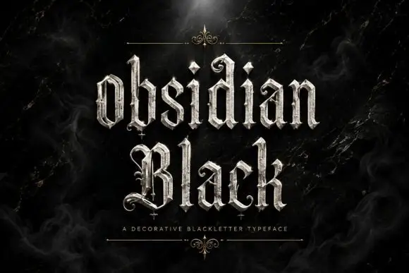
Slender outlined blackletter
Obsidian Black is a slender outlined blackletter in silver on a black marble ground: mixed case with small spirals at the terminals, long fine tips, doubled edges and a scaled texture on the fill, set in two lines with a small tracked line beneath between two hairline rules and drawn fleurons.
Ideas for this font
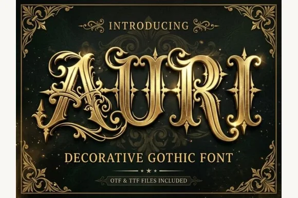
Filigree-swashed Victorian gothic capitals
Auri crowns bold Victorian gothic capitals with mid-stem spurs and scrolling filigree tendrils, built for dark-fantasy covers, emblems and luxury labels, where broad main stems anchor delicate curling side flourishes and turn three to six letter titles or single initials into ornate crests.
Ideas for this font
Same independent foundry
Allow optional Google Analytics to measure visits and catalogue actions. Your search words and notes are not included. Privacy & storage



