High-Contrast Display Serif

Wicked Broom + Raffined
Pairs sculptural editorial warmth with Wicked Broom's clean modern geometry.
Inspect Raffined specimenDisclosure: MakerFileHub may earn a commission from qualifying purchases via paid links on this page. How our links work.
Tall flared blocks with a loose brush script
Wicked Broom is a Halloween duo in purple and orange on white: tall condensed capitals with flared stems and an uneven baseline for the display word, and a loose brush script laid across the middle, with a small handwritten line above and below.
Paid link
Get this fontProject & layout blueprintsAt-a-glance maker compatibility
Cut solid base, outline, and shadow layers in separate vinyl colors and align on registration marks.
Visual anatomy & craft review
The display word is set in tall condensed capitals: the stems flare at the top and the bottom, the W and the K cut their joins to sharp points, the O is a narrow oval, the B and the R keep small square counters, and the letters sit at slightly different heights so the block reads as hand lettered rather than set. Across the middle a loose brush script in orange repeats the name with thick uneven strokes, high loops and a trailing tail, so the two voices overlap instead of stacking. A small handwritten line sits above the block and two lines below it, one a tracked capital line naming the idea and one a script line naming the product. The palette is a violet and a warm orange on a plain white ground with no other element. Wicked Broom is a duo for Halloween packaging, invitations, signs and shirts, and it needs the two colours kept apart so the script does not vanish into the block.
Flared, condensed, uneven
Two-font hierarchy recipes
Tested contrast partners — pairing Wicked Broom with grounded secondary typography.
Wicked Broom + Raffined
Pairs sculptural editorial warmth with Wicked Broom's clean modern geometry.
Inspect Raffined specimen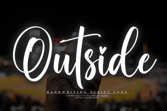
Wicked Broom + Outside
Introduces organic movement on pull-quotes, signatures and gift tags.
Inspect Outside specimenPractical applications
Concrete hierarchy, scale and production guidance tailored to Wicked Broom’s stroke geometry.
A flared block under a brush script fills a jar label with two voices, and the narrow capitals keep a long word inside a small die.
Hierarchy & layout recipe
Print a 60 by 60 mm jar label: set the display word at 15 pt, set the script at 12 pt across it with 6 mm of clear ground, and hold 5 mm of margin on all four sides.
Pre-production check
The orange script over purple can lose contrast when printed small; print one label on the real stock and check the overlap before the run.
The pair splits the occasion from the details on one card, and the uneven lettering suits a night that is meant to look handmade.
Hierarchy & layout recipe
Print a 120 by 120 mm card: set the occasion at 30 pt in the block, set the date at 16 pt in the script with 14 mm of clear ground, and hold 12 mm of margin on all four sides.
Pre-production check
Overlapping the two styles on a small card can turn into a smudge; keep the script clear of the tallest ascenders and proof one card.
Narrow flared capitals fit a long greeting on a tall board, and the brush layer reads at a distance once the lights are low.
Hierarchy & layout recipe
Print a 400 by 600 mm board: set the greeting at 90 pt over three lines, keep 30 mm of clear ground beneath before the date at 24 pt, and hold 25 mm of border on all four sides.
Pre-production check
A narrow face lit from one side reads thinner than it looks on screen; view one printed board under the actual porch light.
Technical & licence verification
Confirm included OTF/TTF/WOFF formats, full glyph tables and licence coverage on the live store page before batch production.
Closest visual alternatives
Matched across letterform anatomy, stroke behaviour and craft applications.
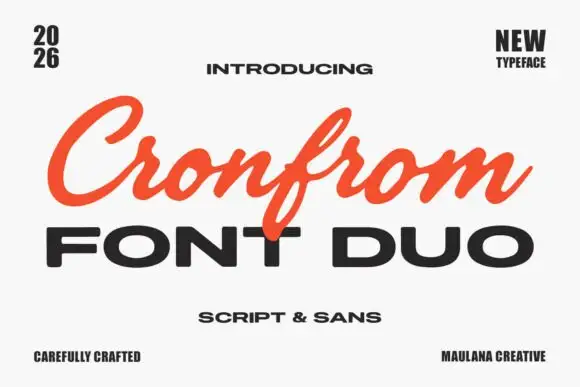
Slanted retro script paired with a wide bold sans in capitals
Cronfrom pairs a slanted retro script with a wide bold sans, so one lockup can carry a handwritten sign name and a hard-edged second line beneath it.
Ideas for this font
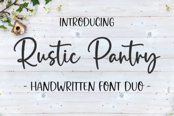
Bouncy farmhouse brush script & tall skinny marker sans duo
Rustic Pantry is a coordinated farmhouse font duo pairing a lively bouncy cursive script with a tall, narrow hand-drawn uppercase sans.
Ideas for this font
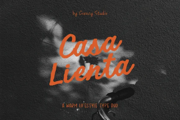
Warm lifestyle brush script + tall condensed handwritten sans duo
Casa Lienta is a warm Mediterranean-lifestyle font duo pairing an expressive thick brush script with a tall, slender handwritten all-caps sans!
Ideas for this font
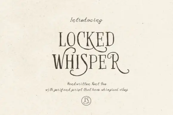
Ornate serif capitals with a whiskered script
Locked Whisper is a duo on speckled cream: ornate display capitals with thin strokes, curled serifs and long whiskers, and a fine script beneath whose letters carry the same curls at a smaller scale.
Ideas for this font
Same independent foundry
Allow optional Google Analytics to measure visits and catalogue actions. Your search words and notes are not included. Privacy & storage



