High-Contrast Display Serif

Vonca + Stanza
Pairs sculptural editorial warmth with Vonca's clean modern geometry.
Inspect Stanza specimenDisclosure: MakerFileHub may earn a commission from qualifying purchases via paid links on this page. How our links work.
Angular contrast capital sans
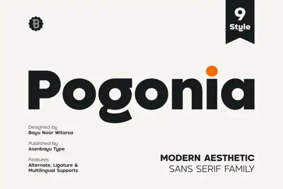
Vonca is an angular contrast capital sans in near-black on a warm off-white sheet: wide capitals with a barless A, a circular O, very fine joins and thick stems, set as one word beneath a small count of styles and above a tracked line that names the family.
Paid link
Get this fontProject & layout blueprintsAt-a-glance maker compatibility
Sturdy stroke walls and open counters weed cleanly on adhesive vinyl, HTV apparel film, and cut cardstock.
Visual anatomy & craft review
The word spans the sheet and the drawing is a capital sans with strong contrast: the stems are heavy, the joins are hairlines, the O is a circle and the A is barless, which gives a minimal face one memorable decision and a structural risk, because a barless A can misread at small sizes. That construction sets a size floor and a stock requirement, and the plate sets the word large enough that the joins and the A hold. The seven small notes along the foot are plain caps and they carry the foundry, the count, the glyph set and the alternates, which is the practical information a buyer checks. Because the letters are wide and contrasting, the face suits a wordmark, a cover and a screen at display sizes.
Sans serif, contrast, angular, minimal
Two-font hierarchy recipes
Tested contrast partners — pairing Vonca with grounded secondary typography.
Vonca + Stanza
Pairs sculptural editorial warmth with Vonca's clean modern geometry.
Inspect Stanza specimen
Vonca + Autography
Introduces organic movement on pull-quotes, signatures and gift tags.
Inspect Autography specimenPractical applications
Concrete hierarchy, scale and production guidance tailored to Vonca’s stroke geometry.
An angular contrast mark gives a practice a signature, and the barless A makes a short name memorable at large sizes. The barless A earns it.
Hierarchy & layout recipe
Set the mark at 18 pt on a card, 100 mm on a wall and 13 pt on a letterhead, keeping the hairlines uncut and the barless A only above 16 pt. Keep one colour and clear space equal to the cap height.
Pre-production check
Check the 13 pt letterhead mark, where the barless A can misread; use the alternate with a bar there. Confirm the wall mark reads at eight metres and that the joins hold in vinyl.
A minimal contrast face gives an art cover restraint, and the circular O lets a short title hold a wide measure. The O carries the width.
Hierarchy & layout recipe
Set the title at 95 mm cap height across 205 mm, the subtitle in a 9 pt sans, and the issue at 7 pt. Print one ink on a coated stock and keep 22 mm margins at the head and foot.
Pre-production check
Check the title at 95 mm, where a hairline join can break; keep it above 0.25 mm. Confirm the 7 pt issue survives lamination and that the title clears the trim at both ends.
A contrast sans reads as contemporary formality, and the fine joins hold in letterpress on a smooth card without a serif.
Hierarchy & layout recipe
A5 invitation: the names at 24 pt, the request in a 9.5 pt serif, and the date at 8.5 pt caps. Keep 24 mm margins and letterpress one ink on a heavy, smooth card.
Pre-production check
Check the 24 pt names in letterpress, where a hairline can sink; proof the plate first. Confirm the request reads at arm's length and that the names clear the trim by 12 mm.
Technical & licence verification
Confirm included OTF/TTF/WOFF formats, full glyph tables and licence coverage on the live store page before batch production.
Closest visual alternatives
Matched across letterform anatomy, stroke behaviour and craft applications.

Light rounded mixed case with an open e and slender upright stems
Clyne Sans draws a light geometric sans with even strokes, circular bowls and a short ascender, so a two-word name reads as a quiet line rather than as a mark.
Ideas for this font
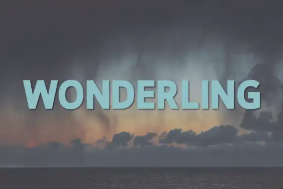
Heavy rounded display sans
Wonderling is a heavy sans in pale blue over a dark photograph of storm clouds above a sea: wide capitals with broad rounded bowls, an even weight, flat terminals and a slight shadow, set as one word with tight letter spacing.
Ideas for this font
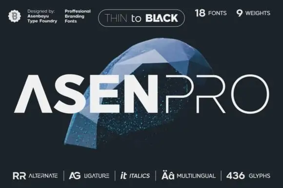
A geometric uppercase name split between heavy ASEN and hairline PRO
Asen Pro shows pale uppercase lettering over a blue faceted object on dark grey, where the first part uses thick geometric strokes with an open triangular A while the second part is much finer and widely spaced, and the cover advertises a large multi-weight family.
Ideas for this font
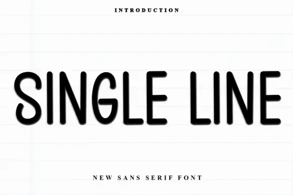
Rounded monoline capitals
Single Line is a rounded monoline sans in black on a pale ruled sheet: upright capitals with narrow oval bowls, an even stroke, soft terminal ends and wide letter spacing, set as one line between a small tracked line above and a plain line beneath.
Same independent foundry
Allow optional Google Analytics to measure visits and catalogue actions. Your search words and notes are not included. Privacy & storage