High-Contrast Display Serif

Wonderling + The Simple Editorial
Pairs sculptural editorial warmth with Wonderling's clean modern geometry.
Inspect The Simple Editorial specimenDisclosure: MakerFileHub may earn a commission from qualifying purchases via paid links on this page. How our links work.
Heavy rounded display sans
Wonderling is a heavy sans in pale blue over a dark photograph of storm clouds above a sea: wide capitals with broad rounded bowls, an even weight, flat terminals and a slight shadow, set as one word with tight letter spacing.
Paid link
Get this fontProject & layout blueprintsAt-a-glance maker compatibility
Sturdy stroke walls and open counters weed cleanly on adhesive vinyl, HTV apparel film, and cut cardstock.
Visual anatomy & craft review
The plate is a single word on a dramatic sky, and the restraint is useful, because it shows one thing clearly: a heavy rounded sans holds its shape over a photograph with strong tonal variation, which is a harder test than a flat ground. The drawing is a wide heavy sans with rounded bowls and flat terminals, so the face reads as solid and friendly rather than as a grotesque, and the tight spacing makes the word a block. That construction sets a moderate size floor, because the bowls close first. There is no other copy on the sheet, so the buyer has no size range to judge, and a print test at the intended size is worth doing. It suits a poster, a cover and a sign.
Sans serif, heavy, rounded, dependable
Two-font hierarchy recipes
Tested contrast partners — pairing Wonderling with grounded secondary typography.
Wonderling + The Simple Editorial
Pairs sculptural editorial warmth with Wonderling's clean modern geometry.
Inspect The Simple Editorial specimen
Wonderling + Hailey
Introduces organic movement on pull-quotes, signatures and gift tags.
Inspect Hailey specimenPractical applications
Concrete hierarchy, scale and production guidance tailored to Wonderling’s stroke geometry.
A heavy rounded face holds over a sky photograph, and the tight spacing turns a short name into a block that reads from a distance.
Hierarchy & layout recipe
A2 poster: the festival at 120 mm cap height, the dates in a 22 mm sans, and the gate at 11 mm. Keep 28 mm margins and print two colours on a coated stock.
Pre-production check
Check the A2 at five metres, where a bowl can merge with the sky behind; keep a 1 mm white keyline or a solid panel. Confirm the 11 mm gate reads at two metres.
A heavy rounded title holds over a landscape, and the friendly shape suits a book that is not academic. It holds over a varied landscape.
Hierarchy & layout recipe
Set the title at 90 mm cap height across 195 mm, the author in an 11 pt serif, and the imprint at 8 pt. Print one colour on a coated stock and keep 22 mm margins at the head.
Pre-production check
Check the title at 90 mm over the photograph, where a stroke can merge with a cloud edge; add a subtle shadow. Confirm the 8 pt imprint survives lamination and that the title clears the trim.
A heavy rounded mark reads as welcoming, and the wide letters carry on a fascia seen from a promenade. It reads as welcoming from the road.
Hierarchy & layout recipe
Fabricate a 900 by 320 mm panel: the cafe at 110 mm cap height, the hours in a 22 mm sans, and a 4 mm rule. Keep 22 mm margins and specify a matte finish.
Pre-production check
Check the panel at 110 mm, where a bowl can fill in metal; keep it open. Confirm the 22 mm hours read at three metres and that the rule clears the fixings at each end.
Technical & licence verification
Confirm included OTF/TTF/WOFF formats, full glyph tables and licence coverage on the live store page before batch production.
Closest visual alternatives
Matched across letterform anatomy, stroke behaviour and craft applications.
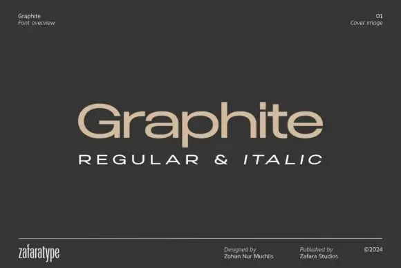
Low wide mixed case with flattened bowls and a long horizontal t bar
Graphite is a wide geometric sans with flattened bowls and a very long horizontal t bar, set here in warm beige on charcoal so the letterforms do the talking and the page stays quiet.
Ideas for this font
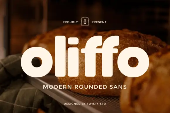
Modern rounded geometric sans
Oliffo is a modern rounded sans in cream over a photograph of bread: lowercase letterforms with almost circular bowls, a dot-less i, a shortened f, and soft terminals, so the word reads as a bakery brand mark rather than as a neutral text face.
Ideas for this font
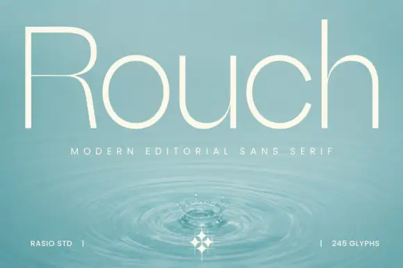
Light circular editorial sans
Rouch is a light circular sans in cream over a photograph of a water surface: mixed case with tall ascenders, near-circular bowls, an R with a fine bowl division and even hairline strokes, set as one word with a tracked line beneath and two credits at the foot.
Ideas for this font
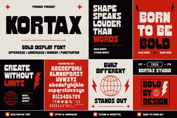
Dense block capitals with squared bowls and sharply cut diagonal joins
Kortax appears across a grid of red, cream and black poster examples, where thick compact capitals carry rounded-square counters, broad flat ends and sharp internal diagonal cuts, the O opens almost rectangular and the K and X add the strongest diagonal breaks.
Ideas for this font
Allow optional Google Analytics to measure visits and catalogue actions. Your search words and notes are not included. Privacy & storage