High-Contrast Display Serif

Asen Pro + Lumera Editorial
Pairs sculptural editorial warmth with Asen Pro's clean modern geometry.
Inspect Lumera Editorial specimenDisclosure: MakerFileHub may earn a commission from qualifying purchases via paid links on this page. How our links work.
A geometric uppercase name split between heavy ASEN and hairline PRO
Asen Pro shows pale uppercase lettering over a blue faceted object on dark grey, where the first part uses thick geometric strokes with an open triangular A while the second part is much finer and widely spaced, and the cover advertises a large multi-weight family.
Paid link
Get this fontProject & layout blueprintsAt-a-glance maker compatibility
Set Cricut or Silhouette operation to Pen, Foil Quill, or Laser Score — not Basic Blade Cut.
Visual anatomy & craft review
The strokes shift from heavy to hairline inside one name, the A opens as a triangle, the spacing widens on the light half and the bowls stay geometric. That split is the character: one wordline carries two weights, which is why the sample keeps a single short name. The advertised weights are not demonstrated together, so compare your own phrase in the styles you actually hold, keep 26 pt for the hairlines and check the A at small sizes. The hairline half of the name is the fragile part: it drops out below about 26 pt and the A's triangle closes, so keep 26 pt and compare the weights you actually hold before a lockup.
A geometric uppercase name split between heavy ASEN and hairline PRO
Two-font hierarchy recipes
Tested contrast partners — pairing Asen Pro with grounded secondary typography.
Asen Pro + Lumera Editorial
Pairs sculptural editorial warmth with Asen Pro's clean modern geometry.
Inspect Lumera Editorial specimen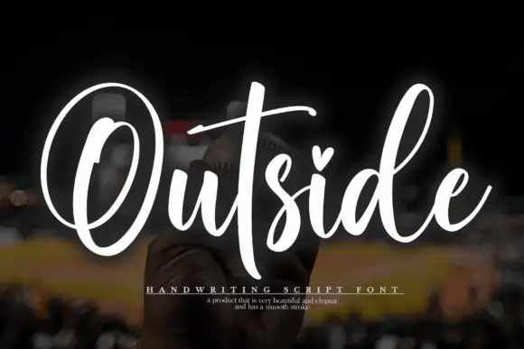
Asen Pro + Outside
Introduces organic movement on pull-quotes, signatures and gift tags.
Inspect Outside specimenPractical applications
Concrete hierarchy, scale and production guidance tailored to Asen Pro’s stroke geometry.
The weight split gives a studio a modern mark, and the geometric caps hold a two-part name at 26 pt on a card, where the heavy half anchors the row.
Hierarchy & layout recipe
Print an 85 by 55 mm card: set the wordmark at 26 pt on one row with the two weights applied per part, keep 16 mm of clear ground beneath before the address at 7 pt, and keep the spacing even.
Pre-production check
The weights are not demonstrated together; check your file before promising the pair and compare your own phrase in both cuts.
The light half suits a running head, and the geometric forms stay crisp at 10 pt across a page, where the wide spacing keeps a long title readable.
Hierarchy & layout recipe
Print a 210 mm page: set the running head at 10 pt on one line with 8 percent tracking, keep 6 mm of clear ground above the first column, and keep the head in one weight so it recedes.
Pre-production check
Hairlines below 8 pt drop out on uncoated stock; check the proof and raise the size, since a 90 gsm coated sheet holds them.
The geometric caps read on a facade, and the heavy half holds a building name at 40 pt on a printed plate, where the open A stays clear at distance.
Hierarchy & layout recipe
Print a 400 by 150 mm plate: set the building name at 40 pt on one row, keep 16 mm of clear ground beneath before the room range at 12 pt, and keep 18 mm of margin for the fixings.
Pre-production check
The triangular A opening closes under 24 pt; check the mounted sign and keep it at 30 pt or above.
Technical & licence verification
Confirm included OTF/TTF/WOFF formats, full glyph tables and licence coverage on the live store page before batch production.
Closest visual alternatives
Matched across letterform anatomy, stroke behaviour and craft applications.
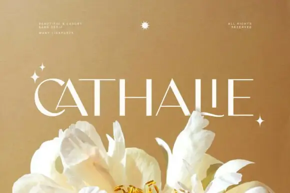
Fine contrast capitals with sharp A diagonals and a long curved L foot
Cathalie is an elegant sans with high stroke contrast: hairline joins, gently flared stems, and a set of ligatures that let the last letter of a word flow into a long thin swash.
Ideas for this font
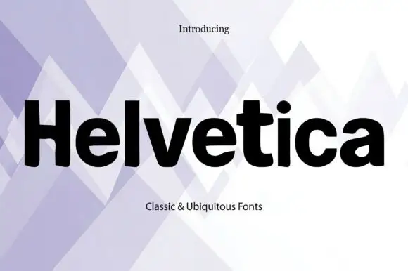
Heavy neutral grotesque
Helvetica is a heavy neutral grotesque in black on a pale lavender pattern: mixed case with compact bowls, horizontal terminals, a short broad t bar and a closed a, set as one large word between a small line above and a plain caption beneath on an abstract ground.
Ideas for this font
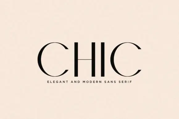
Sparse high-contrast capitals with circular C curves and a hairline H bar
Chic places four black capitals on a pale peach field, where the two C forms sweep from thick curved sides into very fine upper and lower arcs while the H and I use strong plain stems and the H crossbar thins to a hairline.
Ideas for this font
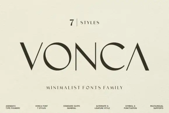
Angular contrast capital sans
Vonca is an angular contrast capital sans in near-black on a warm off-white sheet: wide capitals with a barless A, a circular O, very fine joins and thick stems, set as one word beneath a small count of styles and above a tracked line that names the family.
Ideas for this font
Same independent foundry
Allow optional Google Analytics to measure visits and catalogue actions. Your search words and notes are not included. Privacy & storage