Modern Grotesque Body

Vintara + Inkora
Creates crisp high-hierarchy contrast beneath Vintara headlines across menus, websites and labels.
Inspect Inkora specimenDisclosure: MakerFileHub may earn a commission from qualifying purchases via paid links on this page. How our links work.
Vintage luxury serif
Vintara Serif is a vintage luxury serif in near-black on cream: high contrast, sharp serifs, a swollen bowl and a high waist, shown at title case across the top of a mockup suite of a bag, a box, a tag, a card and a wax-sealed envelope in warm neutrals.
Paid link
Get this fontProject & layout blueprintsAt-a-glance maker compatibility
Sturdy stroke walls and open counters weed cleanly on adhesive vinyl, HTV apparel film, and cut cardstock.
Visual anatomy & craft review
The plate is a branding mockup, which is the right context for a face sold to boutiques: the same mark appears on a bag, a carton, a swing tag and a card, and the buyer can judge whether it holds at 6 mm and at 90 mm in one view. The drawing is a vintage serif with sharp serifs, a swollen bowl and a high waist, and the specimen sets the words in a heavy cut so the contrast between the thick stems and the hairlines is obvious. The small script line beneath the mark is set in a light hand, which shows the secondary voice the family is paired with. Because the serifs are sharp, the face works on a matte carton and in foil, and the warm neutral palette keeps the composition quiet so the letterforms carry it.
Serif, vintage, luxury, branding
Two-font hierarchy recipes
Tested contrast partners — pairing Vintara with grounded secondary typography.
Vintara + Inkora
Creates crisp high-hierarchy contrast beneath Vintara headlines across menus, websites and labels.
Inspect Inkora specimen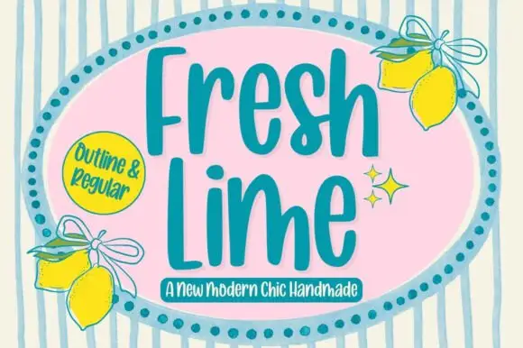
Vintara + Fresh Lime
Adds a warm human signature touch for 1-to-3-word callouts without competing against structured serif capitals.
Inspect Fresh Lime specimenPractical applications
Concrete hierarchy, scale and production guidance tailored to Vintara’s stroke geometry.
A vintage luxury serif reads on a carton and a bag at once, and the sharp serifs hold in foil where a soft face would look blurred.
Hierarchy & layout recipe
Print a 90 by 60 mm carton panel: the mark at 16 pt, the scent in a 6 pt serif, and the weight at 5.5 pt. Keep 5 mm margins and foil one colour on a warm board.
Pre-production check
Check the 16 pt mark in foil, where sharp serifs can break the foil edge; keep them above 0.3 mm. Confirm the 5.5 pt weight reads at arm's length and that the panel sits square.
A vintage serif gives a winter suite formality, and the sharp contrast survives the small sizes a tag and a place card demand.
Hierarchy & layout recipe
A6 card: the names at 22 pt, the details in a 9 pt serif, and the place names at 11 pt. Keep 18 mm margins and print one ink on a heavy cream card with a blind deboss.
Pre-production check
Check the 9 pt details on a debossed card, where hairlines can sink; keep them above 0.25 mm. Confirm the place names read across a table and that the deboss clears the trim.
A vintage serif frames a heritage title, and the high contrast holds at thumbnail size where a lighter face would disappear.
Hierarchy & layout recipe
Set the title at 85 mm cap height across 200 mm, the subtitle in a 12 pt serif, and the year at 9 pt. Print one ink on a cream stock with a matte laminate.
Pre-production check
Check the title at thumbnail size, where a swollen bowl can clot the word; open the spacing. Confirm the 9 pt year survives lamination and that the title clears the trim by 12 mm.
Technical & licence verification
Confirm included OTF/TTF/WOFF formats, full glyph tables and licence coverage on the live store page before batch production.
Closest visual alternatives
Matched across letterform anatomy, stroke behaviour and craft applications.
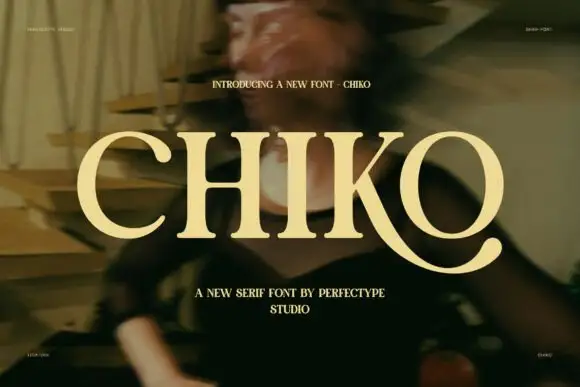
Broad capitals with sturdy stems and a long curved K leg
Chiko is a broad capital serif in which the stems stay substantial, the transitions curve smoothly and the K leg sweeps far beneath the neighbouring O to finish in a thick rounded terminal, so a single word reads as an extended editorial mark.
Ideas for this font
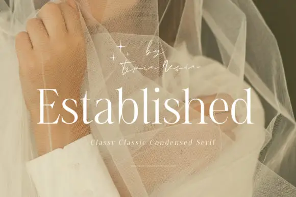
Fine condensed mixed case with long straight ascenders
Established shows light white serif letters with narrow rounded bowls and tall upright stems, where the thin horizontal strokes and small serifs keep a long word visually delicate, and the title overlays a pale portrait behind translucent fabric with a small script credit above.
Ideas for this font

High-contrast luxury serif with a swash descender and ball terminals
Bulgary is a high-contrast luxury serif in which the thick stems swell against hairlines, the terminals finish as small balls and the y drops a wide swash, so a single word carries the weight of a film title.
Ideas for this font
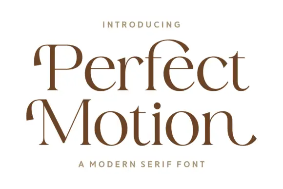
Broad modern serif with hooked entries
Perfect Motion is a broad modern serif in warm brown on white: mixed case with moderate contrast, hooked entries on the P and the M, round bowls and an outward tail on the last n, set on two lines with a tracked line above and beneath.
Same independent foundry
Allow optional Google Analytics to measure visits and catalogue actions. Your search words and notes are not included. Privacy & storage



