Modern Grotesque Body

Perfect Motion + Noar
Creates crisp high-hierarchy contrast beneath Perfect Motion headlines across menus, websites and labels.
Inspect Noar specimenDisclosure: MakerFileHub may earn a commission from qualifying purchases via paid links on this page. How our links work.
Broad modern serif with hooked entries
Perfect Motion is a broad modern serif in warm brown on white: mixed case with moderate contrast, hooked entries on the P and the M, round bowls and an outward tail on the last n, set on two lines with a tracked line above and beneath.
Paid link
Get this fontProject & layout blueprintsAt-a-glance maker compatibility
Weld or Unite overlapping script joins into one continuous vector path before sending to the blade.
Visual anatomy & craft review
The two words are stacked and the drawing is a broad serif in mixed case: the contrast is moderate, the entries hook, and the bowls are round, which gives the face a warm authority rather than a severe one. That construction makes it usable at heading sizes and at text sizes, and the plate shows both by setting the two lines large and the tracked lines small. The outward tail on the final letter is the detail that keeps the word from ending flatly, and it needs a little extra space at the right margin, which the plate provides. The plain white ground keeps the letterforms the subject, and the two tracked lines are the only supporting elements, set in the same family at a fraction of the size.
Serif, modern, editorial, warm
Two-font hierarchy recipes
Tested contrast partners — pairing Perfect Motion with grounded secondary typography.
Perfect Motion + Noar
Creates crisp high-hierarchy contrast beneath Perfect Motion headlines across menus, websites and labels.
Inspect Noar specimen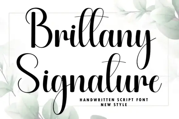
Perfect Motion + Brittany Signature
Adds a warm human signature touch for 1-to-3-word callouts without competing against structured serif capitals.
Inspect Brittany Signature specimenPractical applications
Concrete hierarchy, scale and production guidance tailored to Perfect Motion’s stroke geometry.
A broad serif gives a personal book a warm cover, and the moderate contrast holds at thumbnail size where a didone would fade.
Hierarchy & layout recipe
Set the title at 85 mm cap height across 195 mm, the subtitle in a 12 pt serif, and the author at 9 pt. Print one ink on a cream stock and keep the title in the upper half.
Pre-production check
Check the title at thumbnail size, where the round bowls can clot; open the spacing. Confirm the 9 pt author survives lamination and that the title clears the trim by 12 mm.
A broad serif gives a studio a warm mark, and the hooked entries give a short name a detail that still holds on a business card.
Hierarchy & layout recipe
Set the mark at 17 pt on a card, 90 mm on a wall and 11 pt in a footer, keeping the enters above 12 pt. Keep one colour and clear space equal to the cap height.
Pre-production check
Check the 11 pt footer on uncoated paper, where a hooked entry can fill; keep the size above 11 pt. Confirm the wall mark reads at eight metres and that the tail clears the panel edge.
A warm serif suits a daytime celebration, and the round bowls keep a long list of details readable on a single cream card.
Hierarchy & layout recipe
A5 invitation: the names at 26 pt, the request in a 10 pt serif with 14.5 pt leading, and the date at 9 pt caps. Keep 22 mm margins and print one ink on a cream card.
Pre-production check
Check the 10 pt request on uncoated card, where a moderate serif can fill; test one sheet on the stock. Confirm the names read at arm's length and that the date clears the trim.
Technical & licence verification
Confirm included OTF/TTF/WOFF formats, full glyph tables and licence coverage on the live store page before batch production.
Closest visual alternatives
Matched across letterform anatomy, stroke behaviour and craft applications.
Substantial upright serif
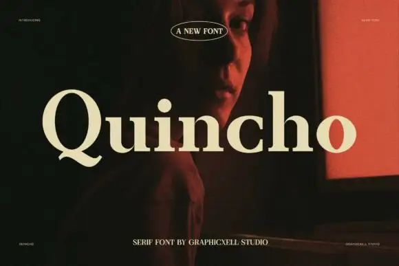
Quincho is a substantial serif in cream over a dark interior with a red screen: upright mixed case with moderate contrast, a short curled Q tail, round bowls and a large x-height, with an oval badge above and a tracked line beneath.
Ideas for this font
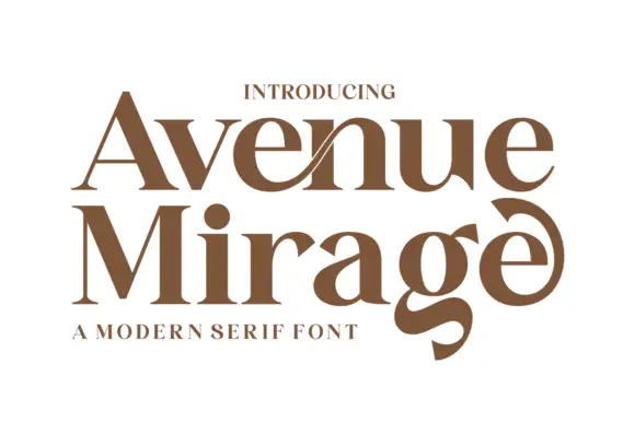
Heavy contrasting mixed case with a low g and curled final e
Avenue Mirage shows brown serif lettering in two rows on white. Broad heavy bowls meet fine joins, a slender diagonal crosses the upper n area, the lower g descends into a thick curved tail, and the final e curls upward into a large terminal above a compact subtitle.
Ideas for this font
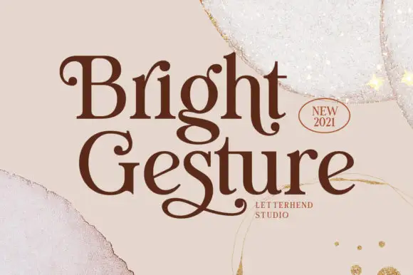
Rounded serif lettering with curled capitals and low returning tails
Bright Gesture shows dark brown mixed-case lettering on a pale torn-paper field, where the B opens with a small inward curl, the G carries a much larger rounded entry and the descending g turns into a broad loop, while a long returning stroke beneath Gesture gives the lower word its own underline-like ending.
Ideas for this font
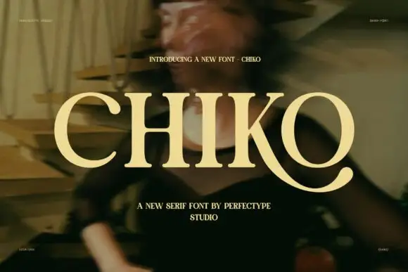
Broad capitals with sturdy stems and a long curved K leg
Chiko is a broad capital serif in which the stems stay substantial, the transitions curve smoothly and the K leg sweeps far beneath the neighbouring O to finish in a thick rounded terminal, so a single word reads as an extended editorial mark.
Ideas for this font
Same independent foundry
Allow optional Google Analytics to measure visits and catalogue actions. Your search words and notes are not included. Privacy & storage