Neutral Sans Workhorse

Vintage Spur + Noar
Lets Vintage Spur own the focal silhouette while handling secondary copy, sizing and subheads cleanly.
Inspect Noar specimenDisclosure: MakerFileHub may earn a commission from qualifying purchases via paid links on this page. How our links work.
Outlined pinched serif display
Vintage Spur is an outlined decorative serif in white with a dark keyline on a purple and teal watercolour ground: wide capitals with pinched sides, pointed spurs at the shoulders, narrow inner tracks and heavy outlines, set in two lines between four drawn corner ornaments, with two plain lines at the foot.
Paid link
Get this fontProject & layout blueprintsAt-a-glance maker compatibility
Cut solid base, outline, and shadow layers in separate vinyl colors and align on registration marks.
Visual anatomy & craft review
The two words are stacked and the drawing is a serif whose outline is the design: each letter is a heavy shape with a pinched waist, pointed spurs and a narrow inner track that runs around the contour, so the word reads as a decorated placard. That construction sets a large size floor, because the inner track closes when the letters shrink, and the plate sets the words large enough that the track is visible throughout. The watercolour ground is staging that supplies colour behind an open letterform, and the four corner ornaments are supplied artwork. Because the letters are open inside and decorated, the face suits a poster, a label and a shirt, and a buyer should test the smallest intended size, since the pinched waist is the first place where the shape will collapse.
Decorative, outlined, serif, western
Two-font hierarchy recipes
Tested contrast partners — pairing Vintage Spur with grounded secondary typography.
Vintage Spur + Noar
Lets Vintage Spur own the focal silhouette while handling secondary copy, sizing and subheads cleanly.
Inspect Noar specimen
Vintage Spur + Lumera Editorial
Grounds bold display lettering with classic typographic authority on posters, badges and apparel.
Inspect Lumera Editorial specimenPractical applications
Concrete hierarchy, scale and production guidance tailored to Vintage Spur’s stroke geometry.
A decorated western serif reads as a fairground placard, and the open letterforms let a coloured ground show through. The ground colour shows through the open letters.
Hierarchy & layout recipe
A2 poster: the market at 95 mm cap height, the dates in a 24 mm sans, and the field at 11 mm. Keep 30 mm margins and print two colours on a light stock.
Pre-production check
Check the A2 at five metres, where the inner track can vanish; keep it above 2 mm. Confirm the 11 mm field reads at two metres and that the ornaments stay balanced.
A decorated serif gives a soda label a period confidence, and the open letterforms allow a coloured bottle to show through.
Hierarchy & layout recipe
Print a 70 by 90 mm label: the brand at 16 pt, the flavour at 9 pt, and the volume at 7.5 pt. Keep 5 mm inside the die and keep the inner track above 1 mm.
Pre-production check
Check the 16 pt brand on a curved bottle, where the track can fill; keep it above 1 mm. Confirm the 7.5 pt volume reads on the shelf and that the label holds in a cooler.
A decorated serif prints as two screens and reads as a costume piece, which suits a themed celebration shirt. Two screens cover the whole shirt.
Hierarchy & layout recipe
Print a 250 mm chest graphic: the slogan at 60 mm cap height, the year at 28 mm, and two inks on a light shirt. Keep the inner track at 2 mm and place the graphic 80 mm below the collar.
Pre-production check
Check the screen at actual mesh, where a 2 mm track can fill; thicken it to 3 mm. Wash-test one shirt and confirm the spurs stay pointed after five cycles.
Technical & licence verification
Confirm included OTF/TTF/WOFF formats, full glyph tables and licence coverage on the live store page before batch production.
Closest visual alternatives
Matched across letterform anatomy, stroke behaviour and craft applications.
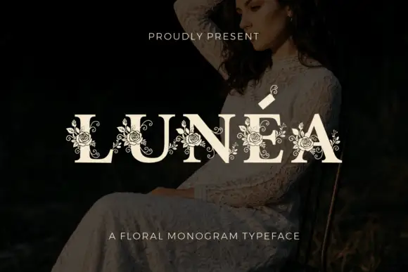
Floral monogram display
Lunéa is a floral monogram display in cream over a dark portrait: broad serif capitals with a fine accent, and fine roses, leaves and curled tendrils drawn over every letter, with a small sprig above the A and a tracked line beneath naming the style.
Ideas for this font
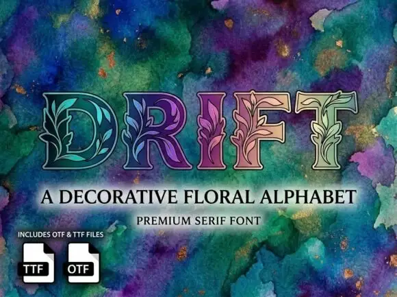
Outlined serif capitals with fine leafy stems woven through their interiors
Drift fills serif capitals with botanical patterns, so leaves, buds and grasses grow inside the strokes, and sets the word over a deep watercolour field in green, teal and purple.
Ideas for this font
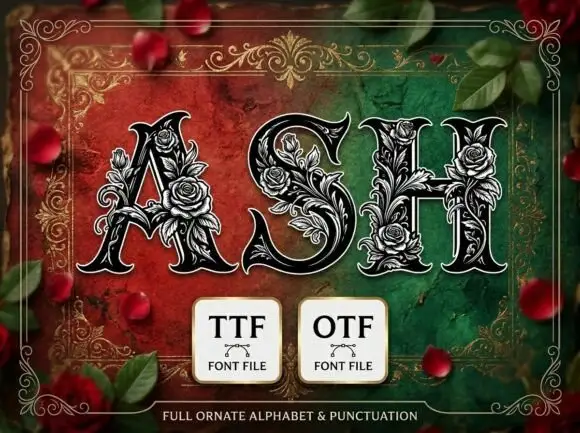
Heavy pointed serif capitals wrapped in dense fine rose and leaf outlines
Ash presents three dark capitals on a red-green field. Broad contrast strokes taper into sharp curled serifs, while pale outlined roses, leaves and tendrils climb around the A, fill parts of the S and bridge the H crossbar, with thin outer contours separating ornament from letter body.
Ideas for this font
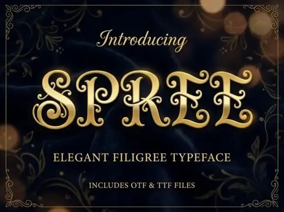
Filigree spiral display
Spree is an ornate display in gold on a dark bokeh ground: high-contrast capitals with long inward spirals, curled terminal extensions and fine filigree inside the bowls, set as one word between a script introducing line and two plain lines naming the style and the formats, all inside a fine ornamental frame.
Ideas for this font
Same independent foundry
Allow optional Google Analytics to measure visits and catalogue actions. Your search words and notes are not included. Privacy & storage