Editorial Serif Anchor

Blissful Wedding + Cervelique
Anchors Blissful Wedding's fluid strokes with crisp Roman proportions on wedding suites, headers and packaging.
Inspect Cervelique specimenDisclosure: MakerFileHub may earn a commission from qualifying purchases via paid links on this page. How our links work.
Heavy looping wedding script with thick stems and short even joins
Blissful Wedding is a heavy looping script in which the stems stay thick through the joins, the loops stay round and short, and the word reads as a warm painted line rather than a formal calligraphic one.
Paid link
Get this fontProject & layout blueprintsAt-a-glance maker compatibility
Weld or Unite overlapping script joins into one continuous vector path before sending to the blade.
Visual anatomy & craft review
The capital B opens with a thick looped stem and closes two round bowls, and the W that follows repeats the loop on its first stroke before settling into four even valleys. Weight never thins: the joins carry the same thickness as the stems, the ascenders rise into narrow loops and the descender on the g drops a fat hook that tapers at the very end. Because the loops are short, the face stays compact and reads at 20 pt on a favour label without turning into a tangle, which is where heavy scripts usually fail. End letters finish with a short loop rather than a flourish. The marble surface, the foliage, the kraft card and the small file-format note are presentation; the script is the two words.
Heavy · Looping · Warm
Two-font hierarchy recipes
Tested contrast partners — pairing Blissful Wedding with grounded secondary typography.
Blissful Wedding + Cervelique
Anchors Blissful Wedding's fluid strokes with crisp Roman proportions on wedding suites, headers and packaging.
Inspect Cervelique specimen
Blissful Wedding + Noar
Keeps small-scale dates, URLs, nutrition facts and care instructions crisp and legible below script titles.
Inspect Noar specimenPractical applications
Concrete hierarchy, scale and production guidance tailored to Blissful Wedding’s stroke geometry.
The heavy loops hold a card at 24 pt and read warmly, which is what a save-the-date needs when it will be pinned to a fridge.
Hierarchy & layout recipe
Print on a 148 by 105 mm card: set the greeting at 24 pt across the upper half, set the date in a 9 pt caps serif beneath, and hold 14 mm between the two so the descender hook clears the numerals.
Pre-production check
A thick descender can touch a date line set close beneath; check the proof at final size and raise the script line rather than shortening the hook.
The compact looped script fits a narrow band, and the heavy stroke prints cleanly on uncoated kraft at 13 pt where a hairline script would break up.
Hierarchy & layout recipe
Print a 45 mm kraft band: set both names at 13 pt across the centre, keep the date in a 5 pt sans at the right end, and leave 7 mm of clear band at each end so the loop is not creased by the fold.
Pre-production check
A band folded over a suite creases at the wraps; check the artwork against a folded dummy and keep the script on the flat front.
The heavy script carries a short thank-you at 18 pt without the formality of a calligraphic face, which suits a card written by hand.
Hierarchy & layout recipe
Print on an A6 card: set the greeting at 18 pt at the top, leave 40 mm of blank space beneath for a handwritten note, and keep 10 mm of margin so the loop stays inside the trim.
Pre-production check
A printed greeting and a handwritten note can clash in weight; check the card with a pen in hand and keep the printed line light enough not to dominate.
Technical & licence verification
Confirm included OTF/TTF/WOFF formats, full glyph tables and licence coverage on the live store page before batch production.
Closest visual alternatives
Matched across letterform anatomy, stroke behaviour and craft applications.
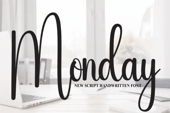
Tall script with an oversized narrow M
Monday is a tall script in black over a photograph of a desk: a very tall narrow capital M drawn as two long strokes with a shallow valley between, a compact connected body and a y whose descender curls below the word.
Ideas for this font
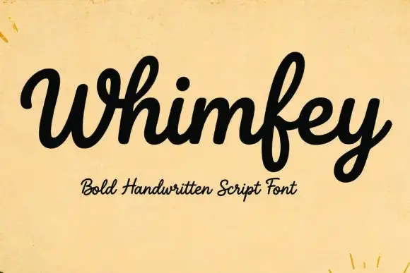
Bold handwritten script
Whimfey is a bold handwritten script in black on aged yellow paper: fat even strokes, a high x-height, short ascenders and a tight rhythm that reads as a confident everyday hand.
Ideas for this font
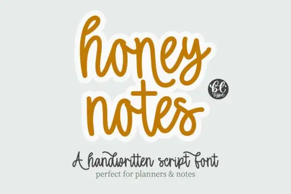
Rounded casual connected handwriting with soft arches and a plain baseline
Honey Notes is rounded casual handwriting in which the letters connect without calligraphic contrast, the arches stay soft and round and the baseline remains level across a phrase.
Ideas for this font
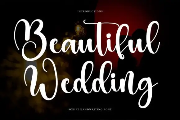
High-contrast looping wedding script
Beautiful Wedding is a formal looping script with a hard split between hairline joins and solid downstrokes, set in two stacked lines that share one wide axis.
Ideas for this font
Same independent foundry
Allow optional Google Analytics to measure visits and catalogue actions. Your search words and notes are not included. Privacy & storage