Modern Grotesque Body

Varsity Bold + Inkora
Creates crisp high-hierarchy contrast beneath Varsity Bold headlines across menus, websites and labels.
Inspect Inkora specimenDisclosure: MakerFileHub may earn a commission from qualifying purchases via paid links on this page. How our links work.
Varsity college blocks with a layered outline
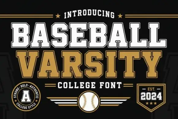
Varsity Bold is a college display in red and black on cream: heavy slab capitals with a layered outline, a condensed fit and flat serifs, presented on a page of badges, a football, a single letter and a script line.
Paid link
Get this fontProject & layout blueprintsAt-a-glance maker compatibility
Sturdy stroke walls and open counters weed cleanly on adhesive vinyl, HTV apparel film, and cut cardstock.
Visual anatomy & craft review
The sheet is built like a college merchandise catalogue: two words in heavy slab capitals with a dark outline and a lighter keyline inside it, a single letter at the left with the same treatment, a football and a badge, and a script line at the lower right. The face itself is a varsity slab: the stems are heavy, the serifs are thick flats, the A and the V come to flat apexes, the S closes into squared shoulders, and the letters are condensed enough that a long word fits one line. The layering is what the sample demonstrates: the block can be printed as a solid, an outline or a two-colour combination, which is how college lettering is normally produced for apparel. The palette is cream, red and black on a warm ground. Varsity Bold is a display face for team wear, school signage, sports posters and merchandise, and it needs capitals at a large size.
Varsity, layered, collegiate
Two-font hierarchy recipes
Tested contrast partners — pairing Varsity Bold with grounded secondary typography.
Varsity Bold + Inkora
Creates crisp high-hierarchy contrast beneath Varsity Bold headlines across menus, websites and labels.
Inspect Inkora specimen
Varsity Bold + Coastal Honey
Adds a warm human signature touch for 1-to-3-word callouts without competing against structured serif capitals.
Inspect Coastal Honey specimenPractical applications
Concrete hierarchy, scale and production guidance tailored to Varsity Bold’s stroke geometry.
A layered slab is what a letterman jacket is meant to carry, and the two-colour outline lets a stitcher build the patch in one pass per colour.
Hierarchy & layout recipe
Print a 250 mm back width: set the team name at 65 mm cap height, keep 24 mm of clear ground above before the number at 170 mm, and hold 55 mm clear of each shoulder seam.
Pre-production check
A layered outline can drift out of register on a garment; print one sample and check the keyline before the order.
A varsity block reads across a field at speed, and the outline version still holds up on a sign seen at a sharp angle in daylight.
Hierarchy & layout recipe
Print a 1500 by 500 mm panel: set the name at 240 pt on one line, keep 50 mm of clear ground beneath before the section at 34 pt, and hold 40 mm of margin on all four sides.
Pre-production check
A thin keyline can fill in on a large vinyl cut; ask for one cut sample before the panel is produced.
A college block names a fixture with the weight of a printed programme, and the layered version covers a title and a team line on one page.
Hierarchy & layout recipe
Print a 148 by 210 mm programme: set the fixture at 44 pt over one line, keep 16 mm of clear ground beneath before the teams at 13 pt, and hold 12 mm of margin on all four sides.
Pre-production check
Two colours plus an outline on a small cover can look busy; choose one treatment and proof the cover.
Technical & licence verification
Confirm included OTF/TTF/WOFF formats, full glyph tables and licence coverage on the live store page before batch production.
Closest visual alternatives
Matched across letterform anatomy, stroke behaviour and craft applications.

Wide athletic capitals with chamfered bowls and rough chips through the slabs
Abcd Varsity is a wide athletic slab in which the flat ends sit close, the bowls chamfer at the corners and irregular chips eat through the heavy slabs, so a two-word title reads as a weathered collegiate board.
Solid varsity slab with flat serifs
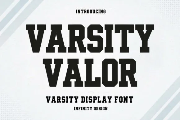
Varsity Valor is a varsity display face in solid black on a pale ground: heavy capitals with thick flat serifs, flat apexes and a tight fit, with a small hatched pattern behind the words and tracked capital lines above and below.
Ideas for this font
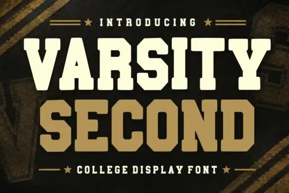
Collegiate block slab display
Varsity Second is a collegiate block in cream and tan on a dark ground: heavy slab capitals with rectangular serifs, wide stems, a flat-topped A and a squared O, stacked with a star rule above and a caption rule below.
Ideas for this font
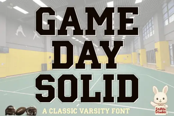
Solid varsity blocks with clipped corners and a dashed cut line around each letter
Game Day is a solid varsity block alphabet in which every letter has clipped corners and a fine dashed line running just inside its edge, so the word reads as a cut-out athletic patch.
Ideas for this font
Same independent foundry
Allow optional Google Analytics to measure visits and catalogue actions. Your search words and notes are not included. Privacy & storage