Modern Grotesque Body

Boxing + Olline
Creates crisp high-hierarchy contrast beneath Boxing headlines across menus, websites and labels.
Inspect Olline specimenDisclosure: MakerFileHub may earn a commission from qualifying purchases via paid links on this page. How our links work.
Angular condensed athletic blocks with compact counters
Boxing places red capitals across a rising black band inside a yellow ring illustration, where the O and G have clipped corners, the X runs sharply diagonal and short slab ends keep the word compact.
Paid link
Get this fontProject & layout blueprintsAt-a-glance maker compatibility
Sturdy stroke walls and open counters weed cleanly on adhesive vinyl, HTV apparel film, and cut cardstock.
Visual anatomy & craft review
The letters stay narrow, the corners clip at an angle, the diagonals run straight and the counters compress into small shapes. That compact athletic block is the character: the word looks stencilled onto a training shirt rather than set as a headline, which is why the cover tilts it along a band. The boxer, gloves, ropes and the angled band are separate artwork and prove no italic style, so set the upright face yourself and keep 36 pt before the clipped corners fill.
Condensed · Clipped corners · Athletic
Two-font hierarchy recipes
Tested contrast partners — pairing Boxing with grounded secondary typography.
Boxing + Olline
Creates crisp high-hierarchy contrast beneath Boxing headlines across menus, websites and labels.
Inspect Olline specimen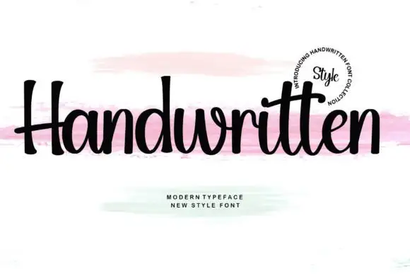
Boxing + Handwritten
Adds a warm human signature touch for 1-to-3-word callouts without competing against structured serif capitals.
Inspect Handwritten specimenPractical applications
Concrete hierarchy, scale and production guidance tailored to Boxing’s stroke geometry.
The condensed blocks suit a club shirt, and the clipped corners stay sharp at 80 mm on a printed transfer in one colour.
Hierarchy & layout recipe
Print a 240 mm transfer: set the club name at 80 mm on one row, keep 12 mm between the letters so the clipped corners stay separate, and keep 18 mm of clear edge around the outermost block.
Pre-production check
Clipped corners printed under 40 mm read as wear; check the transfer proof at half size before approval.
The athletic blocks read from a doorway, and the compact counters hold a two-word sign at 60 mm on a painted panel, where the clipped corners survive a brush coat.
Hierarchy & layout recipe
Paint a 600 by 250 mm panel: set the sign at 60 mm on one row, keep 24 mm of clear ground beneath before the opening hours at 13 pt, and keep 22 mm of border so no slab end is cropped.
Pre-production check
A condensed face painted too narrow looks squashed; check the mounted panel and avoid scaling the width.
The angular blocks set a party banner, and the heavy forms hold a name and an age at 52 pt on an A3 sheet, spaced as two separate blocks so both read.
Hierarchy & layout recipe
Print an A3 banner: set the name at 52 pt on the first row and the age at 52 pt on a second row, keep 16 mm of clear ground between them, and keep 20 mm of margin all round.
Pre-production check
Two dense rows on one sheet merge into a single block; check the banner and keep a clear gap between the rows.
Technical & licence verification
Confirm included OTF/TTF/WOFF formats, full glyph tables and licence coverage on the live store page before batch production.
Closest visual alternatives
Matched across letterform anatomy, stroke behaviour and craft applications.
Condensed distressed athletic slab
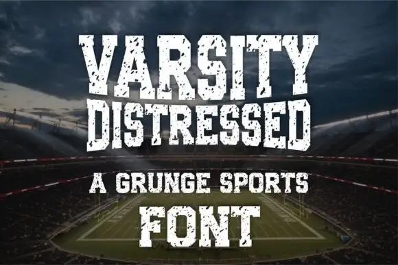
Varsity Distressed is a condensed athletic slab in white on a stadium photograph: heavy caps with narrow counters and flat slabs, chipped and speckled through the fill, set on four lines in decreasing sizes with a tracked line between them and a credit at the foot.
Condensed athletic slab
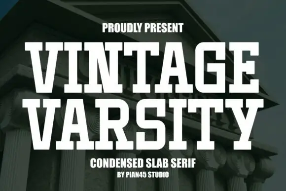
Vintage Varsity is a clean condensed slab in white over a photograph of a classical building: tall capitals with broad horizontal feet, flat terminals and even strokes, set in two lines with a small tracked line above and two plain notes beneath.
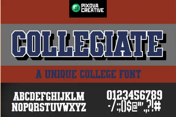
Condensed athletic capitals with clipped corners and slab feet
Collegiate shows narrow block capitals with heavy upright strokes, broad slab feet and clipped outer corners: the main title carries a white outline and a black offset shadow, with smaller alphabet, numeral and punctuation samples printed beneath.
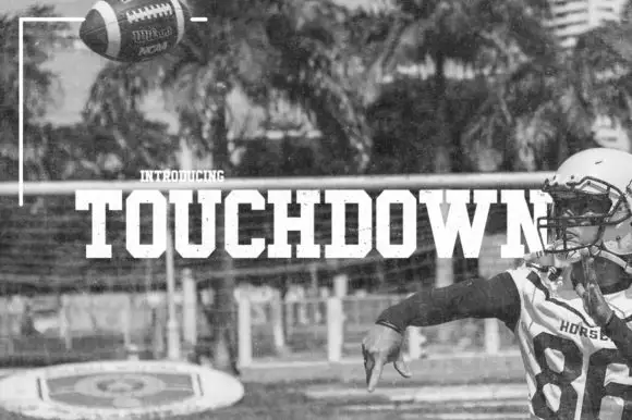
Condensed athletic slab
Touchdown is a solid condensed athletic slab in white over a monochrome photograph of a quarterback: heavy capitals with clipped bowls, square feet and flat terminals, set as one line across the middle of the image with a small tracked note above.
Ideas for this font
Same independent foundry
Allow optional Google Analytics to measure visits and catalogue actions. Your search words and notes are not included. Privacy & storage