Neutral Sans Workhorse

Toraku + Inkora
Lets Toraku own the focal silhouette while handling secondary copy, sizing and subheads cleanly.
Inspect Inkora specimenDisclosure: MakerFileHub may earn a commission from qualifying purchases via paid links on this page. How our links work.
Oblique futuristic wide sans
Toraku is a futuristic oblique sans in white on a blueprint-blue scene: wide even strokes, a strong forward slant, squared terminals and a tall x-height, with three lines set at different sizes over a retro-futurist landscape, so the plate reads as a technical title card.
Paid link
Get this fontProject & layout blueprintsAt-a-glance maker compatibility
Sturdy stroke walls and open counters weed cleanly on adhesive vinyl, HTV apparel film, and cut cardstock.
Visual anatomy & craft review
The main word is set large and slanted, and the drawing is a wide grotesque pushed into italics: the stems are even, the counters are open, and the terminals are cut at an angle that follows the slant, which keeps the letters from looking like a roman that was sheared. The wide width and the tight leading let three lines stack into a block, and the smaller lines use the same skeleton at reduced scale, which is how a title card actually works. The ground is a treated photograph of a shoreline with towers and a planet, printed in blueprint blue with corner marks and small interface details, so the whole plate imitates a technical drawing rather than a poster. Because the face is wide and oblique, it holds best at display sizes, which the specimen respects.
Futuristic, oblique, wide, technical
Two-font hierarchy recipes
Tested contrast partners — pairing Toraku with grounded secondary typography.
Toraku + Inkora
Lets Toraku own the focal silhouette while handling secondary copy, sizing and subheads cleanly.
Inspect Inkora specimen
Toraku + Brenco
Grounds bold display lettering with classic typographic authority on posters, badges and apparel.
Inspect Brenco specimenPractical applications
Concrete hierarchy, scale and production guidance tailored to Toraku’s stroke geometry.
An oblique wide sans reads as a title card from the period the book is about, and the even strokes hold at cover size where a novelty futuristic face would look dated within a season.
Hierarchy & layout recipe
Set the title at 90 mm cap height on a 6 degree slant, the subtitle in a 10 pt grotesque, and the editor at 8 pt. Print white on a deep blue and keep the corner marks as the only ornament around the title block.
Pre-production check
Check the title at 90 mm, where the slant can push the last letter past the trim; shift the block left by 6 mm. Confirm the 10 pt subtitle reads at arm's length and that the title holds at thumbnail size online.
An oblique sans signals motion and engineering, and the flat construction survives being cut in vinyl for a reception wall where a gradient wordmark would need printing.
Hierarchy & layout recipe
Cut a 900 mm reception mark: the name at 160 mm cap height, a 12 mm minimum stroke, and 30 mm between letters. Keep the slant at 6 degrees so verticals still read as verticals at a glance and specify a matte vinyl.
Pre-production check
Check the cut at 160 mm on the wall, where a 12 mm stroke can look thin from the entrance; keep it above 10 mm. Confirm the mark reads at eight metres and that the slant does not look like a misaligned panel.
A futuristic oblique face sets a tournament tone in one word, and the wide letters read from the back of a hall where an italic text face would blur.
Hierarchy & layout recipe
A2 portrait: the event at 120 mm cap height, the schedule in a 12 mm mono, and the prize at 26 mm. Keep 25 mm margins, print white on a dark blue, and align the schedule to a strict left column.
Pre-production check
Check the poster at six metres, where the slant can make the schedule look crooked; keep the small type upright. Confirm the 12 mm schedule reads at two metres and that the prize line sits on the same baseline as the column.
Technical & licence verification
Confirm included OTF/TTF/WOFF formats, full glyph tables and licence coverage on the live store page before batch production.
Closest visual alternatives
Matched across letterform anatomy, stroke behaviour and craft applications.
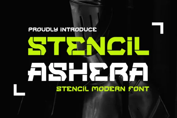
Wide futuristic sci-fi & cyber-industrial stencil sans
Stencil Ashera is a wide, geometric futuristic stencil font slicing horizontal and diagonal tech bridges through bold sci-fi capitals.
Ideas for this font
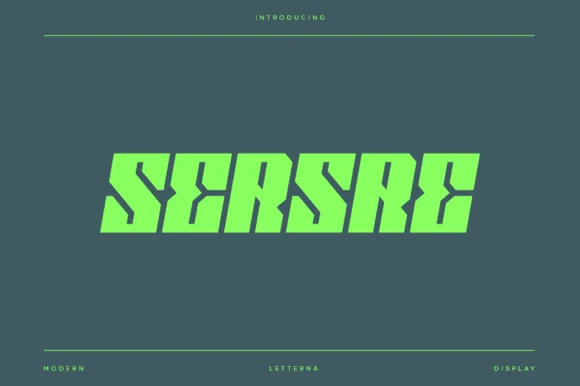
Slanted cyberpunk speed-sliced futuristic sci-fi block sans
Sersre is an aggressive, forward-slanted cyberpunk display typeface slicing razor-sharp horizontal speed notches into monolithic futuristic blocks!
Ideas for this font
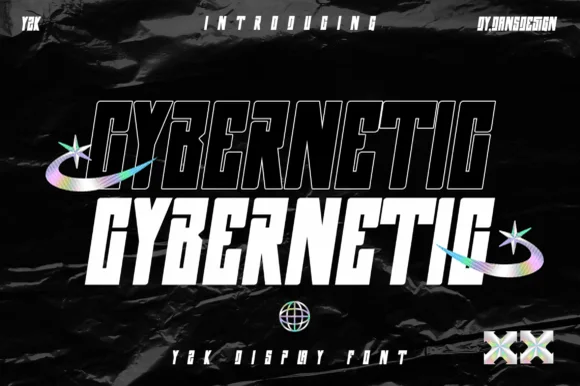
2-style condensed slanted Y2K cyberpunk sans (Solid & Outline)
Cybernetic is a sleek, condensed futuristic Y2K tech sans (NOT a medieval blackletter) showcasing matched Outline and Solid slanted cuts.
Ideas for this font
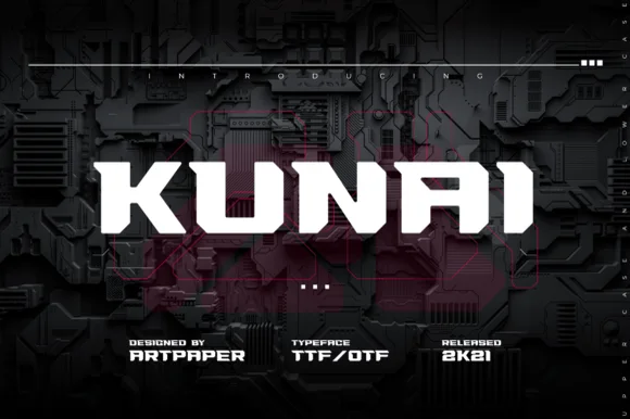
Blade-notched ninja & tactical cyberpunk sans (TTF / OTF)
Kunai slices sharp diagonal kunai-dagger notches into heavy industrial block capitals for tactical gaming and anime techwear (TTF / OTF).
Ideas for this font
Same independent foundry
Allow optional Google Analytics to measure visits and catalogue actions. Your search words and notes are not included. Privacy & storage