High-Contrast Display Serif

Quiet Story + Cronelo
Pairs sculptural editorial warmth with Quiet Story's clean modern geometry.
Inspect Cronelo specimenDisclosure: MakerFileHub may earn a commission from qualifying purchases via paid links on this page. How our links work.
Textured serif capitals and looping script
Quiet Story is a duo on a weathered photograph: heavy serif capitals with a printed texture, and a looping script beneath in the same cream ink, with a small script credit at the foot.
Paid link
Get this fontProject & layout blueprintsAt-a-glance maker compatibility
Weld or Unite overlapping script joins into one continuous vector path before sending to the blade.
Visual anatomy & craft review
QUIET fills the card in heavy serif capitals, and the letters carry a printed texture: the edges are broken by small chips, the stems are thick and the serifs are wide, so the word reads as printed on a worn poster rather than a clean page. Story follows beneath in a looping script with wide bowls and a light join, and the pairing works because the script is much lighter than the capitals without being fine. A third setting of the same script, smaller again, carries the credit at the foot, which shows how the face behaves at caption size. The ground is a photograph of a rock on a beach in muted colour, and the cream ink sits over it with a texture of its own. The duo is an editorial and packaging combination: the serif carries a title, the script carries a line, and both share one ink.
A weathered serif over a looping script
Two-font hierarchy recipes
Tested contrast partners — pairing Quiet Story with grounded secondary typography.
Quiet Story + Cronelo
Pairs sculptural editorial warmth with Quiet Story's clean modern geometry.
Inspect Cronelo specimen
Quiet Story + Esmeralda
Introduces organic movement on pull-quotes, signatures and gift tags.
Inspect Esmeralda specimenPractical applications
Concrete hierarchy, scale and production guidance tailored to Quiet Story’s stroke geometry.
A weathered serif over a looping script reads as a printed card enlarged, and one ink keeps a plain board affordable for a small ceremony.
Hierarchy & layout recipe
Print a 500 by 350 mm board: set the main word at 110 pt in the serif, set the line at 44 pt in the script, keep 24 mm of clear ground beneath, and hold 22 mm of border.
Pre-production check
The printed texture can look like damage at board size; print one at the final size and judge the wear before the set.
A textured serif with a script beneath gives a feature cover a printed rather than a digital feel, and the pair covers the title and the standfirst in one purchase.
Hierarchy & layout recipe
Print a 230 by 300 mm cover: set the title at 90 pt in the serif, set the standfirst at 40 pt in the script with 26 mm of clear ground, and hold 20 mm of margin on all sides.
Pre-production check
Thin script joins disappear on newsprint; print one cover on the actual stock and check the loop before the run.
A weathered serif says the bar has a history, and the script supplies the warmth that a plain serif alone would not on a small label.
Hierarchy & layout recipe
Print a 60 by 90 mm label: set the name at 16 pt in the serif, set the line at 8 pt in the script with 6 mm of clear ground, and hold 4 mm of margin on all sides.
Pre-production check
Two weights on one small label can crowd; print one at the real size and check the ratio before the order.
Technical & licence verification
Confirm included OTF/TTF/WOFF formats, full glyph tables and licence coverage on the live store page before batch production.
Closest visual alternatives
Matched across letterform anatomy, stroke behaviour and craft applications.
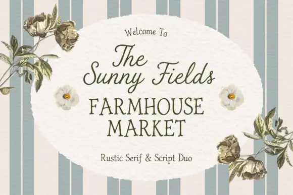
Rustic serif paired with a light script in a farmhouse treatment
The Sunny Field pairs a rustic serif in spaced capitals with a light script above it, so a market sign can carry a soft welcome line and a firm name beneath.
Ideas for this font
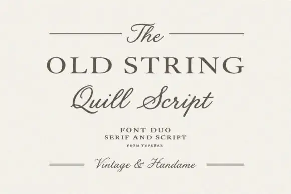
Serif and quill script duo
The Old String is a duo in soft grey-brown on cream: a wide classical serif in caps for the main line, a quill script with fine hairlines and long tails for the second, and small tracked notes between hairline rules, with the script repeated at the foot in a smaller size.
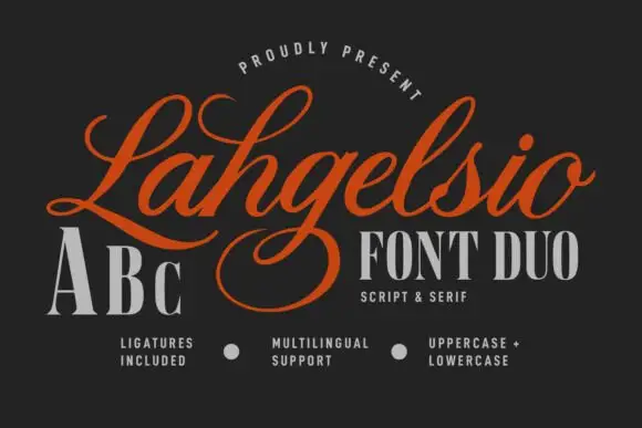
Flourished formal script paired with a tall contrast serif
Lahgelsio is a duo: an ornate script with tall loops and a mirrored flourish, and a tall high-contrast serif with fine hairlines, made to be stacked on the same card.
Ideas for this font
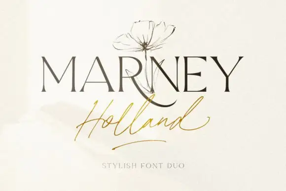
Fine serif and loose signature duo
Marney Holland pairs a tall high-contrast serif capital cut with a loose thin script: the R curls its leg below the serif line, the script runs light through its joins and a long low exit stroke closes the written line.
Ideas for this font
Same independent foundry
Allow optional Google Analytics to measure visits and catalogue actions. Your search words and notes are not included. Privacy & storage



