Modern Grotesque Body

Texas Retro + Monure
Creates crisp high-hierarchy contrast beneath Texas Retro headlines across menus, websites and labels.
Inspect Monure specimenDisclosure: MakerFileHub may earn a commission from qualifying purchases via paid links on this page. How our links work.
Cowboy western slab
Texas Retro is a cowboy western slab in brown with a cream outline on an off-white ground: heavy caps with spurred serifs, a swollen waist and closed counters, set on two lines inside an ornamental frame with stars, hairline rules and corner scrolls, and a tracked line beneath.
Paid link
Get this fontProject & layout blueprintsAt-a-glance maker compatibility
Sturdy stroke walls and open counters weed cleanly on adhesive vinyl, HTV apparel film, and cut cardstock.
Visual anatomy & craft review
The two words are stacked and the drawing is a western slab at heavy weight: the serifs sprout small spurs, the waist swells, and the counters are narrow, which gives the block its period silhouette. The cream outline separates the letters from the ground and lets the brown read as a printed ink rather than a flat fill. The frame does the rest of the work — hairline rules, stars, corner scrolls and a small divider — and the tracked line beneath is set in a condensed caps face. Because the letters are heavy, the face reads at sign scale and on apparel, and the specimen sets it large inside the frame so the spurs are visible.
Western, slab, bold, nostalgic
Two-font hierarchy recipes
Tested contrast partners — pairing Texas Retro with grounded secondary typography.
Texas Retro + Monure
Creates crisp high-hierarchy contrast beneath Texas Retro headlines across menus, websites and labels.
Inspect Monure specimen
Texas Retro + Esmeralda
Adds a warm human signature touch for 1-to-3-word callouts without competing against structured serif capitals.
Inspect Esmeralda specimenPractical applications
Concrete hierarchy, scale and production guidance tailored to Texas Retro’s stroke geometry.
A western slab reads as a smokehouse sign, and the heavy spurs survive in paint at fascia scale where a lighter face would soften.
Hierarchy & layout recipe
Paint a 1,300 by 400 mm fascia: the name at 130 mm cap height, a 4 mm outline, and the hours in a 26 mm slab. Keep 30 mm margins and paint two colours on a light board.
Pre-production check
Check the fascia at 130 mm, where a spur can close a counter; keep them above 5 mm. Confirm the 26 mm hours read at four metres and that the outline stays even along the whole word.
A western slab prints as two screens and reads as a themed shirt, and the outline gives the graphic an edge on a dark garment.
Hierarchy & layout recipe
Print a 260 mm chest graphic: the phrase at 55 mm cap height, a 3 mm outline, and two inks on a dark shirt. Keep the thinnest serif at 4 mm and place the graphic 80 mm below the collar.
Pre-production check
Check the screen at actual mesh, where a 4 mm serif fills; thicken it. Wash-test one shirt and confirm the outline stays registered after five cycles.
A western slab gives a rodeo poster the look of a printed bill, and the frame supplies the ornament a period poster expects.
Hierarchy & layout recipe
A2 portrait: the event at 120 mm cap height, the dates in a 24 mm slab, and the venue at 12 mm. Keep 30 mm margins and print two colours on a warm ground with the frame as the border.
Pre-production check
Check the poster at five metres, where the narrow counters can close; keep them above 5 mm. Confirm the 12 mm venue reads at three metres and that the frame clears the trim.
Technical & licence verification
Confirm included OTF/TTF/WOFF formats, full glyph tables and licence coverage on the live store page before batch production.
Closest visual alternatives
Matched across letterform anatomy, stroke behaviour and craft applications.
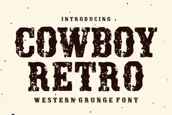
Western capitals with pinched sides and large broken ink patches
Cowboy Retro uses dark Western slabs with inward notches at mid-height, where broad pale chips break the heavy fill around the C and O and the word edges turn visibly irregular.
Ideas for this font
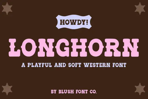
Soft rounded western slab with a light serif line
Longhorn Western is a soft western display in pink on brown: fat rounded slab capitals with eased corners, a wide fit, and a small ribbon banner above carrying a greeting in a lighter slab.
Ideas for this font
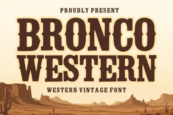
Broad Western slabs with pinched mid-stroke notches
Bronco Western uses heavy brown capitals with broad feet and inward pinches at mid-height, where the narrow O counter changes width around its centre to reinforce the Western sign character.
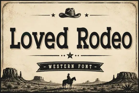
Vintage western slab with ornaments
Loved Rodeo is a vintage western slab in black on aged paper: bracketed slab serifs, a slightly flared stem, an R with a spurred leg, and a composition framed by a hat, stars, a ribbon banner and a desert silhouette, so the pair reads as a saloon sign rather than as a modern serif.
Ideas for this font
Same independent foundry
Allow optional Google Analytics to measure visits and catalogue actions. Your search words and notes are not included. Privacy & storage