Modern Grotesque Body

Superior Actioned + Montreal
Creates crisp high-hierarchy contrast beneath Superior Actioned headlines across menus, websites and labels.
Inspect Montreal specimenDisclosure: MakerFileHub may earn a commission from qualifying purchases via paid links on this page. How our links work.
Tall geometric chamfered slab
Superior Actioned is a tall geometric slab in white on black: extremely tall caps with deep chamfers and narrow vertical counters, a full numeral row above, and a small block of description at the foot.
Paid link
Get this fontProject & layout blueprintsAt-a-glance maker compatibility
Sturdy stroke walls and open counters weed cleanly on adhesive vinyl, HTV apparel film, and cut cardstock.
Visual anatomy & craft review
The two words are stacked and the drawing is a slab at the geometric end: the stems are tall and vertical, the serifs are squared, and every corner is chamfered at forty-five degrees, which gives the face the look of stencilled or cut lettering rather than of printed type. The chamfers are the detail that limits the size range, because they close the counters when the letters shrink, and the plate is honest about it by setting the block as tall as the sheet allows. The numeral row above shows the figures at the same construction, which is what a poster or a jersey needs, and the small description at the foot is set in a plain sans. Because the counters are narrow, the face works at large sizes, and the black ground keeps the white crisp.
Slab, geometric, tall, athletic
Two-font hierarchy recipes
Tested contrast partners — pairing Superior Actioned with grounded secondary typography.
Superior Actioned + Montreal
Creates crisp high-hierarchy contrast beneath Superior Actioned headlines across menus, websites and labels.
Inspect Montreal specimen
Superior Actioned + Silken Luxe
Adds a warm human signature touch for 1-to-3-word callouts without competing against structured serif capitals.
Inspect Silken Luxe specimenPractical applications
Concrete hierarchy, scale and production guidance tailored to Superior Actioned’s stroke geometry.
A chamfered slab reads as cut lettering, and the tall narrow forms fit a long team name on a banner without dropping the cap height.
Hierarchy & layout recipe
Print 1,300 by 500 mm: the fixture at 160 mm cap height, the date in a 34 mm sans, and a 5 mm rule. Keep 30 mm margins and print one colour on a dark vinyl.
Pre-production check
Check the banner at ten metres, where the chamfers can vanish; keep them above 8 mm. Confirm the 34 mm date reads at five metres and that the eyelets clear the block.
A chamfered slab gives a cover a contemporary poster feel, and the narrow counters hold at thumbnail size where a wide slab would clot.
Hierarchy & layout recipe
Set the title at 80 mm cap height across 190 mm in two lines, the subtitle in a 10 pt sans, and the year at 8 pt. Print one ink on a matte stock and keep the lines tight.
Pre-production check
Check the title at 80 mm, where the chamfers can merge at the joins; open the tracking. Confirm the 8 pt year survives lamination and that the block clears the trim.
A chamfered slab reads as kit lettering, and the tall forms hold in embroidery where a rounded face loses its shape at small size.
Hierarchy & layout recipe
Set the mark at 70 mm on a banner, 30 mm on a jersey back and 14 mm on a card, keeping the chamfers above 20 mm. Hold clear space equal to the cap height on every side.
Pre-production check
Check the 14 mm card mark, where a chamfer closes the counter; use a plain cut at that size. Confirm the 30 mm jersey mark reads at eight metres and that the stitch holds.
Technical & licence verification
Confirm included OTF/TTF/WOFF formats, full glyph tables and licence coverage on the live store page before batch production.
Closest visual alternatives
Matched across letterform anatomy, stroke behaviour and craft applications.
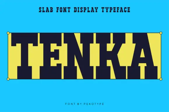
Very heavy square slab
Tenka is a very heavy square slab in dark navy on bright cyan: capitals built from wide slab blocks with tall tight counters and blunt serifs, set as one word between two corner dots inside a hairline box, with a plain line above and a credit beneath.
Ideas for this font
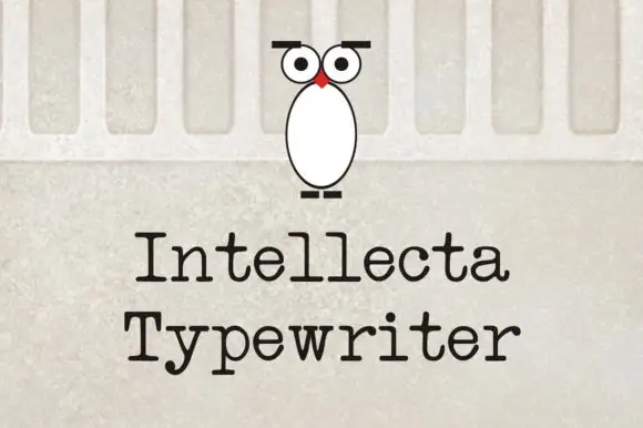
Evenly spaced typewriter-like letters with rounded slab feet
Intellecta Typewriter shows black title-case words in two lines on a pale wall-like background, where the letters carry relatively even stroke weight, broad horizontal feet and a y that drops below the second word with a short bent ending while the r finishes in a small rounded shoulder.
Ideas for this font
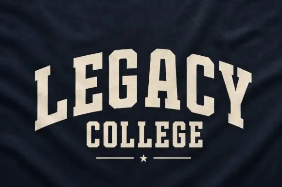
Narrow solid college capitals
Legacy College is a narrow solid college block in cream on navy heather fabric: the word is arched over a straight second line, with a rule and a star closing the composition.
Ideas for this font
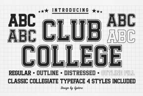
Tall collegiate blocks supplied in regular, outline, distressed and filled styles
Club College is a tall collegiate capital alphabet supplied in four treatments — regular, outline, distressed and outline fill — all built on the same squared skeleton with heavy slabs.
Ideas for this font
Same independent foundry
Allow optional Google Analytics to measure visits and catalogue actions. Your search words and notes are not included. Privacy & storage



