Neutral Sans Workhorse

Puscreb + Sailors
Lets Puscreb own the focal silhouette while handling secondary copy, sizing and subheads cleanly.
Inspect Sailors specimenDisclosure: MakerFileHub may earn a commission from qualifying purchases via paid links on this page. How our links work.
Tall narrow display with curved blades
Puscreb is a very tall narrow display in near-black on an aged paper ground: capitals with curved blades at the outer edges, deep pointed shoulders and narrow bodies, set as one large word above two plain lines and a small paragraph of description.
Paid link
Get this fontProject & layout blueprintsAt-a-glance maker compatibility
Sturdy stroke walls and open counters weed cleanly on adhesive vinyl, HTV apparel film, and cut cardstock.
Visual anatomy & craft review
The plate is a printed specimen on aged paper, and the paragraph of description at the foot is unusual: the sheet states plainly what the face is and where it belongs rather than leaving it to the buyer. The drawing is a very tall capital with curved blades on the outer edges, so the letters read as a gothic hybrid rather than as a blackletter, and the blades give each stem an outward flick that makes the word wider at the top and bottom than in the middle. That construction sets a moderate size floor, because the blades thin first. It suits a title, a logo and a poster, and the blade flicks mean the face needs clearance at both margins.
Display, tall, sharp, dramatic
Two-font hierarchy recipes
Tested contrast partners — pairing Puscreb with grounded secondary typography.
Puscreb + Sailors
Lets Puscreb own the focal silhouette while handling secondary copy, sizing and subheads cleanly.
Inspect Sailors specimen
Puscreb + Cervelique
Grounds bold display lettering with classic typographic authority on posters, badges and apparel.
Inspect Cervelique specimenPractical applications
Concrete hierarchy, scale and production guidance tailored to Puscreb’s stroke geometry.
A bladed display reads as a title card, and the narrow bodies fill a portrait frame with one word. The blades sell the drama.
Hierarchy & layout recipe
A2 poster: the title at 110 mm cap height, the details in a 14 mm serif, and the venue at 11 mm. Keep 30 mm margins and print one colour on a dark stock.
Pre-production check
Check the A2 at five metres, where a blade can vanish; keep it above 2.5 mm. Confirm the 11 mm venue reads at two metres and that the blades clear the margin.
A bladed display gives a dark cover a title with a silhouette, and the narrow fit holds a long word on a portrait format.
Hierarchy & layout recipe
Set the title at 100 mm cap height across 140 mm, the author in a 12 pt serif, and the imprint at 8 pt. Print two colours on a textured stock and keep 20 mm margins.
Pre-production check
Check the title at 100 mm, where a blade can clot; keep the counters open. Confirm the 8 pt imprint survives lamination and that the blades clear the trim by 12 mm.
A bladed lockup reads as tattoo lettering, and the heavy stems hold on a window in vinyl at night. It reads as tattoo lettering.
Hierarchy & layout recipe
Cut 700 by 300 mm vinyl: the studio at 110 mm cap height, the line in a 20 mm serif, and a 4 mm contour. Keep 25 mm margins and apply to a pane at dusk.
Pre-production check
Check the cut at 110 mm, where a 4 mm blade can tear on weeding; widen it to 6 mm. Confirm the 20 mm line reads at two metres and that the blades clear the frame.
Technical & licence verification
Confirm included OTF/TTF/WOFF formats, full glyph tables and licence coverage on the live store page before batch production.
Closest visual alternatives
Matched across letterform anatomy, stroke behaviour and craft applications.
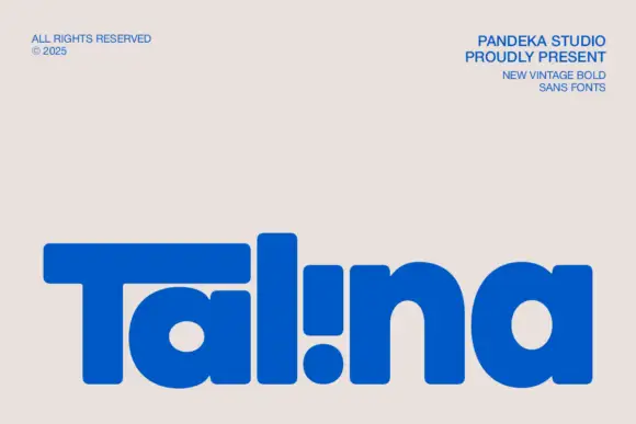
Heavy rounded logo display
Talina is a heavy rounded display in royal blue on a pale sheet: a short name set in very heavy rounded letters with an extended T arm, wide round bowls and an inverted dot-and-stem i that reads as a cut counter, with three small credits in the corners.
Ideas for this font
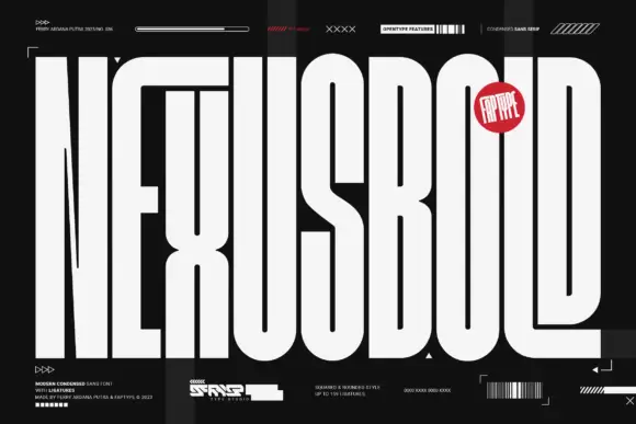
Ultra-tall narrow capitals
Nexusbold is an ultra-tall condensed display in off-white on black: capitals with shared-looking top bars, long rectangular counters and flat terminals, set as one enormous word that fills the whole sheet, surrounded by small technical labels, a barcode and a red badge.
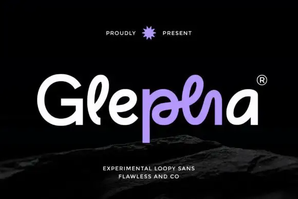
Looped rounded mixed case with interwoven central strokes and a deep p stem
Glepha shows white and purple lettering on black, where a broad open G introduces rounded lowercase forms, the l rises into a narrow loop and the central letters intertwine through a crossing horizontal stroke, while the p drops far below the main bodies and the final a keeps a simple broad bowl.
Ideas for this font
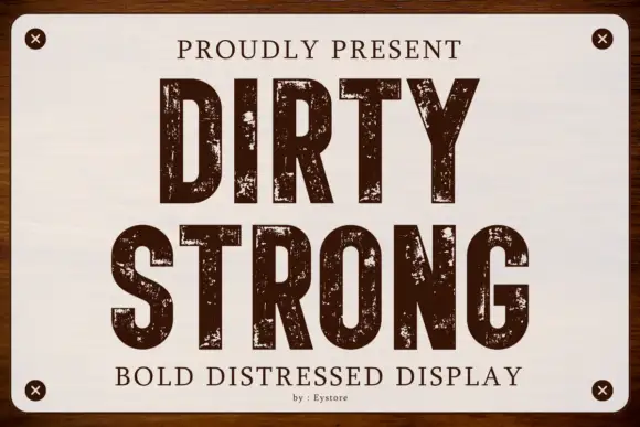
Condensed capitals with coarse scattered erosion and straight stems
Dirty Strong is a condensed industrial display in which the stems run straight and narrow, the bowls stay compact and coarse patches of wear break the fill at several scales, so a heading reads as paint on a warehouse sign.
Ideas for this font
Same independent foundry
Allow optional Google Analytics to measure visits and catalogue actions. Your search words and notes are not included. Privacy & storage