Editorial Serif Anchor

Super School + Resquel
Anchors Super School's fluid strokes with crisp Roman proportions on wedding suites, headers and packaging.
Inspect Resquel specimenDisclosure: MakerFileHub may earn a commission from qualifying purchases via paid links on this page. How our links work.
Tall irregular rounded capitals
Super School is a tall hand-lettered capital display in a warm four-colour palette, with irregular rounded strokes, a bouncing baseline and drawn stars and bursts around the words.
Paid link
Get this fontProject & layout blueprintsAt-a-glance maker compatibility
Weld or Unite overlapping script joins into one continuous vector path before sending to the blade.
Visual anatomy & craft review
Super runs above School in tall condensed capitals, and every letter is drawn by hand: the stems are slightly bowed, the terminals are rounded, the crossbar of the first S sits at an angle and the letters sit at different heights so the rows have the rhythm of a hand-painted sign. The palette is limited to orange, deep teal, salmon pink and coral, with each word using the whole set in sequence rather than one colour per word. Small drawn stars, dots and burst marks fill the spaces beside the letters, and a line of loose handwriting at the foot reads a cute handlettered fonts. The face is a cheerful display for school and children's material: it needs a large size for the irregular strokes to read as drawn, and the colours can be reduced to one without losing the shape.
A multicolour hand-lettered school display
Two-font hierarchy recipes
Tested contrast partners — pairing Super School with grounded secondary typography.
Super School + Resquel
Anchors Super School's fluid strokes with crisp Roman proportions on wedding suites, headers and packaging.
Inspect Resquel specimen
Super School + Lemon Milk Pro FTR
Keeps small-scale dates, URLs, nutrition facts and care instructions crisp and legible below script titles.
Inspect Lemon Milk Pro FTR specimenPractical applications
Concrete hierarchy, scale and production guidance tailored to Super School’s stroke geometry.
Tall hand-lettered capitals are how a primary classroom labels its displays, and the irregular strokes suit work pinned up by children.
Hierarchy & layout recipe
Print a 420 by 297 mm sheet: set the board title at 120 pt on one row, keep 28 mm of clear ground beneath before the subject line at 22 pt, and hold 20 mm of margin on all four sides.
Pre-production check
School printers drop the warm palette to muddy tones; print one sheet on the actual machine and check the colours before the set.
A hand-lettered multi-colour banner reads across a playground, and the drawn stars give it a festive finish without extra artwork.
Hierarchy & layout recipe
Print a 1000 by 400 mm banner: set the fair name at 170 pt on one row, keep 32 mm of clear ground beneath before the date at 28 pt, and hold 28 mm of border on all sides.
Pre-production check
Wide vinyl banners make hand-drawn strokes look wobbly; print one at the final size and check the letterforms before the order.
A cheerful sign marks where the party is, which is what a room full of parents actually needs, and the drawn stars do the decoration.
Hierarchy & layout recipe
Print a 400 by 250 mm board: set the greeting at 90 pt on one row, keep 22 mm of clear ground beneath before the times at 18 pt, and hold 20 mm of border on all sides.
Pre-production check
Party boards are usually printed at home; print one on the actual machine and check that the pastel letters separate before the set.
Technical & licence verification
Confirm included OTF/TTF/WOFF formats, full glyph tables and licence coverage on the live store page before batch production.
Closest visual alternatives
Matched across letterform anatomy, stroke behaviour and craft applications.
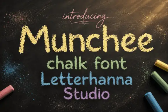
Chalk-textured display
Munchee is a chalk-textured display in cream and pastel on a blackboard: letters drawn with a broken chalky edge, a rounded skeleton with uneven heights, and three further lines in green, blue and purple that show the same face in different chalk colours.
Ideas for this font
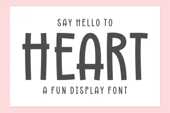
Tall hand-drawn capitals with rough edges and thin raised crossbars
Heart is a tall hand-drawn capital alphabet in which the strokes are narrow and rough-edged, the crossbars sit high and thin, and every letter leans a little, so a word reads as something brushed on a wall.
Ideas for this font
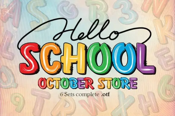
Bright irregular capitals with pale curved highlights and rough dark offsets
Hello School shows chunky irregular capitals in red, orange, yellow, green, blue and violet, where pale curved strokes sit inside the faces, dark rough-edged offsets create a drawn shadow and the large SCHOOL row has tall open counters with uneven widths.
Ideas for this font
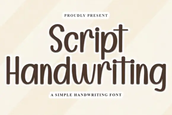
Tall rounded separate handwriting
Script Handwriting is a tall rounded handwriting in brown on cream: narrow letters with a high x-height, a light monoline stroke, fully rounded ends and short ascenders, set as an unjoined hand rather than a script.
Same independent foundry
Allow optional Google Analytics to measure visits and catalogue actions. Your search words and notes are not included. Privacy & storage



