Editorial Serif Anchor

Sunset Paradise + Amor Hadena
Anchors Sunset Paradise's fluid strokes with crisp Roman proportions on wedding suites, headers and packaging.
Inspect Amor Hadena specimenDisclosure: MakerFileHub may earn a commission from qualifying purchases via paid links on this page. How our links work.
Chic script with cherries and a badge
Sunset Paradise is a chic script in green on cream: rounded strokes with a slight taper, tall narrow letters, a bouncy baseline and a heart in place of the dot on the i, set inside a drawn shield panel over red stripes.
Paid link
Get this fontProject & layout blueprintsAt-a-glance maker compatibility
Weld or Unite overlapping script joins into one continuous vector path before sending to the blade.
Visual anatomy & craft review
The two words are stacked inside a bordered shield, and the face is a mid-century script: the S opens with a loop, the u and the n are narrow, the s and the e close small, the P of Paradise throws a tall loop and the final e lifts into a shallow exit, while the letters stay upright and the whole phrase bounces so the pair reads as a hand-painted sign. The stroke is medium with a soft taper, the joins are short and the counters are open, which is what lets a green script read on a cream panel at a moderate size. Drawn cherries hang at the upper right and lower left, small red bursts sit between the words, and the shield is laid over wide red stripes with a scalloped edge. Sunset Paradise is a script for packaging, menus and cards with a warm vintage tone.
A mid-century script on a shield panel
Two-font hierarchy recipes
Tested contrast partners — pairing Sunset Paradise with grounded secondary typography.
Sunset Paradise + Amor Hadena
Anchors Sunset Paradise's fluid strokes with crisp Roman proportions on wedding suites, headers and packaging.
Inspect Amor Hadena specimen
Sunset Paradise + Bielchon
Keeps small-scale dates, URLs, nutrition facts and care instructions crisp and legible below script titles.
Inspect Bielchon specimenPractical applications
Concrete hierarchy, scale and production guidance tailored to Sunset Paradise’s stroke geometry.
A mid-century script gives a summer celebration a bright, period voice, and the drawn panel turns a plain board into a framed sign.
Hierarchy & layout recipe
Print a 500 by 350 mm board: set the greeting at 96 pt over two lines, keep 24 mm of clear ground beneath before the names at 22 pt, and hold 22 mm of border on all four sides.
Pre-production check
A bouncy script inside a drawn frame can sit off centre; print one at the final size and check the balance before the set.
A warm script with drawn fruit sets a cheerful tone, and the heart dot keeps it from reading as a generic greeting card.
Hierarchy & layout recipe
Print a 120 by 120 mm square card: set the greeting at 30 pt over two lines, keep 14 mm of clear ground beneath before the message at 9.5 pt, and hold 13 mm of margin on all four sides.
Pre-production check
The drawn cherries and the script can compete on a small card; print one at the finished size and check the hierarchy before the batch.
A vintage script suits a drink sold on nostalgia, and the narrow letters fit a long flavour name inside the drawn shield label.
Hierarchy & layout recipe
Print a 55 by 90 mm shield label: set the flavour at 15 pt on one line, keep 6 mm of clear ground beneath before the volume at 5 pt, and hold 5 mm of margin on all four sides.
Pre-production check
A drawn border plus a script can crowd a small label; print one on the real stock and check the panel before the order.
Technical & licence verification
Confirm included OTF/TTF/WOFF formats, full glyph tables and licence coverage on the live store page before batch production.
Closest visual alternatives
Matched across letterform anatomy, stroke behaviour and craft applications.
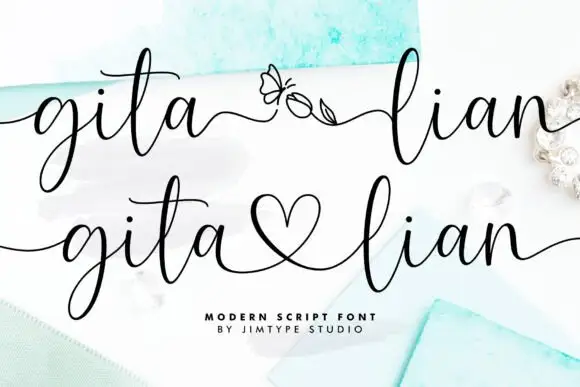
Elegant script with long entry swashes and drawn connectors
Gita Lian is an elegant script in which long swashes enter and leave the word and a drawn connector ties two names together, so a two-name lockup reads as a single written gesture rather than as two separate words.
Ideas for this font
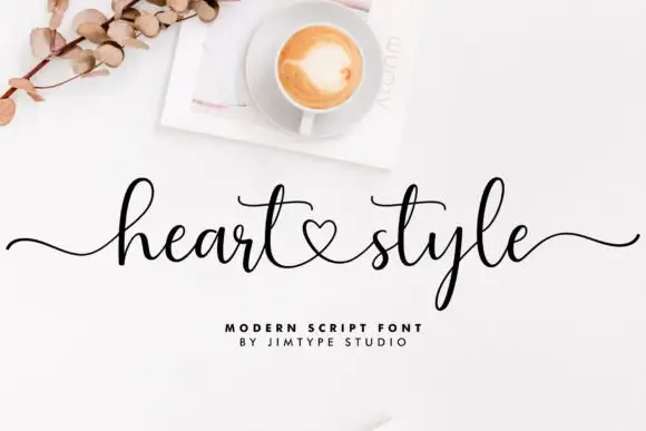
Script with a central heart connection
Heart Style joins two words through a small heart, with long outer strokes stretching the heading across the artwork while the h and l rise well above the word body, the y falls below it and two long t crossbars sit near the centre.
Ideas for this font
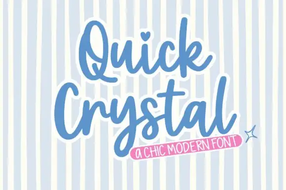
Rounded bold script with a keyline
Quick Crystal is a rounded bold script in blue with a white keyline on a pale striped ground: fat even strokes, a capital Q with a curled tail, and a final l that lifts into a short exit as the word ends.
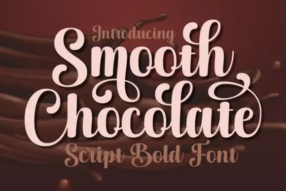
Broad looped confectionery script
Smooth Chocolate is a broad looped script in pale pink over poured chocolate: wide bowls, tall loops, ball terminals on the ascenders and a light script caption in the same family beneath.
Same independent foundry
Allow optional Google Analytics to measure visits and catalogue actions. Your search words and notes are not included. Privacy & storage