High-Contrast Display Serif

Sunday Memories + Kernova
Pairs sculptural editorial warmth with Sunday Memories's clean modern geometry.
Inspect Kernova specimenDisclosure: MakerFileHub may earn a commission from qualifying purchases via paid links on this page. How our links work.
Festive condensed sans with a flowing script
Sunday Memories is a festive duo: a bold condensed sans in red and green with a flowing script written across the gap between the two words, framed by drawn holly.
Paid link
Get this fontProject & layout blueprintsAt-a-glance maker compatibility
Weld or Unite overlapping script joins into one continuous vector path before sending to the blade.
Visual anatomy & craft review
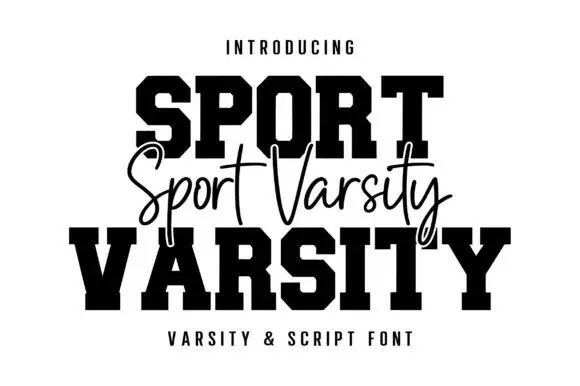
Sunday is set in red and Memories in green, both in the same bold condensed sans with rounded corners and a hand-drawn edge, and between them the words Sunday Memories are written again in a fine flowing script that overlaps the bottom of the first word and the top of the second. That overlap is the layout idea: the script acts as a bridge, so the two heavy rows read as one composition rather than as two lines. Drawn holly and berry sprigs fill the four corners inside a thin frame, and three captions at the top, middle and bottom name the pair and its intended use. The duo is a seasonal combination for cards, tags and packaging: the sans carries the loud words, the script carries the message, and the red and green pair should be kept to those two inks.
A Christmas pair in red and green
Two-font hierarchy recipes
Tested contrast partners — pairing Sunday Memories with grounded secondary typography.
Sunday Memories + Kernova
Pairs sculptural editorial warmth with Sunday Memories's clean modern geometry.
Inspect Kernova specimen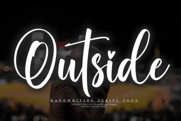
Sunday Memories + Outside
Introduces organic movement on pull-quotes, signatures and gift tags.
Inspect Outside specimenPractical applications
Concrete hierarchy, scale and production guidance tailored to Sunday Memories’s stroke geometry.
The red and green pair does the seasonal work without a photograph, and the script bridge gives a simple two-word greeting a designed layout.
Hierarchy & layout recipe
Print a 120 by 120 mm square card: set the main words at 34 pt across two rows with the script at 20 pt bridging them, keep 14 mm of clear ground beneath the greeting, and hold 12 mm of margin.
Pre-production check
Red over green can read as a vibration on a cheap print; print one card on the actual machine and check the edges before the batch.
A tag needs a greeting and a name in a very small space, and the pair separates the two without adding a second typeface to the job.
Hierarchy & layout recipe
Print a 45 by 80 mm tag: set the greeting at 12 pt, set the name at 8 pt in the script beneath with 5 mm of clear ground, and hold 4 mm from the holly frame to the punch hole.
Pre-production check
The drawn holly crowds a small tag; print one at the real size, punch it and check the frame before the order.
A hamper label is read at arm's length on a table, and the bold condensed words plus a script line give a small producer a seasonal mark.
Hierarchy & layout recipe
Print a 70 by 45 mm label: set the product at 14 pt, set the greeting at 9 pt in the script with 4 mm of clear ground, and hold 4 mm from the corner sprig to the die line.
Pre-production check
Two inks on a kraft label turn muddy; print one on the real stock and check the red before the order.
Technical & licence verification
Confirm included OTF/TTF/WOFF formats, full glyph tables and licence coverage on the live store page before batch production.
Closest visual alternatives
Matched across letterform anatomy, stroke behaviour and craft applications.
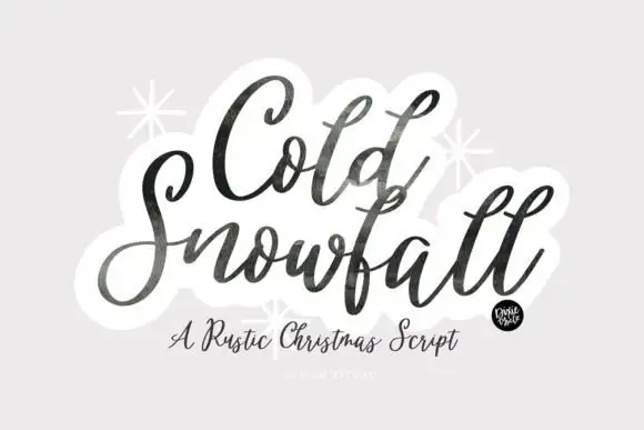
Textured slanted seasonal brush script
Cold Snowfall is a slanted thick-thin seasonal script whose dark strokes look worn at the edges, whose tittles are drawn as snowflakes and whose tall f and l loops crowd the centre line.
Ideas for this font
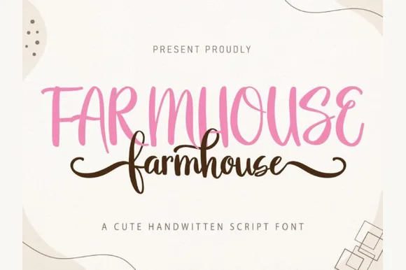
Playful tall farmhouse sans & wing-tailed script duo
Farmhouse (by MistyDesigns) is a coordinated farmhouse font duo pairing bouncy tall uppercase print with a heart-and-curl-tailed cursive script.
Ideas for this font
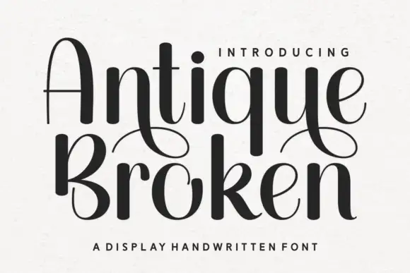
Handwritten display with high contrast and broken strokes
Antique Broken is a handwritten display alphabet in which the strokes swell to heavy dark shapes and then break into thin lines, so a word reads as drawn with a broad nib that lifted between strokes.
Ideas for this font
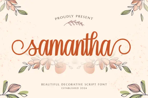
Heavy decorative script with curled entries
Samantha is a heavy decorative script in warm orange on speckled cream: thick even strokes, a tall loop on the h, curled entry and exit strokes on the s and the a, and an illustrated bouquet of leaves and flowers drawn beneath the word.
Ideas for this font
Same independent foundry
Allow optional Google Analytics to measure visits and catalogue actions. Your search words and notes are not included. Privacy & storage