High-Contrast Display Serif

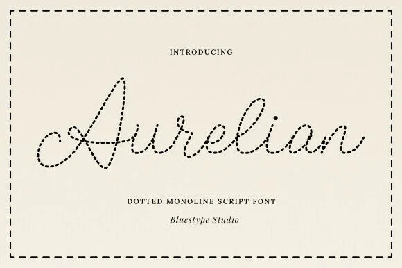
Sunday Inspired + Auretha
Pairs sculptural editorial warmth with Sunday Inspired's clean modern geometry.
Inspect Auretha specimenDisclosure: MakerFileHub may earn a commission from qualifying purchases via paid links on this page. How our links work.
Playful script and tall sans duo
Sunday Inspired is a playful duo in coral on cream: a tall narrow sans in caps for the first line and a light handwritten script for the second, with small hearts flanking the lockup and a round badge at the right, so the plate reads as a friendly brand set rather than a single typeface.
Paid link
Get this fontProject & layout blueprintsAt-a-glance maker compatibility
Weld or Unite overlapping script joins into one continuous vector path before sending to the blade.
Visual anatomy & craft review
The pairing is the design: the caps are tall, even and upright, while the script is loose, slanted and connected, and the contrast between the two lets one line carry the name and the other carry the tone. The caps stay narrow enough to fit a long word across a band, and the script keeps its loops open so it survives at small sizes. Small outlined hearts sit at either side of the lockup and a circular badge states the format, which is the commercial language of a duo product. The palette is a single coral on cream with a pale band across the middle, and the two captions at the foot are set in the same sans and in the script, so the sheet demonstrates the pairing rather than describing it.
Duo, playful, handwritten, friendly
Two-font hierarchy recipes
Tested contrast partners — pairing Sunday Inspired with grounded secondary typography.
Sunday Inspired + Auretha
Pairs sculptural editorial warmth with Sunday Inspired's clean modern geometry.
Inspect Auretha specimen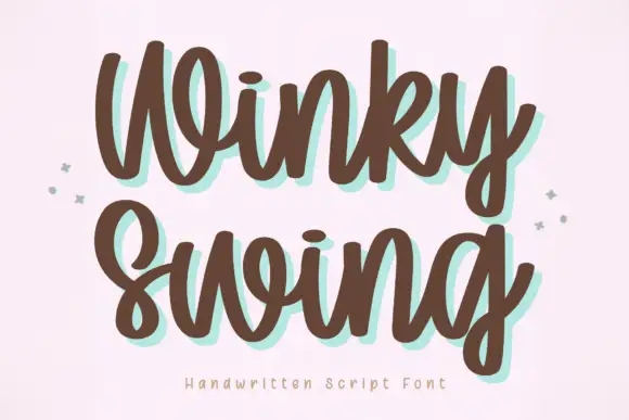
Sunday Inspired + Winky Swing
Introduces organic movement on pull-quotes, signatures and gift tags.
Inspect Winky Swing specimenPractical applications
Concrete hierarchy, scale and production guidance tailored to Sunday Inspired’s stroke geometry.
A tall caps face and a light script give a bakery a name and a tone from one purchase, and the narrow caps keep a long word readable on a bag where a wide face would wrap.
Hierarchy & layout recipe
Set the name at 30 pt in the caps, the descriptor at 14 pt in the script, and the address at 7 pt in the caps. Keep one colour, hold 6 mm clear around the lockup, and build a stacked version for square formats.
Pre-production check
Check the 14 pt script descriptor, where a light stroke can fade; keep the size above 12 pt. Confirm the name reads on a kraft bag and that the stacked version keeps the same optical spacing.
A caps-plus-script duo gives a relaxed wedding a consistent voice across a welcome sign and table cards, and the script carries the warmth that the caps alone would not.
Hierarchy & layout recipe
A1 board: the names at 90 mm in the caps, the greeting at 60 mm in the script, and the date at 24 mm. Keep 40 mm margins and paint one colour on a light board so the script's loops stay open at distance.
Pre-production check
Check the script at 60 mm on a painted board, where thin joins can break; thicken the stroke for the panel. Confirm the 24 mm date reads from four metres and that the caps and script look like one family.
A friendly duo suits a school fair, and the narrow caps fit the event name across the top of an A4 while the script handles the welcome line.
Hierarchy & layout recipe
A4 print: the event at 44 mm in the caps, the welcome at 22 mm in the script, and the times at 10 mm in the caps. Keep 20 mm margins and print one colour on coloured paper so the notice stands out.
Pre-production check
Check the A4 at two metres, where a light script can thin out behind glass; keep the ink solid. Confirm the 10 mm times read at arm's length and that the script line does not push the details off the sheet.
Technical & licence verification
Confirm included OTF/TTF/WOFF formats, full glyph tables and licence coverage on the live store page before batch production.
Closest visual alternatives
Matched across letterform anatomy, stroke behaviour and craft applications.

Looped handwritten script paired with a bold rounded sans in small caps
Enchanted Bride is a duo of a looped handwritten script with soft rounded stems and a bold rounded sans, arranged so the script carries the names and the sans carries the labels.
Ideas for this font
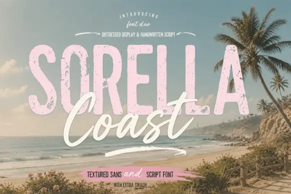
Distressed display sans and handwritten script
Sorella Coast is a duo: a tall distressed display sans in dusty pink with worn edges and speckles, and a loose handwritten script in cream that crosses the block letters.
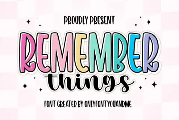
Tall narrow display capitals with a looping script
Remember Things is a duo on a pink checker ground: tall narrow display capitals in pastel colours with a heavy dark outline, and a fat looping script in black beneath them.
Ideas for this font
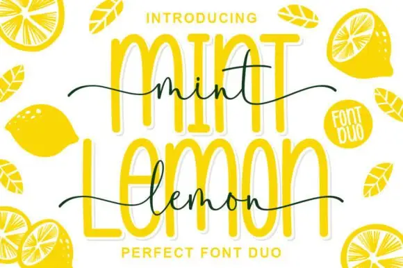
Outlined tall caps with a thin script crossing
Mint Lemon is a duo in bright yellow: tall outline capitals with a thick white cut-out, and a thin handwriting script that crosses them at the waist, with drawn lemon halves around the card.
Ideas for this font
Same independent foundry
Allow optional Google Analytics to measure visits and catalogue actions. Your search words and notes are not included. Privacy & storage