High-Contrast Display Serif

Jolie + Auretha
Pairs sculptural editorial warmth with Jolie's clean modern geometry.
Inspect Auretha specimenDisclosure: MakerFileHub may earn a commission from qualifying purchases via paid links on this page. How our links work.
Rounded solid capitals paired with fine butterfly-and-leaf contours along their edges
Jolie places broad white capitals on turquoise with fine coloured contours following parts of the outer edges: the contours rise into small looped butterfly shapes near the upper terminals and tiny leaf sprigs grow from several lower strokes.
Paid link
Get this fontProject & layout blueprintsAt-a-glance maker compatibility
Cut solid base, outline, and shadow layers in separate vinyl colors and align on registration marks.
Visual anatomy & craft review
The white bodies stay heavy and round, the ornament runs as a hairline beside the edges and the botanical marks appear at selected terminals rather than on every letter. The weight difference between body and ornament is the character: one shape carries the word and a second, much finer line decorates it, which is why the cover stacks the two treatments. Because the ornament is a hairline, keep 1.25 inches of stacked height before it survives, and confirm how the solid and decorative layers are accessed rather than assuming automatic multicolour output.
Duo · Solid caps · Fine ornament
Two-font hierarchy recipes
Tested contrast partners — pairing Jolie with grounded secondary typography.
Jolie + Auretha
Pairs sculptural editorial warmth with Jolie's clean modern geometry.
Inspect Auretha specimen
Jolie + Hailey
Introduces organic movement on pull-quotes, signatures and gift tags.
Inspect Hailey specimenPractical applications
Concrete hierarchy, scale and production guidance tailored to Jolie’s stroke geometry.
The fine butterfly contours give a suite its ornament, and the solid capitals keep the names clear at 40 mm on heavy card stock. The fine ornament also keeps a bold row from feeling heavy.
Hierarchy & layout recipe
Print a 130 by 180 mm card: set the names at 40 mm in capitals, keep 10 mm of clear card outside the contours, and set the venue at 9 pt in a light serif with 14 mm of clear ground below.
Pre-production check
A hairline contour printed under 0.3 mm breaks; check the film at full size and keep the names at 34 mm or above.
The leaf sprigs suit a flacon label, and the round bodies stay solid at 26 mm on a 50 mm panel in two colours. The leaf sprigs also give a bottle a botanical note.
Hierarchy & layout recipe
Print a 50 by 60 mm label: set the house name at 26 mm, keep every leaf stem at 0.4 mm, and set the volume in a 5 pt caps at the foot with 4 mm of clear ground. Keep the ornament on the front panel.
Pre-production check
Two colours on a hairline ornament misregister; check the plate proof and keep the ornament in the darker ink.
The butterfly contours soften a bold row, and the solid capitals hold a name at 36 pt on an A6 sheet. The contours also give a card its detail at small size.
Hierarchy & layout recipe
Print an A6 card: set the name at 36 pt, keep 12 mm of clear card around the ornament, and set the details at 9 pt in a plain sans in the lower third. Keep the ornament on the flat centre.
Pre-production check
Ornament on every terminal at small size looks busy; check the card and keep the decoration on two letters at most.
Technical & licence verification
Confirm included OTF/TTF/WOFF formats, full glyph tables and licence coverage on the live store page before batch production.
Closest visual alternatives
Matched across letterform anatomy, stroke behaviour and craft applications.
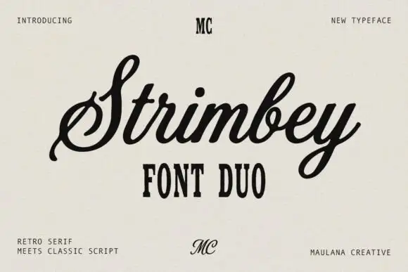
Retro serif with a classic script
Strimbey is a duo on warm cream: a retro condensed serif in small capitals with tall flat-topped letters, and a classic script with fine contrast that flows above it, with small monogram marks at the top and foot of the sheet.
Ideas for this font
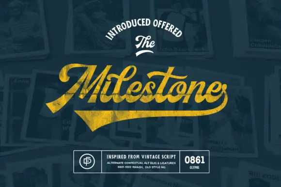
Vintage script with a heavy swash underline
Milestone is a vintage script in gold on navy: a heavy connected script with a swash that runs beneath the word and lifts into a broad tail, presented over a collage of old photographs and a badge block.
Ideas for this font
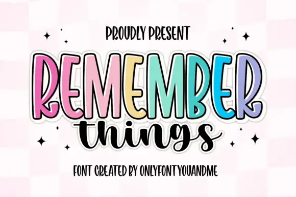
Tall narrow display capitals with a looping script
Remember Things is a duo on a pink checker ground: tall narrow display capitals in pastel colours with a heavy dark outline, and a fat looping script in black beneath them.
Ideas for this font
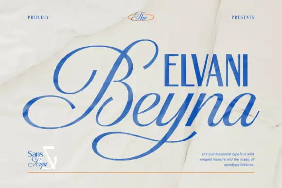
High-contrast calligraphic script with a wide sweeping capital
Beyna Elvani is a high-contrast calligraphic script in which the capital sweeps below the baseline, the joins stay thin and the ligatures tie the letters, so a name reads as an engraved signature with a single long gesture.
Ideas for this font
Same independent foundry
Allow optional Google Analytics to measure visits and catalogue actions. Your search words and notes are not included. Privacy & storage