Modern Grotesque Body

Typedeer Mono + Nyxar
Creates crisp high-hierarchy contrast beneath Typedeer Mono headlines across menus, websites and labels.
Inspect Nyxar specimenDisclosure: MakerFileHub may earn a commission from qualifying purchases via paid links on this page. How our links work.
Typewriter stamp display
Typedeer Mono is a typewriter-stamp display in black on white: rough typed mixed case with square feet, uneven ink and bracket punctuation, set as one word with a yellow label above, a stamp at the lower right and two plain notes at the foot.
Paid link
Get this fontProject & layout blueprintsAt-a-glance maker compatibility
Fine grain and micro-texture excel in 300 DPI print, sublimation, and screen print rather than small vinyl weeding.
Visual anatomy & craft review
The plate is built around the stamp idea: the word is set as though it were struck by a rubber stamp, with uneven ink, square feet and a wide monospaced fit, and the bracket characters are used as punctuation in the sample, which shows the buyer how the face handles them. That construction sets a moderate size floor, because the uneven ink reads as texture only above a certain size, and the plate sets the word large enough that the roughness is legible. The yellow label above and the stamp at the lower right are product graphics that name the style and the space count, and the two plain notes carry the studio and the glyph count. Because the letters are monospaced and rough, the face suits a label, a poster and a card for a workshop, a record or a coffee brand.
Slab, typewriter, rough, mono
Two-font hierarchy recipes
Tested contrast partners — pairing Typedeer Mono with grounded secondary typography.
Typedeer Mono + Nyxar
Creates crisp high-hierarchy contrast beneath Typedeer Mono headlines across menus, websites and labels.
Inspect Nyxar specimen
Typedeer Mono + Autography
Adds a warm human signature touch for 1-to-3-word callouts without competing against structured serif capitals.
Inspect Autography specimenPractical applications
Concrete hierarchy, scale and production guidance tailored to Typedeer Mono’s stroke geometry.
A stamped mono face gives a roaster a workshop register, and the monospaced fit keeps a long date stamp aligned. A date stamp needs a mono fit to line up.
Hierarchy & layout recipe
Print a 60 by 90 mm label: the roaster at 14 pt, the blend at 8.5 pt, and the roast date at 8 pt. Keep 5 mm inside the die and keep the smallest detail above 0.4 mm.
Pre-production check
Check the 8 pt date on a label, where the rough ink can clot; keep it above 9 pt. Confirm the date stamps align in the mono fit and that the label holds on a bag.
A stamped face gives a zine a printed-by-hand feel, and the mono fit lets a short title hold a wide, even measure. A zine should look printed by hand.
Hierarchy & layout recipe
Set the title at 60 mm cap height across 170 mm, the issue in a 9 pt mono, and the price at 8 pt. Print one ink on a newsprint stock and keep 20 mm margins.
Pre-production check
Check the title at 60 mm, where the rough edge can fill on newsprint; keep it above 0.5 mm. Confirm the 8 pt price reads and that the title clears the trim.
A stamped card reads as a note from the shop rather than a marketing piece, and the mono fit keeps the details aligned. A shop card should sound like a note.
Hierarchy & layout recipe
A6 card: the greeting at 18 pt, the message at 9.5 pt, and the address at 8 pt. Keep 16 mm margins and print one ink on a cream card. Leave 16 mm at the foot for the address line.
Pre-production check
Check the 9.5 pt message on cream card, where the rough ink can break; keep it above 10 pt. Confirm the greeting reads at arm's length and that the card takes an envelope.
Technical & licence verification
Confirm included OTF/TTF/WOFF formats, full glyph tables and licence coverage on the live store page before batch production.
Closest visual alternatives
Matched across letterform anatomy, stroke behaviour and craft applications.
Thin typewriter monospace
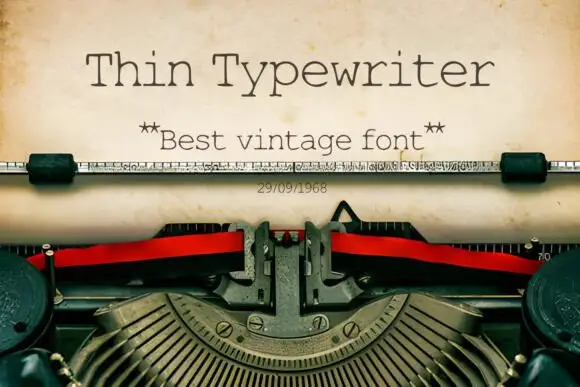
Thin Typewriter is a thin monospaced slab in dark ink on aged paper, set inside a typewriter: light uniform strokes, slab serifs on every stem, a tall x-height and wide letterspacing that comes from the fixed advance, with a star-flanked subtitle and a dated line beneath.
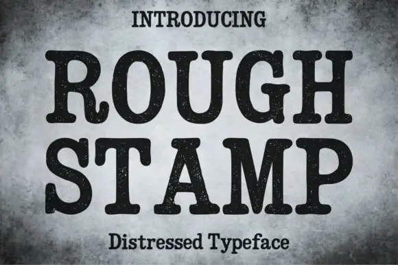
Distressed rounded slab
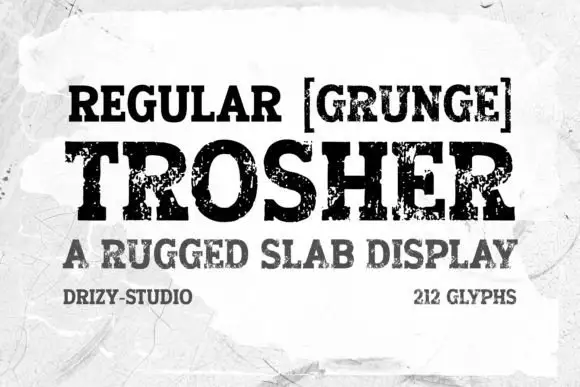
Rough Stamp is a rounded heavy slab in black on a mottled grey ground: fat stems with round slab serifs, a curled R leg and fine speckled wear across every stroke, set on two lines with tracked caps above and a subtitle beneath.
Ideas for this font
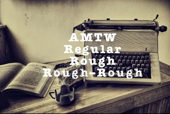
Heavy typed-looking forms shown in clean and increasingly broken treatments
AMTW is a heavy typewriter-style slab in which rounded feet and broad bowls appear in three treatments: a fairly clean regular row, a broken rough row and a much more eroded third row beneath the main initials.
Ideas for this font
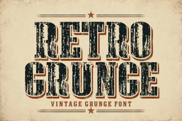
Tall worn slabs with vertical scrape texture
Retro Grunge shows tall closely spaced slab capitals with rounded bowls and deep vertical scratches, where the E and R keep heavy stems even as the surface breaks and a red-brown offset edge sits behind the black letters on aged paper.
Ideas for this font
Same independent foundry
Allow optional Google Analytics to measure visits and catalogue actions. Your search words and notes are not included. Privacy & storage