Modern Grotesque Body

Moonlight + Nyxar
Creates crisp high-hierarchy contrast beneath Moonlight headlines across menus, websites and labels.
Inspect Nyxar specimenDisclosure: MakerFileHub may earn a commission from qualifying purchases via paid links on this page. How our links work.
Tall irregular handwritten slab serif
Moonlight is a handwritten slab serif in deep purple on lavender: tall narrow letters with blunt serifs, an uneven baseline and a second bold cut, shown over soft painted shapes.
Paid link
Get this fontProject & layout blueprintsAt-a-glance maker compatibility
Sturdy stroke walls and open counters weed cleanly on adhesive vinyl, HTV apparel film, and cut cardstock.
Visual anatomy & craft review
Moonlight fills the card in one word, and the lettering is drawn rather than set: the M is tall and narrow with a small middle vertex, the o's are joined by a bridge across the top, the n and the h carry blunt rectangular serifs, the l and the t rise high and the g drops into a curved descender. The baseline wanders, the strokes vary slightly in weight and the serifs sit at slightly different angles, which is what keeps the face looking written rather than cut. Behind the word, soft painted shapes in lavender, cream and blue give a watercolour ground, and a caption beneath notes that there are regular and bold cuts. The face is a warm display serif for packaging, cards and small signs: it needs a decent size for the serifs, and it holds a two-word name better than a long line.
A handwritten slab on lavender
Two-font hierarchy recipes
Tested contrast partners — pairing Moonlight with grounded secondary typography.
Moonlight + Nyxar
Creates crisp high-hierarchy contrast beneath Moonlight headlines across menus, websites and labels.
Inspect Nyxar specimen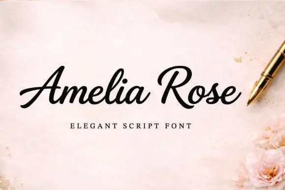
Moonlight + Amelia Rose
Adds a warm human signature touch for 1-to-3-word callouts without competing against structured serif capitals.
Inspect Amelia Rose specimenPractical applications
Concrete hierarchy, scale and production guidance tailored to Moonlight’s stroke geometry.
A handwritten slab is warm without being rustic, and it stays readable for older guests who find a script hard to parse.
Hierarchy & layout recipe
Print a 450 by 300 mm board: set the greeting at 80 pt on one row, keep 22 mm of clear ground beneath before the names at 22 pt, and hold 20 mm of border on all sides.
Pre-production check
A wandering baseline reads as a printing fault at large size; print one board at the final size and check the rhythm before the set.
A slab with handwritten details suggests a workshop rather than a factory, and the bold cut gives a short product name presence.
Hierarchy & layout recipe
Print a 55 by 45 mm label: set the product at 14 pt on one row, keep 5 mm of clear ground beneath before the scent at 5 pt, and hold 4 mm from the lowest serif to the die line.
Pre-production check
Blunt serifs can merge at label size; print one at the real size and check the n and the h before the order.
A warm slab separates a home and lifestyle page from the news pages, and the tall narrow letterforms fit a long heading on one line.
Hierarchy & layout recipe
Print a 230 by 300 mm opener: set the heading at 52 pt on one row, keep 18 mm of clear ground beneath before the standfirst at 10.5 pt, and hold 18 mm of margin on both sides.
Pre-production check
Even a slight irregularity can look like a fault beside justified copy; print one opener and check the heading sits level before the issue.
Technical & licence verification
Confirm included OTF/TTF/WOFF formats, full glyph tables and licence coverage on the live store page before batch production.
Closest visual alternatives
Matched across letterform anatomy, stroke behaviour and craft applications.
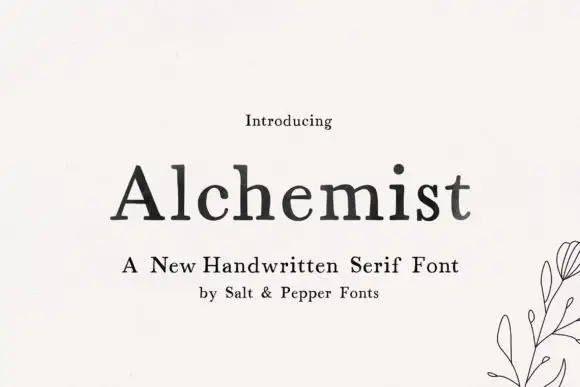
Soft handwritten serif with irregular small details
Alchemist shows black mixed-case letters with modest contrast and softly uneven edges, where a wide A and rounded lowercase bowls sit beside a tall h and a lightly curved t terminal, and the title rests on cream next to a small botanical line drawing and handwritten-serif wording.
Ideas for this font
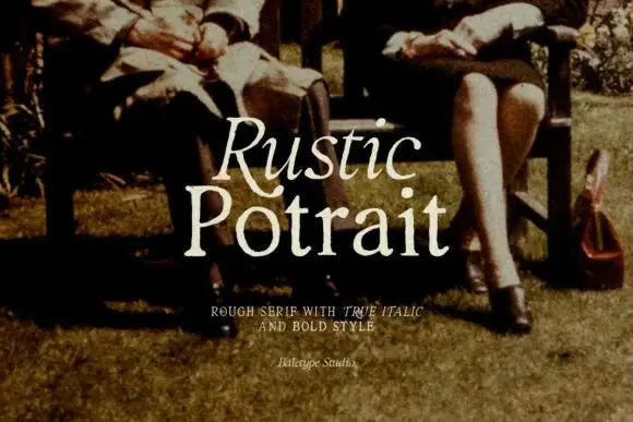
Rough serif with italic
Rustic Portrait is a rough serif in warm cream over a sepia photograph of two people on a garden bench: moderate contrast, soft worn serifs and a slight tilt, with the first word in the roman and the second in the same cut, and a tracked line beneath naming the italic and bold.
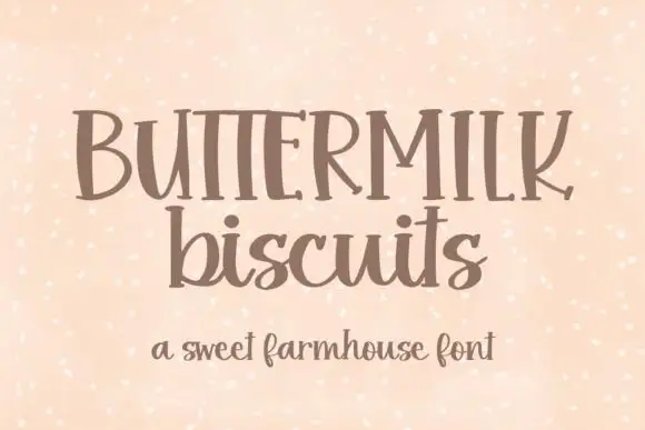
Irregular flared serif with a handwritten rhythm and uneven letter widths
Buttermilk Biscuits is a serif with a handwritten rhythm: the serifs flare unevenly, the letter widths vary, and the capitals mix proportions so a word reads as something lettered by hand with a broad nib.
Ideas for this font
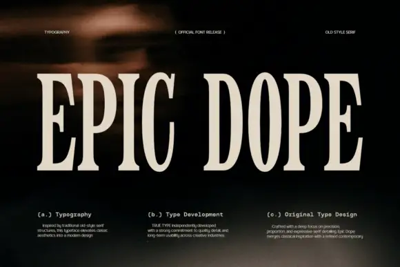
Condensed old-style serif with tall narrow letterspaced capitals
Epic Dope is a condensed old-style serif in which the capitals stretch tall, the serifs finish in small balls and the fit runs narrow, so a two-word title reads as a film credit card rather than as a headline.
Ideas for this font
Same independent foundry
Allow optional Google Analytics to measure visits and catalogue actions. Your search words and notes are not included. Privacy & storage