Neutral Sans Workhorse

Sport Varsity + Nyxar
Lets Sport Varsity own the focal silhouette while handling secondary copy, sizing and subheads cleanly.
Inspect Nyxar specimenDisclosure: MakerFileHub may earn a commission from qualifying purchases via paid links on this page. How our links work.
Playful handmade athletic display
Sport Varsity is a playful handmade display in black over a pale stadium photograph: tall irregular caps with thick strokes, a bouncing baseline, uneven widths and blunt terminals, set on two lines with tracked lines above and beneath naming the category.
Paid link
Get this fontProject & layout blueprintsAt-a-glance maker compatibility
Sturdy stroke walls and open counters weed cleanly on adhesive vinyl, HTV apparel film, and cut cardstock.
Visual anatomy & craft review
The two words are stacked and the drawing is hand lettering at heavy weight: the strokes vary, the letters lean and bounce, and the widths differ from letter to letter, which keeps a varsity subject playful rather than official. That is the point of the face: it borrows the energy of sports lettering without the discipline of a college slab, so it suits a school fair more than a league kit. Because the strokes are heavy, the face reads at a distance and on fabric, and the counters stay open enough for small sizes. The plate sets it over a pale photograph of a stadium, which gives context without competing, and the tracked lines above and beneath are set in a plain caps face.
Playful, handmade, bold, athletic
Two-font hierarchy recipes
Tested contrast partners — pairing Sport Varsity with grounded secondary typography.
Sport Varsity + Nyxar
Lets Sport Varsity own the focal silhouette while handling secondary copy, sizing and subheads cleanly.
Inspect Nyxar specimen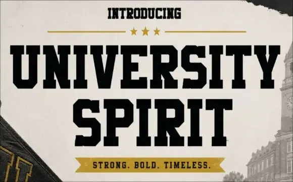
Sport Varsity + University Spirit
Grounds bold display lettering with classic typographic authority on posters, badges and apparel.
Inspect University Spirit specimenPractical applications
Concrete hierarchy, scale and production guidance tailored to Sport Varsity’s stroke geometry.
A playful handmade face reads as a painted school banner, and the heavy strokes hold on vinyl where a thin script would break up in sunlight.
Hierarchy & layout recipe
Print 1,200 by 500 mm: the event at 150 mm cap height, the times in a 30 mm sans, and a 6 mm border. Keep 30 mm margins and print two colours on a light ground.
Pre-production check
Check the banner at six metres, where the bounce can look like crooked setting; align the first and last letters. Confirm the 30 mm times read at four metres and that the border clears the eyelets.
A handmade athletic face prints as one screen and looks drawn rather than licensed, which suits a family celebration more than an official team kit would.
Hierarchy & layout recipe
Print a 250 mm chest graphic: the name at 55 mm cap height, the age at 45 mm, and one ink on a light shirt. Keep the thinnest stroke at 4 mm and place the graphic 80 mm below the collar.
Pre-production check
Check the screen at actual mesh, where a 4 mm stroke fills; thicken it. Wash-test one shirt and confirm the age stays legible after five cycles.
A playful face reads as a neighbourhood gym rather than a chain, and the thick letters hold on a board that sits outdoors.
Hierarchy & layout recipe
Paint a 1,000 by 400 mm board: the gym at 120 mm cap height, the classes in a 24 mm sans, and a 5 mm rule. Keep 25 mm margins and paint two colours on a light board.
Pre-production check
Check the board at four metres, where the bounce can read as damage; keep the variation subtle. Confirm the 24 mm classes read at two metres and that the rule clears the frame.
Technical & licence verification
Confirm included OTF/TTF/WOFF formats, full glyph tables and licence coverage on the live store page before batch production.
Closest visual alternatives
Matched across letterform anatomy, stroke behaviour and craft applications.
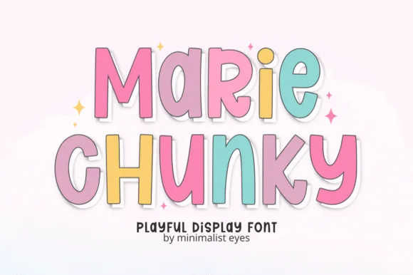
Tall bouncy pastel sticker cartoon sans
Marie Chunky is a tall, lively cartoon display font mixing uppercase and lowercase bubble shapes inside crisp outline borders!
Ideas for this font
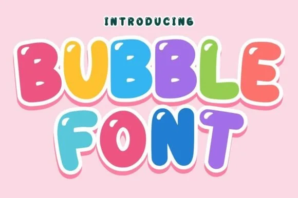
Bouncy comic-tilted rainbow cartoon bubble sans
Bubble (by Infinity art Studio) is a lively, tilted-baseline cartoon bubble font with open rounded counters and energetic kid-merchandise bounce.
Ideas for this font
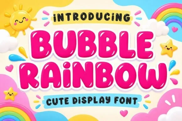
Ultra-plump kawaii bubble display with shine highlights
Bubble Rainbow is a super-plump, jellybean-round bubble display font accented with cute curved shine highlights inside each letter.
Ideas for this font
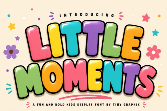
3D comic-extruded chunky kids' bubble display
Little Moments is a heavy, comic-book kids' bubble font with tilted overlapping capitals, plump rounded bellies, and glossy cartoon punch.
Ideas for this font
Same independent foundry
Allow optional Google Analytics to measure visits and catalogue actions. Your search words and notes are not included. Privacy & storage