Modern Grotesque Body

Spooky Season + Furion
Creates crisp high-hierarchy contrast beneath Spooky Season headlines across menus, websites and labels.
Inspect Furion specimenDisclosure: MakerFileHub may earn a commission from qualifying purchases via paid links on this page. How our links work.
Rustic serif with ghost counters
Spooky Season is a rustic serif shown on a linen book cover: uneven edges, bracketed serifs and counter details drawn as tiny ghost silhouettes, in rust, tan, sage and black, set in two stacked words on a cream ground with autumn leaves on the table around it.
Paid link
Get this fontProject & layout blueprintsAt-a-glance maker compatibility
Fine grain and micro-texture excel in 300 DPI print, sublimation, and screen print rather than small vinyl weeding.
Visual anatomy & craft review
The plate is a product mock-up, and the type is photographed on a linen cover, which is honest for a face with this much surface detail: the uneven edges and the ghost counters are visible at a size a buyer would actually use. The letters are a warm bracketed serif rather than a novelty display, so the word reads as a printed book title, and the small ghosts inside the counters give it the seasonal note without a scene. That construction sets a moderate size floor, because the ghost counters close first. The leaves and the table are staging. It suits a cover, a card and a tag for an autumn or a cosy Halloween subject.
Serif, rustic, halloween, warm
Two-font hierarchy recipes
Tested contrast partners — pairing Spooky Season with grounded secondary typography.
Spooky Season + Furion
Creates crisp high-hierarchy contrast beneath Spooky Season headlines across menus, websites and labels.
Inspect Furion specimen
Spooky Season + Stylish
Adds a warm human signature touch for 1-to-3-word callouts without competing against structured serif capitals.
Inspect Stylish specimenPractical applications
Concrete hierarchy, scale and production guidance tailored to Spooky Season’s stroke geometry.
A rustic serif sets a warm season, and the ghost counters add the note without making the card frightening. It reads as a warm season.
Hierarchy & layout recipe
A6 card: the greeting at 30 pt, the details in a 10 pt serif, and the date at 9 pt. Keep 15 mm margins, print three colours on a cream card and leave 12 mm at the foot for the address.
Pre-production check
Check the 30 pt greeting at home-print resolution, where a ghost counter closes; keep it above 1.2 mm. Confirm the details read at arm's length and that the card folds flat.
A rustic serif carries a seasonal collection, and the uneven edges suit a textured cover better than a polished face. It suits a text cover.
Hierarchy & layout recipe
Set the title at 70 mm cap height across 165 mm, the author in an 11 pt serif, and the imprint at 8 pt. Print two colours on a textured stock and keep 22 mm margins.
Pre-production check
Check the title at 70 mm, where an edge can clot; keep the counters open. Confirm the 8 pt imprint survives lamination and that the ghost details clear the trim.
A rustic tag names a farm sale, and the warm colours hold on kraft where a dark face would look heavy. It reads on kraft stock.
Hierarchy & layout recipe
Print 50 by 75 mm tags: the farm at 12 pt, the product at 8 pt, and two colours on a kraft card. Keep 5 mm inside the die and keep the ghost counters above 0.8 mm.
Pre-production check
Check the 12 pt farm on kraft, where a ghost counter fills; keep it above 0.8 mm. Confirm the 8 pt product reads at arm's length and that the tags tie cleanly.
Technical & licence verification
Confirm included OTF/TTF/WOFF formats, full glyph tables and licence coverage on the live store page before batch production.
Closest visual alternatives
Matched across letterform anatomy, stroke behaviour and craft applications.
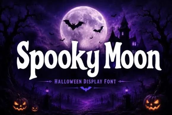
Bulbous seasonal display
Spooky Moon is a bulbous display in white on a purple graveyard scene: heavy letters with rounded shoulders, flared stems and a few small spurs, a tight rhythm and a slight bounce, with a tracked subtitle beneath and a small bat divider between the words.
Ideas for this font
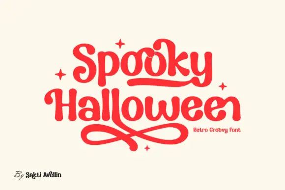
Rounded retro letters with looping underlines
Spooky Halloween uses soft heavy serif shapes rather than sharp or dripping forms, set in red on cream, with a rounded underline that runs under the first word, crossed loops sweeping beneath the second and four small four-point stars placed around the block.
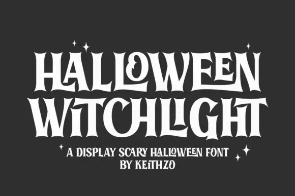
Tall flared Halloween letters with inward curls
Halloween Witchlight shows tall narrow letters with sharply flared ends, where a curled counter and stretched horizontal strokes vary a dense two-line title and the flares open at the feet and crowns of the stems.
Ideas for this font
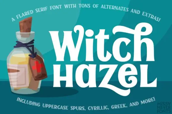
Flared mixed-case serifs with long curling terminals
Witch Hazel shows substantial white serif letters on teal beside an illustrated bottle, where the strokes flare before each serif, the bowls stay round, a tall h curls across the top and a broad z sweeps into a long low tail.
Ideas for this font
Same independent foundry
Allow optional Google Analytics to measure visits and catalogue actions. Your search words and notes are not included. Privacy & storage