Neutral Sans Workhorse

Spooky Monster + Hermano
Lets Spooky Monster own the focal silhouette while handling secondary copy, sizing and subheads cleanly.
Inspect Hermano specimenDisclosure: MakerFileHub may earn a commission from qualifying purchases via paid links on this page. How our links work.
Layered Halloween display with two cuts
Spooky Monster is a two-cut Halloween display in cream and orange on purple: a sharp gothic-flavoured capital cut for the first word and an ornate swashed serif for the second, both stacked over flat illustrations of ghosts, pumpkins and skulls.
Paid link
Get this fontProject & layout blueprintsAt-a-glance maker compatibility
Sturdy stroke walls and open counters weed cleanly on adhesive vinyl, HTV apparel film, and cut cardstock.
Visual anatomy & craft review
The two words show the two cuts: the upper line is a narrow display with angular cuts and small spurs, drawn to look like carved lettering, while the lower line is a wider serif with long swashes on the M and the R and a heavy base, so the pair covers both a spooky and a festive register. Both are set at the same width and stacked tightly, which makes the pair read as a single lockup, and the swashes of the lower line reach up between the letters of the upper one, so the two cuts interlock rather than sit apart. The ground is a flat purple field with cartoon ghosts, a pumpkin and bones around the edges, and the caption beneath is set in the first cut at a much smaller size, showing the range of the family.
Halloween, ornate, playful, spooky
Two-font hierarchy recipes
Tested contrast partners — pairing Spooky Monster with grounded secondary typography.
Spooky Monster + Hermano
Lets Spooky Monster own the focal silhouette while handling secondary copy, sizing and subheads cleanly.
Inspect Hermano specimen
Spooky Monster + Grandeur – Elegant Classic Serif
Grounds bold display lettering with classic typographic authority on posters, badges and apparel.
Inspect Grandeur – Elegant Classic Serif specimenPractical applications
Concrete hierarchy, scale and production guidance tailored to Spooky Monster’s stroke geometry.
Two cuts of one family give a poster a headline and a reading line in the same voice, which matters when the artwork is busy with illustrations.
Hierarchy & layout recipe
A2 portrait: the two words at 110 mm and 90 mm, the details in the narrow cut at 18 mm, and the illustrations kept to the borders. Keep 25 mm margins so the swashes never cross the illustration edge.
Pre-production check
Check the interlock between the two lines at full size, where the lower swashes can touch the upper letters and look like a printing error; keep 4 mm of air. Confirm the 18 mm details read at three metres and that the swashes clear the trim.
A festive Halloween pair keeps a birthday card seasonal without being frightening, which matters when the card is for a child or a grandparent.
Hierarchy & layout recipe
A6 card: the first word at 30 pt, the second at 26 pt, the details in the narrow cut at 9 pt. Keep the card to two colours plus the ground so a home printer reproduces the swashes cleanly at that size.
Pre-production check
Check the 26 pt swashed line on a home printer, where a thin swash tip can break; keep the swashes only above 24 pt. Confirm the 9 pt details read at arm's length and that the two lines do not collide.
A festive pair reads as a school fair rather than a horror event, and the narrow cut at small sizes keeps the practical details legible beside a decorative headline.
Hierarchy & layout recipe
A4 print: the headline at 60 mm, the details in the narrow cut at 12 mm, and a single pumpkin illustration in the corner. Keep the palette to three colours so the notice photocopies without turning muddy.
Pre-production check
Check the A4 on a school copier, where the orange can shift toward grey and weaken the contrast; test one copy. Confirm the 12 mm details read from two metres and that the illustration does not crowd the swashes.
Technical & licence verification
Confirm included OTF/TTF/WOFF formats, full glyph tables and licence coverage on the live store page before batch production.
Closest visual alternatives
Matched across letterform anatomy, stroke behaviour and craft applications.
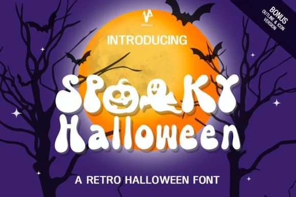
70s groovy ghost & jack-o'-lantern counter font (+ Bonus Outline & Icons!)
Spooky Halloween (by NPNaay) is a 1970s groovy display pack hiding cute ghosts & jack-o'-lanterns inside letter bowls—PLUS a Bonus Outline & Icon version!
Ideas for this font
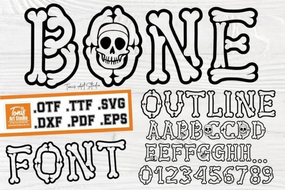
Cartoon hollow bone & grinning-skull Halloween alphabet (.OTF .TTF .SVG .DXF .PDF .EPS)!
Bone Outline builds every letter and '0–9' numeral out of cartoon skeleton bones—complete with a grinning skull inside 'O'—in OTF, TTF, SVG, DXF, PDF & EPS!
Ideas for this font
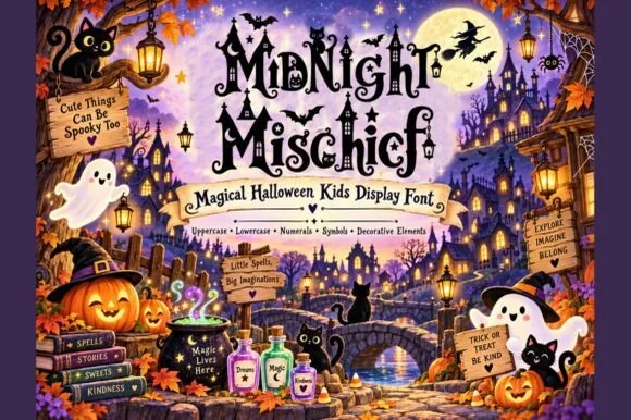
Whimsical witchy storybook Halloween font with curls, stars & spiders
Midnight Mischief is an enchanted children's Halloween display font curling fairy-tale serif stems with hanging spiders, stars, and moons! (Full charset + elements).
Ideas for this font
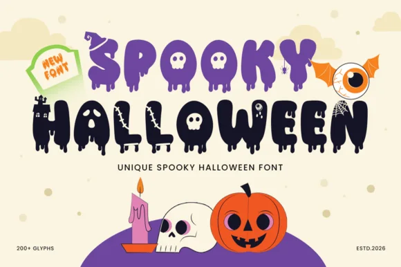
200+ glyph melting-ooze, witch-hat & haunted-castle horror alphabet
Spooky Halloween (by Umitype) is a loaded 200+ glyph Halloween display font crowning melting slime letters with witch hats, haunted castles, skulls & eyeballs!
Ideas for this font
Same independent foundry
Allow optional Google Analytics to measure visits and catalogue actions. Your search words and notes are not included. Privacy & storage