Neutral Sans Workhorse

Soccer Army + Corven
Lets Soccer Army own the focal silhouette while handling secondary copy, sizing and subheads cleanly.
Inspect Corven specimenDisclosure: MakerFileHub may earn a commission from qualifying purchases via paid links on this page. How our links work.
Soccer-panel rounded block
Soccer Army is a display face on a white ground: four large rounded capitals tiled with black-and-white soccer panels, a full alphabet, numeral and punctuation row beneath in the same fill, and small soccer balls at the sides of the frame.
Paid link
Get this fontProject & layout blueprintsAt-a-glance maker compatibility
Sturdy stroke walls and open counters weed cleanly on adhesive vinyl, HTV apparel film, and cut cardstock.
Visual anatomy & craft review
The plate is a craft sheet, and the alphabet row is the honest evidence: it shows the whole set at a smaller size, so a buyer can see how the panels behave before committing to a heading. The letters are rounded blocks tiled edge to edge with ball panels, so the fill reads as the letter's own surface rather than as a pattern laid over it, and the outline stays thin so the panels keep their contrast. That construction sets a moderate size floor, because the panels merge first, but it is a coarser fill than most novelty faces and survives a smaller size. The soccer balls at the sides are supplied ornament. It suits a shirt, a poster and a party card for a football subject.
Decorative, soccer, panel, sport
Two-font hierarchy recipes
Tested contrast partners — pairing Soccer Army with grounded secondary typography.
Soccer Army + Corven
Lets Soccer Army own the focal silhouette while handling secondary copy, sizing and subheads cleanly.
Inspect Corven specimen
Soccer Army + The Simple Editorial
Grounds bold display lettering with classic typographic authority on posters, badges and apparel.
Inspect The Simple Editorial specimenPractical applications
Concrete hierarchy, scale and production guidance tailored to Soccer Army’s stroke geometry.
A panel display prints as supporters' kit, and the coarse fill holds on a shirt where a fine novelty face would turn to grey.
Hierarchy & layout recipe
Print a 250 mm chest graphic: the club at 55 mm cap height, the year at 24 mm, and two inks on a light shirt. Keep the smallest panel at 3 mm and place the graphic 80 mm below the collar.
Pre-production check
Check the screen at actual mesh, where a 3 mm panel can fill; enlarge it to 4 mm. Wash-test one shirt and confirm the contrast stays clean after five cycles.
A panel display names a league, and the fill reads at distance where a flat block would look like a generic sign. It reads as a league bill.
Hierarchy & layout recipe
A2 poster: the league at 100 mm cap height, the details in a 20 mm sans, and the venue at 11 mm. Keep 28 mm margins, print two colours on a light stock and keep the panels above 3 mm.
Pre-production check
Check the A2 at five metres, where a panel vanishes; keep the larger panels only. Confirm the 11 mm venue reads at two metres and that the rule clears the type.
A panel card names the party, and the black and white fill suits a card printed in one ink on coloured stock. It suits a one-ink card.
Hierarchy & layout recipe
A6 card: the greeting at 30 pt, the details in a 10 pt sans, and the date at 9 pt. Keep 15 mm margins, print one ink on a coloured card and leave 12 mm at the foot for the address.
Pre-production check
Check the 30 pt greeting at home-print resolution, where a panel closes; keep it above 1.2 mm. Confirm the details keep a 4.5:1 contrast and that the card folds flat.
Technical & licence verification
Confirm included OTF/TTF/WOFF formats, full glyph tables and licence coverage on the live store page before batch production.
Closest visual alternatives
Matched across letterform anatomy, stroke behaviour and craft applications.
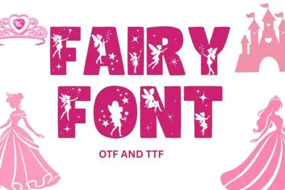
Broad block capitals with pale fairy silhouettes and small star-shaped openings
Fairy is a colour font that draws heavy block capitals in pink and cuts a fairy silhouette into each letter, with sparkles scattered through the fill and a castle drawn beside the words.
Ideas for this font
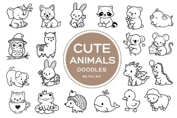
Rounded black outline animal dingbats with simple expressions and props
Cute Animals Doodles is a typable collection of about two dozen animals — elephant, corgi, bunny, raccoon, bear, owl, alpaca, koala, mouse, hedgehog, whale, duck, sheep, a small dragon — each drawn in one even black line.
Ideas for this font
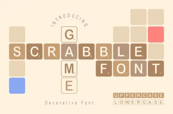
Game-tile display
Scrabble Game is a novelty display on cream: plain capitals set inside rounded square tiles with small numerals in the lower corner, arranged on a grid as a crossword, with blank and coloured tiles filling the gaps and a small format line at the lower right.
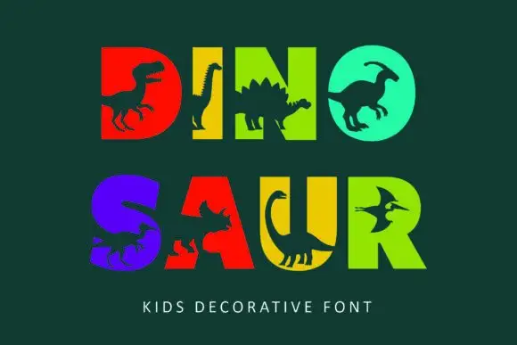
Heavy block capitals cut through by distinct dinosaur silhouettes
Dinosaur sets heavy square capitals in solid colours and cuts a dinosaur silhouette out of each letter, so a word reads as a row of coloured blocks with prehistoric animals standing in the counters.
Ideas for this font
Same independent foundry
Allow optional Google Analytics to measure visits and catalogue actions. Your search words and notes are not included. Privacy & storage