Neutral Sans Workhorse

Agondara + Furion
Lets Agondara own the focal silhouette while handling secondary copy, sizing and subheads cleanly.
Inspect Furion specimenDisclosure: MakerFileHub may earn a commission from qualifying purchases via paid links on this page. How our links work.
Condensed ornamental gothic with forked top terminals and spiral descenders
Agondara is a condensed ornamental gothic in which the strokes curve heavily, the top terminals fork into points, the bowls end in inward curls and the g drops into a large spiral, so a masthead reads as a heritage fashion title.
Paid link
Get this fontProject & layout blueprintsAt-a-glance maker compatibility
Sturdy stroke walls and open counters weed cleanly on adhesive vinyl, HTV apparel film, and cut cardstock.
Visual anatomy & craft review
The A lifts a narrow apex above heavy shoulders, the g spirals a long tail under the baseline, the o closes a curved bowl into an inward hook and the ascenders finish in forked points rather than flat cuts. The forked terminals are the character: they give a condensed word a sharp edge, which is why the sample sets one large masthead over a portrait. Because the ornaments sit outside the letter, the face needs 40 pt in print and generous leading, and it weeds from three quarters of an inch of cap height. The fashion portrait, the small cover lines and the magazine furniture are presentation; the black ornamental masthead is the face.
Ornamental · Condensed · Gothic
Two-font hierarchy recipes
Tested contrast partners — pairing Agondara with grounded secondary typography.
Agondara + Furion
Lets Agondara own the focal silhouette while handling secondary copy, sizing and subheads cleanly.
Inspect Furion specimen
Agondara + Brenco
Grounds bold display lettering with classic typographic authority on posters, badges and apparel.
Inspect Brenco specimenPractical applications
Concrete hierarchy, scale and production guidance tailored to Agondara’s stroke geometry.
The ornamental gothic gives an atelier a heritage mark, and the condensed weight fits a long house name at 30 pt on a 70 mm card.
Hierarchy & layout recipe
Print an 85 by 55 mm card: set the house name at 30 pt, keep 12 mm of clear ground beneath for the spiral g, and set the address at 7 pt in a neutral serif.
Pre-production check
A spiral descender printed into an address block wraps the first word; check the card and keep 10 mm under the baseline.
The forked terminals carry a cover at scale, and the condensed forms keep a two-word masthead short at 90 pt across an A4 sheet.
Hierarchy & layout recipe
Print an A4 cover: set the masthead at 90 pt across the upper third, keep 24 mm of clear ground beneath the forked points, and set the issue line in a 9 pt caps at the foot.
Pre-production check
Ornamented points printed over a portrait's edge look damaged; check the cover and keep the masthead on the plainest band.
The heritage forms suit a themed ceremony, and the heavy strokes stay solid at 60 mm on a printed welcome sign in one ink.
Hierarchy & layout recipe
Print a 420 by 300 mm sign: set the names at 60 mm on one line, keep 25 mm of clear ground beneath for the spiral g, and set the date in a 16 pt caps under that gap.
Pre-production check
Two ornamental lines stacked with spirals collide; check the sign and keep 22 mm between the baselines.
Technical & licence verification
Confirm included OTF/TTF/WOFF formats, full glyph tables and licence coverage on the live store page before batch production.
Closest visual alternatives
Matched across letterform anatomy, stroke behaviour and craft applications.
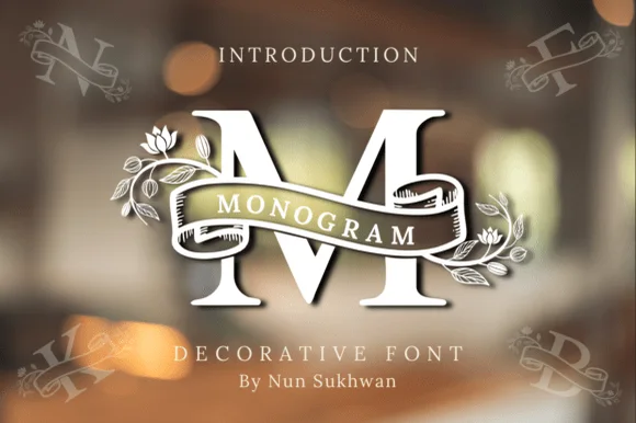
Ribbon-banner floral serif monogram
Amorette Monogram wraps classically built serif initials in a curved ribbon scroll and blooming botanical vines, and the corner specimens show N, F, K and B each carrying their own banner and floral detailing around bold structural stems.
Ideas for this font
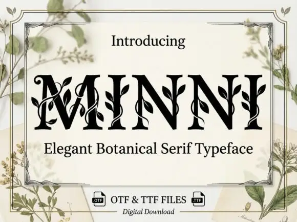
Botanical ornamented serif
Minni is a botanical serif in black on cream: high-contrast caps whose stems sprout leaves and curling vines, sharp serifs and a narrow waist, with a light botanical frame and small file badges at the foot.
Ideas for this font
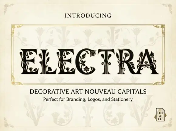
Contrast serif capitals with leaf-shaped openings and curling botanical extensions
Electra presents dark capitals inside a pale ornamental frame: broad serif strokes are cut by fine leaves and curling stems, some terminals expand into fan-like leaf forms, C encloses a small floral cluster, T grows symmetrical branches inside its stem and A carries a pointed botanical counter.
Ideas for this font
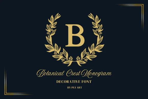
Gold laurel-wreath serif monogram
Botanical Crest Monogram surrounds classic roman initials with a poised laurel leaf wreath, built for family crests, embroidery-look prints and gifts, where clean separation between the bold central capital and the surrounding leaf ring keeps the initial readable from invitation scale up to a wall plaque.
Ideas for this font
Same independent foundry
Allow optional Google Analytics to measure visits and catalogue actions. Your search words and notes are not included. Privacy & storage



