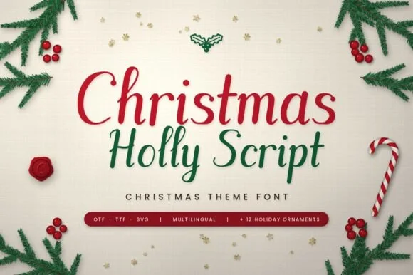
Neutral Sans Workhorse

Color Stars + Modern Heritage
Lets Color Stars own the focal silhouette while handling secondary copy, sizing and subheads cleanly.
Inspect Modern Heritage specimenDisclosure: MakerFileHub may earn a commission from qualifying purchases via paid links on this page. How our links work.
Capital silhouettes assembled from many separate small five-point stars
Color Stars fills every letter with a dense cluster of small five-pointed stars in white, so a word appears as a constellation drawn tightly enough to read as type.
Paid link
Get this fontProject & layout blueprintsAt-a-glance maker compatibility
Sturdy stroke walls and open counters weed cleanly on adhesive vinyl, HTV apparel film, and cut cardstock.
Visual anatomy & craft review
STARS spans the middle of the card, and each stroke is a pack of tiny stars set close enough to form a solid shape with a soft edge where the outline is irregular. The ground is a night sky with a faint band of the Milky Way, and the letters are the brightest thing in the frame, so the word reads as a constellation rather than as a pattern. Below the horizon a treeline stands in near black. The construction is entirely textural: there is no outline and no skeleton line visible, which means the face needs a dark ground and a generous size, because at small sizes the stars read as noise and the word dissolves into a cloud.
Capital silhouettes assembled from many separate small five-point stars
Two-font hierarchy recipes
Tested contrast partners — pairing Color Stars with grounded secondary typography.
Color Stars + Modern Heritage
Lets Color Stars own the focal silhouette while handling secondary copy, sizing and subheads cleanly.
Inspect Modern Heritage specimen
Color Stars + Things
Grounds bold display lettering with classic typographic authority on posters, badges and apparel.
Inspect Things specimenPractical applications
Concrete hierarchy, scale and production guidance tailored to Color Stars’s stroke geometry.
The star fill matches a printed night sky on a programme cover, and the word reads even when the cover is reproduced in one ink on cheap paper.
Hierarchy & layout recipe
Print a 148 by 210 mm programme: set the concert title at 60 pt across two rows, keep 24 mm of clear ground beneath before the ensemble line at 10 pt, and hold 16 mm from the star edges to the trim.
Pre-production check
Stars break up when photocopied; copy one programme on the machine the venue uses and check the word before the run.
The night sky and the stars carry the season without a drawing, and a dark card with pale type reads as a premium greeting next to a printed snowman.
Hierarchy & layout recipe
Print a 120 by 170 mm card: set the greeting at 40 pt across two rows, keep 16 mm of clear ground beneath before the written note, and hold 13 mm from the star edges to the card edge.
Pre-production check
Pale stars on dark stock need an opaque ink; print one card on the real board and check the density first.
The lettering is the subject of the page in a way a neutral headline cannot be, and it sets up a feature on the night sky before the first line of copy is read.
Hierarchy & layout recipe
Print a 230 by 300 mm opener: set the feature title at 110 pt across one row, keep 34 mm of clear ground beneath before the standfirst at 11 pt, and hold 20 mm from the star edge to the right trim.
Pre-production check
Small dense stars band in offset; print one opener on the intended press and check the clusters before the issue.
Technical & licence verification
Confirm included OTF/TTF/WOFF formats, full glyph tables and licence coverage on the live store page before batch production.
Closest visual alternatives
Matched across letterform anatomy, stroke behaviour and craft applications.
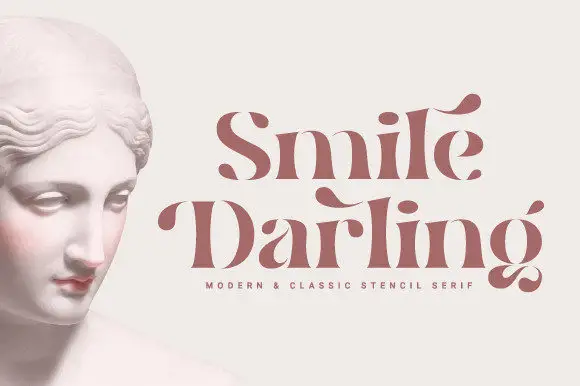
Stencil contrast serif display
Smile Darling is a stencil contrast serif in dusty rose beside a marble bust: mixed case with heavy stems, detached hairlines that float free of the letters, pointed terminals and curled spurs, set in two lines with a tracked line beneath naming the style.
Ideas for this font
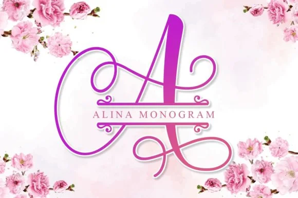
Calligraphic split-bar monogram
Alina Monogram builds ornate calligraphic capitals with an integrated centre split bar, where sweeping ribbon loops wrap each uppercase initial while a clean horizontal band runs through the middle to hold family names or a wedding date.
Ideas for this font
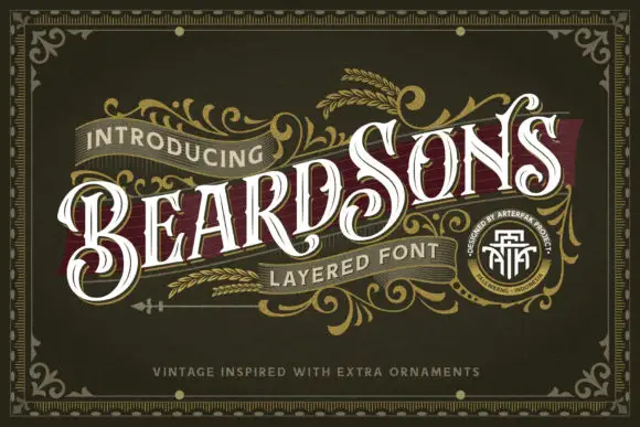
Curled high-contrast capitals with offset inline-like decoration
Beardsons rises diagonally across an ornate olive cover, where white capitals carry thin internal lines, narrow waists and extended curled terminals around the opening B and the central S, a dark red offset behind the letters adds depth and fine gold foliage frames the name.
Ideas for this font
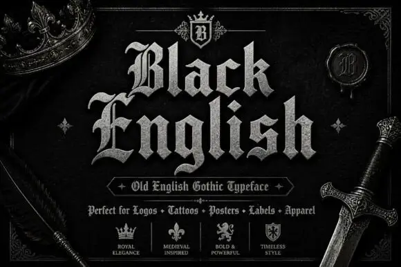
Angular blackletter with diamond-ended strokes and ornate initials
Black English shows pale Gothic mixed case on black, where angular broken bowls, pointed joins and diamond stroke endings give the lowercase a dense rhythm, the large B and E carry extra entry flourishes and a grey hatched treatment adds surface detail to the shown title.
Ideas for this font
Same independent foundry
Allow optional Google Analytics to measure visits and catalogue actions. Your search words and notes are not included. Privacy & storage