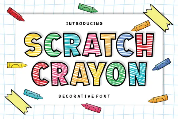
Neutral Sans Workhorse

Ask Why + Cultivo
Lets Ask Why own the focal silhouette while handling secondary copy, sizing and subheads cleanly.
Inspect Cultivo specimenDisclosure: MakerFileHub may earn a commission from qualifying purchases via paid links on this page. How our links work.
Bold whimsical blocks with uneven proportions and soft squared corners
Ask Why is a bold whimsical display in which the letters sit softly squared, the stance shifts from letter to letter and the widths vary, so a two-word phrase reads as lettering drawn by hand with a broad marker.
Paid link
Get this fontProject & layout blueprintsAt-a-glance maker compatibility
Sturdy stroke walls and open counters weed cleanly on adhesive vinyl, HTV apparel film, and cut cardstock.
Visual anatomy & craft review
The A keeps a small triangular counter under a wide shoulder, the W spreads very wide and open, the h rises on a heavy stem and the y curls its tail, all at a chunky weight with rounded corners and an uneven baseline. The uneven proportions are the character: no two letters share a width, which is why the sample sets two rows over a dark botanical cover. Because the letters are wide, a long phrase needs deliberate leading from 30 pt and the small triangular counter should be checked after any reduction. The birds and foliage in the sample are artwork; the white two-row title is the face.
Whimsical · Chunky · Uneven
Two-font hierarchy recipes
Tested contrast partners — pairing Ask Why with grounded secondary typography.
Ask Why + Cultivo
Lets Ask Why own the focal silhouette while handling secondary copy, sizing and subheads cleanly.
Inspect Cultivo specimen
Ask Why + Flowsky Editorial
Grounds bold display lettering with classic typographic authority on posters, badges and apparel.
Inspect Flowsky Editorial specimenPractical applications
Concrete hierarchy, scale and production guidance tailored to Ask Why’s stroke geometry.
The whimsical blocks give a studio name personality, and the uneven widths keep it from looking like a template at 50 mm on a printed door sign.
Hierarchy & layout recipe
Print an A4 sign: set the studio name at 50 mm on two rows, keep 20 mm of clear ground between the rows so the wide letters do not collide, and keep 22 mm of border all round the sheet.
Pre-production check
An uneven baseline printed against a straight rule looks crooked; check the sign and keep any divider well clear of the block.
The chunky letters suit a small card, and the rounded corners keep a greeting friendly at 34 pt without extra decoration on the sheet.
Hierarchy & layout recipe
Print an A6 card: set the greeting at 34 pt on two rows, set the name at 14 pt in a neutral sans beneath with 12 mm of clear ground, and keep 14 mm of margin all round the card.
Pre-production check
Small triangular counters printed at 18 pt close up; check the proof and keep the display lines at 30 pt or above.
The uneven lettering suits a child-height board, and the heavy stems stay legible at 44 mm on a laminated sign in one flat colour.
Hierarchy & layout recipe
Print an A4 sign: set the question at 44 mm, keep 18 mm of border all round, and laminate with a matte pouch so the soft corners do not catch the ceiling lights.
Pre-production check
A glossy laminate over soft corners throws highlights; check the mounted board from three metres and switch to matte film.
Technical & licence verification
Confirm included OTF/TTF/WOFF formats, full glyph tables and licence coverage on the live store page before batch production.
Closest visual alternatives
Matched across letterform anatomy, stroke behaviour and craft applications.
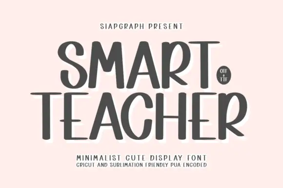
Tall narrow minimalist display lettering
Smart Teacher is a tall narrow display face in charcoal: mixed capital and lower-case forms in one line, a wide T bar, a small round counter in the o and a soft white halo behind the lettering.
Ideas for this font
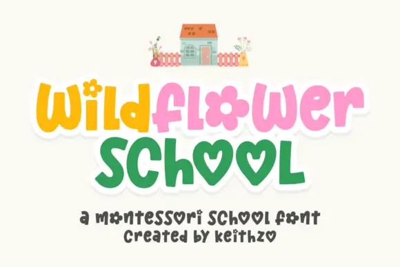
Playful rounded letters with flower and heart forms
Wildflower School is a cheerful hand-drawn display in which the round letters become shapes: the o of flower is a flower head, both o's of school are hearts, and the pastel caps sit inside a white sticker outline.
Ideas for this font
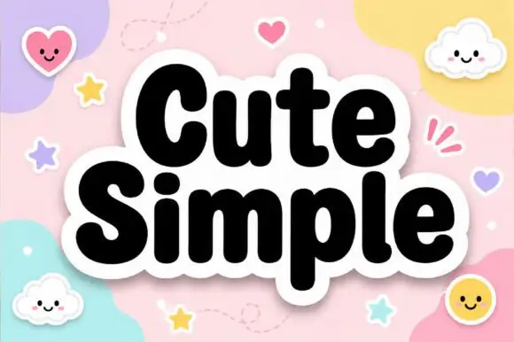
Very heavy rounded mixed-case lettering with a soft sticker outline
Cute Simple is very heavy rounded mixed-case lettering in which the bowls press against the stems and a thick soft outline wraps the whole lockup, so a word reads as one cut sticker rather than as separate letters.
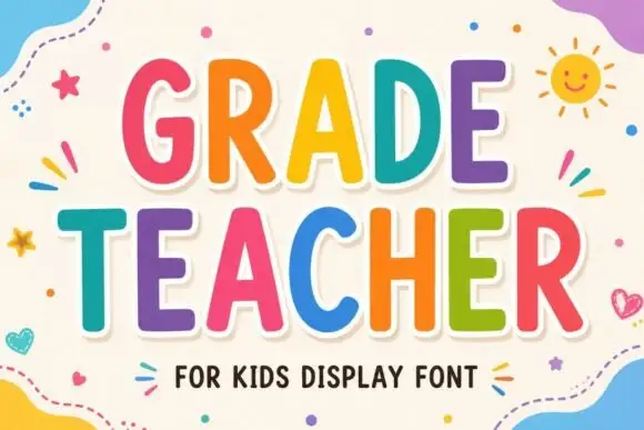
Tall rounded classroom capitals with simple counters and per-letter colour
Grade Teacher is a tall rounded capital alphabet with simple counters, drawn so a heading reads as classroom lettering that a teacher could have cut out of coloured card.
Ideas for this font
Same independent foundry
Allow optional Google Analytics to measure visits and catalogue actions. Your search words and notes are not included. Privacy & storage